Data Series
A data series is a chart element that is a data array. A chart is based on a set of data series.
Data series are shown graphically on the chart, for example, as a set of colored columns.
A chart data series which has a name is highlighted in a specific color and an icon specified in the legend.
NOTE. By default, no more than 99 series can be displayed on a chart. If the greater number of series is selected, the first 99 series is displayed, the rest is hidden. To change the maximum number of series displayed on a chart, use registry settings.
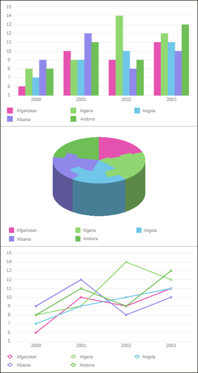
Examples of series for various chart types:
To set up chart data series, use the Data Series group of parameters on the side panel.
 To open the Data Series group of parameters

 Parameters button on the toolbar, then select the required group.
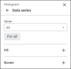
NOTE. The number of displayed parameters depends on the chart or series type.
By default, the All value is selected in the Series drop-down list for all chart types, except for the following: waterfall chart, stock exchange chart, box chart, and histogram with fluctuation intervals. This value is used to determine settings applied for all series displayed in a chart. Waterfall and stock exchange charts by default display the series, for which the chart was built.
Parameters available for the All series:
NOTE. Parameters available for the All series depend on the chart type.
To set up a specific series, select it in the Series drop-down list. To set up all series, select the All series. Note that the setting determined for the All series do not overwrite the settings determined manually for a specific series.
To apply settings of the All series for all series, including the series with custom settings, click the For All button.
The data series setup panel looks as follows when a specific series is selected:
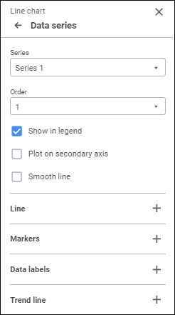
Set the parameters:
Series Sequence Order
Chart series sequence order can be changed if the Bind to Source checkbox is deselected for all chart types, except for waterfall charts and stock exchange charts.
In the Order drop-down list select the series sequence order in a chart. Series numbering starts with one.
The order of a series on a chart determines the order of its displaying in the legend.
Setting up the order of series on a chart is also available in the Series Groups group of parameters for histograms of the  Stacked Histogram with Groups and
  Stacked 3D Histogram with Groups types.
Displaying/Hiding a Series in a Chart
To set up displaying a series in a chart, use the Show in Legend checkbox. The checkbox is selected by default and a series is displayed in the legend.
NOTE. Showing or hiding a series in a legend is available for all chart types, except for waterfall chart.
Series Type
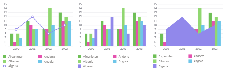
To change a series type for mixed and radar charts, select the type in the Series Type drop-down list:
Line. The series is shown as a line.
Column. The series is shown as a column. It is available only for mixed charts.
Area. The series is shown as a colored area.
Below is the example of a mixed chart with various settings of one of data series (Line, Column, and Area, respectively):
The following series types are available for stepped charts:
Stepped Line. The series is shown as a broken line.
Stepped Area. The series is shown as a colored area.
Below is the example of a stepped chart with various settings of one of data series (Stepped Chart and Stepped Area Chart, respectively):
Series Line Smoothing
Line smoothing is used to eliminate curved line effect that occurs on plotting line charts and radar charts, a series of the Line type of mixed chart, and of scatter chart with connecting lines.
To smooth chart linear series, select the Smooth Line checkbox.
Series Fill
To set up series fill, open a drop-down palette and select fill type in the drop-down list:
NOTE. Series fill is available for all chart types, except for the following: line chart, scatter chart and stock exchange, and for all chat types, except for the Line and the Stepped Chart types.
No Fill. Fill is not used.
Automatic Fill. Default value. Automatic solid fill is used.
Solid Fill. Select solid fill color for the plot area in the drop-down palette. If required, specify fill opacity percent.
Two-Color Fill. Select the start and the end colors of two-color gradient in the drop-down palette. If required, specify tilt angle and fill opacity percent.
Heterogeneous Fill. Select a solid fill line gradient color in the drop-down palette. If required, specify fill opacity percent.
Hatching Fill. Execute the operations:
Select solid fill color in the drop-down palette. If required, specify fill color and hatching color transparency percent.
Select texture option in the Hatching drop-down list.
Select hatching color in the drop-down color palette.
One can select standard and custom colors in the drop-down palette. The palette contains only standard colors by default.
To create a custom color:
Click the
 Add Color button. The advanced color palette opens.
Select a color in the advanced color palette, use color picker to select color on a browser page, or set color code in the RGB or HEX format.
After executing the operations the custom color is created and added to the palette.
NOTE. The maximum possible number of custom colors in the a palette is 23.
To delete custom color from the palette, select the Delete item in the selected color's context menu.
If the All value is selected in the Series drop-down list, the checkboxes will be available depending on the fill type in use:
Select Color. The checkbox is available for solid and heterogeneous fill. When the checkbox is selected, the selected color fill is applied to the chart.
From, To. The checkboxes are available for two-color fill. When each checkbox is selected, the selected color two-color fill is applied to the chart.
NOTE. If any chart series has its own fill, it remains regardless of the checkbox state. To apply the specified fill to the entire chart, click the For All button.
All checkboxes are deselected by default.
Border
To set up a data series border, set the following:
NOTE. Series border setup is available for all chart types, except for the following: line chart, scatter chart and stock exchange chart, and for all series types, except for the Line and the Stepped Chart types.
Line Type. Select line type in the drop-down list.
Line Color. Select line color in the drop-down palette. One can select standard and custom colors. The palette contains only standard colors by default.
To create a custom color:
Click the
Add Color button. The advanced color palette opens.
Select a color in the advanced color palette, use color picker to select color on a browser page, or set color code in the RGB or HEX format.
After executing the operations the custom color is created and added to the palette.
NOTE. The maximum possible number of custom colors in the a palette is 23.
To delete custom color from the palette, select the Delete item in the selected color's context menu.
Line Width. Set the required line width using the keyboard or the value editor.
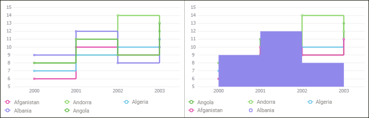
Step Position
Step is a curve connecting two neighboring series values.
To change step position relative to a data series point, select the required position option in the Step drop-down list: left, center, or right of the series point.
NOTE. Step position setup is available only for stepped charts.
Below is the example of stepped chart with various step positions (Left, Center, and Right, respectively):
Series Line
To set up a series line, set the following:
NOTE. Series line setup is available for line chart series, and for series of the Line type in mixed charts, stepped charts and radar charts.
Line Type. Select line type in the drop-down list.
Line Color. Select line color in the drop-down palette. One can select standard and custom colors. The palette contains only standard colors by default.
To create a custom color:
Click the
Add Color button. The advanced color palette opens.
Select a color in the advanced color palette, use color picker to select color on a browser page, or set color code in the RGB or HEX format.
After executing the operations the custom color is created and added to the palette.
NOTE. The maximum possible number of custom colors in the a palette is 23.
To delete custom color from the palette, select the Delete item in the selected color's context menu.
Line Width. Set the required line width using the keyboard or the value editor.
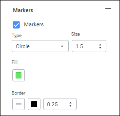
Markers
A marker is a single value of a data array displayed as a point of a shape.
To set up displaying of data series markers, make sure that the Markers checkbox is selected on the side panel:
NOTE. Maker displaying setup is available for series of a histogram with fluctuation intervals, line chart, scatter chart, stock exchange chart, box chart, box chart with linear series, for series of the Line type of mixed charts and radar charts, for a series of the Stepped Chart type of a stepped chart. The listed chart types should be two-dimensional.
Set the parameters:
Type. Select a marker type in the drop-down list:
Diamond. Markers are shown as diamonds.
Inverse Triangle. Markers are shown as downward triangles.
Triangle. Markers are shown as upward triangles.
Circle. Markers are shown as circles.
Square. Markers are shown as squares.
Line. Markers are displayed as dashes.
Auto Rotate. Select the checkbox to tilt markers at a tangent to a chart series line. When the checkbox is deselected, markers are positioned vertically.
NOTE. Marker automatic rotation is available only for the Inverse Triangle and the Triangle types.
Size. Set marker size in millimeters using the keyboard of the value editor.
Fill. Select marker fill method in the drop-down palette and determine corresponding settings.
The following fill options are available:
Solid Fill. Default value. Select marker solid fill color. If required, specify fill opacity percent.
No Fill. Tooltip background fill will not be used. Click the
 No Color button.
One can select standard and custom colors. The palette contains only standard colors by default.
To create a custom color:
Click the
Add Color button. The advanced color palette opens.
Select a color in the advanced color palette, use color picker to select color on a browser page, or set color code in the RGB or HEX format.
After executing the operations the custom color is created and added to the palette.
NOTE. The maximum possible number of custom colors in the a palette is 23.
To delete custom color from the palette, select the Delete item in the selected color's context menu.
Border. Set up border displaying:
Type. Select a border type in the drop-down list.
Color. Select border solid fill color in the drop-down palette.
One can select standard and custom colors. The palette contains only standard colors by default.
To create a custom color:
Click the
Add Color button. The advanced color palette opens.
Select a color in the advanced color palette, use color picker to select color on a browser page, or set color code in the RGB or HEX format.
After executing the operations the custom color is created and added to the palette.
NOTE. The maximum possible number of custom colors in the a palette is 23.
To delete custom color from the palette, select the Delete item in the selected color's context menu.
Line Width. Set line width using the keyboard or the value editor.
After executing the operation, markers are displayed for the data series according to the specified parameters.
If required, deselect the Markers checkbox to hide data series markers from the chart.
Data Labels
Data labels contain information about data series or single data points and make it easier to understand a chart.
To display labels for a selected series, select the Data Labels checkbox.
NOTE. Data series label setup is available for series of all chart types, except for waterfall charts.
For details about data label setup see the Data Labels section.
Plotting a Series on a Secondary Axis
A secondary axis is an auxiliary value axis, which can display:
Values of data series that strongly differ from other series' values.
Series values presented on the chart as a different data type.
To plot a series on a secondary value axis, select the Plot on Secondary Axis checkbox. After the checkbox is selected, the Value Axis (Secondary) group of parameters is displayed that is used to set up a secondary axis.
NOTE. Plotting a series on a secondary axis is available for all chart types, except for radar charts, pie charts and waterfall charts.
For details about secondary axis setup see the Chart Axes section.
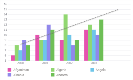
Trend Line
A trend line is used to visualize data trends and predict their further changes.
The example of a trend line with a one point forward forecast:
To display a trend line, select the Trend Line checkbox.
NOTE. Trend line setup is available only for histograms, histograms with fluctuation intervals, area charts, line charts, mixed charts, scatter charts, bubble charts and stepped charts.
After the checkbox is selected, the trend line parameters setup panel is displayed:
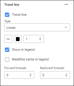
Set the parameters:
Type. Select trend line type in the drop-down list:
Linear. It is applied in simple cases when data series points are located close to the trend line. The linear type of trend line is applicable to the value that increases or decreases at a constant speed.
Logarithmic. The logarithmic trend line describes well the value that increases or decreases quickly at the beginning and then gradually stabilizes. The logarithmic trend line can be used both for negative and positive data values.
Exponential. The exponential trend line is a curved line that should be used when data values rise or fall at constantly increasing rates. However, for the data that contain zero or negative values, this trend line type cannot be used.
Power. The power trend line gives the best results when used with data sets that compare measurements that increase at a specific rate. An example of such a dependency is the acceleration of a race car at 1-second intervals. If there are zero or negative value in the data, power trend line type cannot be used.
Average. The trend line that passes through the data series mean. Such trend line enables the user to view dynamics of changing the considered value depending on the mean value.
Peak Values. The following trend lines are plotted: the line that goes through the maximum value of data series and the line that goes through the minimum value of data series.
Line Type. Select line type in the drop-down list.
NOTE. Trend line type selection is available only for two-dimensional chart types.
Line Color. Select line color in the drop-down palette. One can select standard and custom colors. The palette contains only standard colors by default.
To create a custom color:
Click the
Add Color button. The advanced color palette opens.
Select a color in the advanced color palette, use color picker to select color on a browser page, or set color code in the RGB or HEX format.
After executing the operations the custom color is created and added to the palette.
NOTE. The maximum possible number of custom colors in the a palette is 23.
To delete custom color from the palette, select the Delete item in the selected color's context menu.
Line Width. Set the required line width using the keyboard or the value editor.
To set up displaying a trend line in the legend, use the Show in Legend checkbox. The checkbox is selected by default and a trend line is displayed in the legend.
To redefine trend line name in the legend, select the Redefine Name in Legend checkbox and set a new line name. It is available only when the Show in Legend checkbox is selected.
Depending on the trend line type selection, additional fields will be available:
Forward Forecast/Backward Forecast. Set the required number of forecasting steps using the keyboard or the value editor. This setting is available for all trend line types, except for Average and Peak Values.
Peak Interval. Set the required interval, at which peak values of the series are calculated, using the keyboard or the value editor. This setting is available for trend lines of the Peak Values type.
Color Scheme
A color scheme is used to determine column color: Increase, Decrease, Total.
To change column color, select the required color in the drop-down palette or set it in the RGB and HEX format.
NOTE. Color scheme setup is available only for waterfall charts.
Visibility of Connecting Lines
To display connecting lines, use the Connecting Lines checkbox. The checkbox is selected by default and connecting lines are displayed. Line color, type, and width are can be set up on the Border panel.
NOTE. Visibility of connecting lines can be set up only for waterfall charts.