Legend
A legend contains names and markers of data series on a chart. The order of displaying data series in the legend corresponds with their order on a chart.
NOTE. A legend shows only the data series, for which the Show in Legend checkbox is selected.
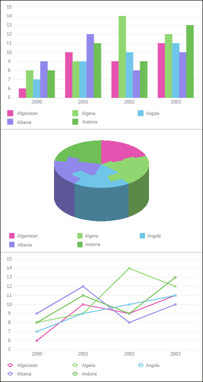
Examples of legends for various chart types:
To set up a chart legend, use the Legend group of parameters on the side panel.
 Open the Legend group of parameters

 Parameters button on the toolbar, then select the required group.
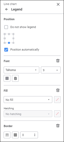
Set the parameters:
Position
Select legend position relative to the chart area. The available options: top left corner, top border center, top right corner, right border center, bottom right corner, block bottom border center , bottom left corner, left border center. When the position option is selected, the Position Legend Automatically checkbox is selected.
By default, the legend is positioned at the bottom of the chart.
To hide the chart, select the Do not Show Legend checkbox.
Elements Layout
Determine element layout settings in the legend:
To set element layout option, select the required option in the drop-down list:
Automatic. Default value. The number of rows and columns is selected depending on the number of legend elements and its size.
Multiple Columns. Specify the number of columns for legend elements. The specified number of columns is used regardless of the legend size.
Multiple Rows. Specify the number of rows for legend elements. The specified number of rows is used regardless of the legend size.
NOTE. To view chart elements that do not fit the legend, use row/column scrollbars.
To wrap words in the legend, select the Word Wrap checkbox. The setting is used only for the Multiple Columns legend element layout option with the 1 value.
Available legend element name displaying options:
Element names without word wrap:

Element names with word wrap:

Font
Set up font parameters:
Font. Select one of the available fonts in the drop-down list. If required, one can load custom fonts.
Font size. Select the required font size. The size is set in points, and it can be selected in the drop-down list or entered manually. The range of available values: [8; 36].
Color. Select font color in the drop-down palette. One can select standard and custom colors. The palette contains only standard colors by default.
To create a custom color:
Click the
 Add Color button. The advanced color palette opens.
Select a color in the advanced color palette, use color picker to select color on a browser page, or set color code in the RGB or HEX format.
After executing the operations the custom color is created and added to the palette.
NOTE. The maximum possible number of custom colors in the a palette is 23.
To delete custom color from the palette, select the Delete item in the selected color's context menu.
Style. Select font style:
B. Bold.
I. Italic.
U. Underline.
When the button is pressed, the corresponding font style is used. Several styles can be used simultaneously, for example, pressed B and I buttons result in bold italic font style.
Fill
To set up legend background, select fill type in the drop-down list:
No Fill. Default value. Fill is not used.
Solid Fill. Select solid fill color in the drop-down palette. If required, specify fill opacity percent.
Two-Color Fill. Select start and end gradient colors in the drop-down palette. If required, specify tilt angle and fill opacity percent.
Hatching Fill. Execute the operations:
Select solid fill color in the drop-down palette. If required, specify fill color and hatching color transparency percent.
Select texture option in the Hatching drop-down list.
Select hatching color in the drop-down color palette.
The drop-down palette can be used to select standard and custom colors. The palette contains only standard colors by default.
To create a custom color:
Click the
Add Color button. The advanced color palette opens:
Select a color in the advanced color palette, use color picker to select color on a browser page, or set color code in the RGB or HEX format.
After executing the operations the custom color is created and added to the palette.
NOTE. The maximum possible number of custom colors in the a palette is 23.
To delete custom color from the palette, select the Delete item in the selected color's context menu.
To reset fill settings, click the  Delete button.
Border
To set up legend border, set:
Line Type. Select line type in the drop-down list.
Line Color. Select line color in the drop-down palette. One can select standard and custom colors. The palette contains only standard colors by default.
To create a custom color:
Click the
Add Color button. The advanced color palette opens.
Select a color in the advanced color palette, use color picker to select color on a browser page, or set color code in the RGB or HEX format.
After executing the operations the custom color is created and added to the palette.
NOTE. The maximum possible number of custom colors in the a palette is 23.
To delete custom color from the palette, select the Delete item in the selected color's context menu.
Line Width. Set the required line width using the keyboard or the value editor.
To reset birder settings, click the Delete button.