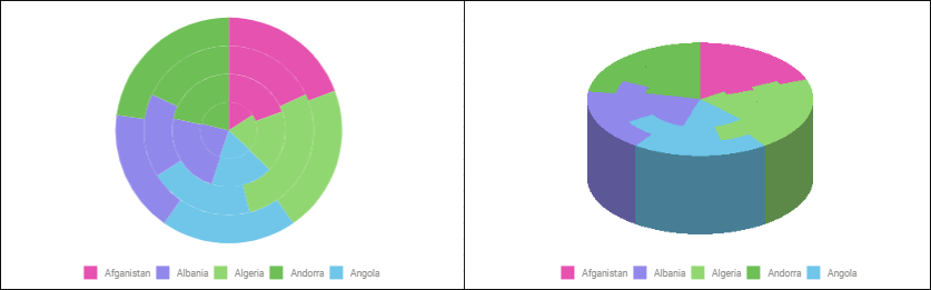
A pie chart shows size of elements belonging to one data series proportionally to sum of elements.
Each group of data is displayed as a circle that is divided into sectors, which angular sizes are proportional to data element values.
The example of a pie chart with absolute values and a 3D pie chart:
Available pie chart types:
 absolute values.
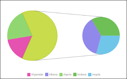
 secondary pie chart.
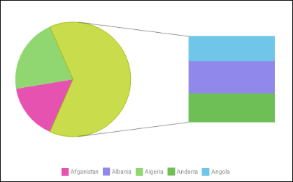
 secondary chart.
 absolute values 3D.
 Doughnut.
A secondary pie chart is a pie chart with part of values displayed on the second chart.
A secondary histogram is a pie chart with part of the values displayed on the histogram.
A doughnut chart shows size of elements belonging to one data series proportionally to sum of elements. Each data group is shown as a circle divided into sectors. The first data series is shown in the center of the chart. If percents are shown in data labels, each circle should make up 100%.
The following settings are available during chart editing:
See also:
Chart Types | Data Visualization as Charts