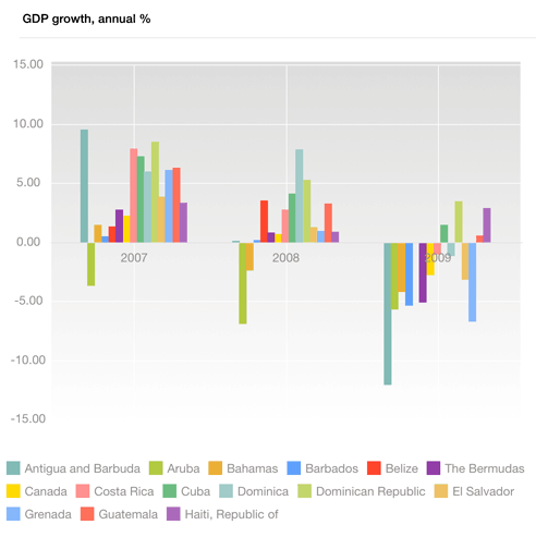
A chart is a form of graphical presentation of table data.
To work with a chart:
In the Analytical Queries (OLAP) tool tap the Chart button at the center of the page top panel.
In the Dashboards tool:
Tap the chart title.
Go to the full-screen mode of blocks and select a block with a chart.

To work with dimensions, use the Layout panel at the left page edge.
The selected elements of the dimension located in rows are used as series. The selected elements of the dimension located in columns are used as categories (the X axis).
If a chart and a table are based on the same data source, the chart can display values that differ from those in the table. To do this:
Set a fixed dimension that acts as metrics for the chart and the table, by which the chart is plotted.
Select the value to be displayed in the table metrics dimension.
Select the value, by which the chart is plotted, in the chart metrics dimension.
The chart and the table display different data.
NOTE. In dashboards, charts and tables can be plotted based on various data sources.
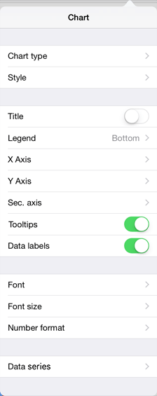
To set up chart parameters, tap the  button at the top right corner of the express report page or dashboard.
After the operation has been executed, the Chart dialog box opens:

Font.
See also: