Tap the  button at the top right page corner.
Select the Data Series item in the Chart dialog box that opens.
Select a data series in the list.
A data series is a set of related data elements displayed on a chart. Each data series of a chart is colored or labeled individually, as specified in the chart legend.
The specified parameters can be set up for every data series displayed on a chart.
To set up data series parameters:
Tap the  button at the top right page corner.
Select the Data Series item in the Chart dialog box that opens.
Select a data series in the list.
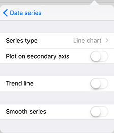
The dialog box opens:

NOTE. The Smooth Series switch button is available only for the Linear type.
The following settings are available:
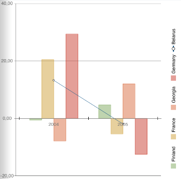
Series Type. Select data series type in the list: bar, line or area. The setting is not available for pie charts, doughnut charts and bar charts. The series display type is selected only within a single chart subtype. For example, the data series of a stacked histogram can be transformed to a stacked line or a stacked area. The image below shows a mixed chart. One of the chart's series is displayed as a line:

Plot on Secondary Axis. The switch button determines whether secondary axis is used for a configured data series.
Trend Line. The switch button determines whether a trend line is used for a configured series. Additional settings are displayed when the switch button is enabled.
Smooth Series. It is used to remove broken line effect that appears on building a series of the Linear type. The setting is available for series of the Linear type.
See also:
Chart | Chart Types | Legend | Secondary Axis