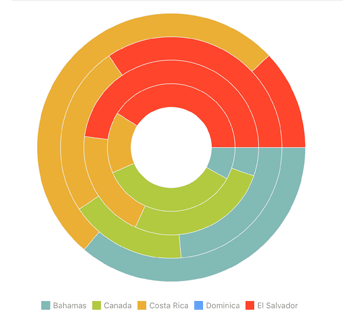
A doughnut chart, just like a pie chart, shows relations between the parts and the whole. Each ring of a doughnut chart represents a category. Parts of the rings are data series. A doughnut chart visualizes the relation of data series within multiple categories:

On using a doughnut chart consider the following:
Size of the inner and outer rings does not correspond to the data value.
Zero values on the chart are not displayed, negative values are displayed by the unit.
See also: