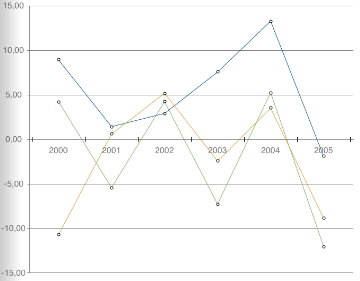
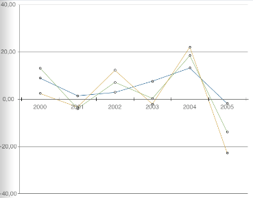
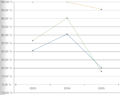
Line charts display data changes over time in the most graphical way. The categories are uniformly distributed along the X axis, and the values are shown along the Y axis on line charts.
The following types of line charts are available:
Line Chart. Shows absolute series values.
Stacked Line Chart. Shows stacked values. Estimates share of each value in the total sum.
Normalized Stacked Line Chart. Shows values as percentage. Estimates share of each value in the total sum.
The figures below from left to right show a line chart, a stacked line chart, a normalized stacked line chart.


See also: