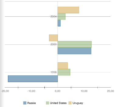
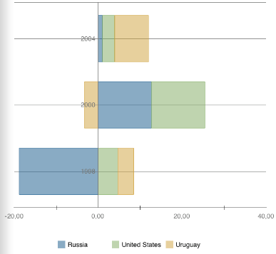
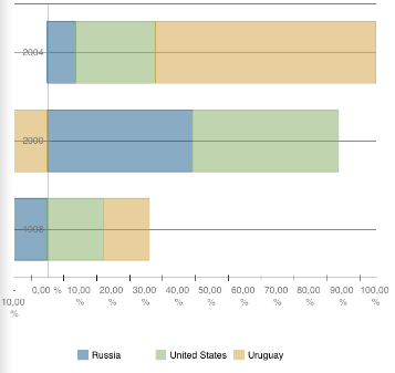
The value of each element is displayed as a horizontal bar, which length is proportional to the element value. A custom set of bars is displayed for each of the data groups; data series are highlighted by the bar color.
The charts of this type locate the categories on the vertical axis and values on the horizontal axis.
The following types of bar charts are available:
Bar Chart. Shows absolute series values.
Stacked Bar Chart. Shows stacked values. Estimates share of each value in the total sum.
Normalized Stacked Bar Chart. Shows values as percentage. Estimates share of each value in the total sum.
The figures below from left to right show a bar chart, a stacked bar chart, a normalized stacked bar chart.


See also: