Tap the  button. The Chart dialog box opens.
Select the X Axis item or Y Axis item. The dialog box opens:
The X axis is oriented horizontally, the Y axis is oriented vertically. The X axis contains categories, the Y axis contains values.
NOTE. When a bar chart is created, the category axis is vertically oriented and the value axis is horizontally oriented.
To set up value axis parameters:
Tap the  button. The Chart dialog box opens.
Select the X Axis item or Y Axis item. The dialog box opens:
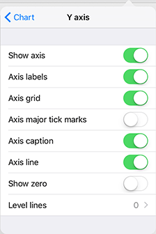
The dialog box contains chart element visibility settings:
Display the axis.
Axis labels.
Axis grid.
Axis major tick marks.
Axis caption.
Axis line.
The other settings available for the Y axis:
Display zero.
To manage visibility of axis elements, use the following switch buttons:
 . The element is visible.
 . The element is invisible.
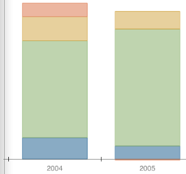
Axis Labels. The figure below shows the X axis labels displayed and Y axis labels hidden:
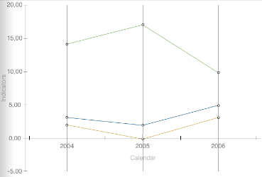
Axis Grid. X axis grid - vertical lines:
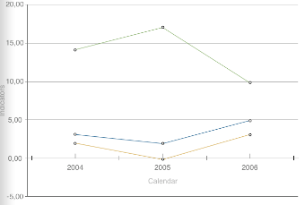
Y axis grid - horizontal lines:
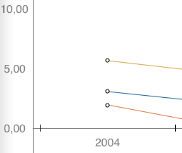
Axis Major Tick Marks. Major tick marks are short lines on the axis located next to the value labels:
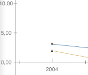
Major tick marks are hidden:
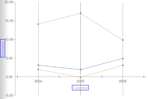
Axis Caption. The axis caption includes the name of the dimension, by which the axis is based. The X and Y axis captions (highlighted in blue) are displayed in the figure below:
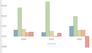
Axis Line. The figure below shows the chart with the axis lines hidden:
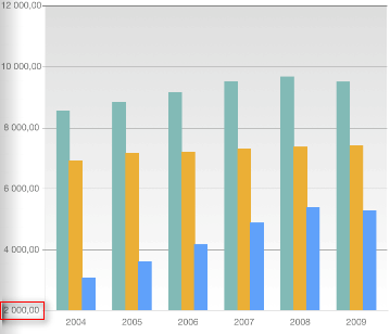
Show Zero. Zero is not shown:
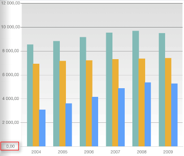
Zero is shown:
See also: