In this article:
Setting Up Data Visualization
When working with information panels in the edit mode, to set up data visualizers, use the control panel and side panel.
Control Panel
The control panel is used to work with dimensions and facts of visualizers and to set up their fields.
To show the control panel, press the  Dimensions button. The control panel is displayed by default.
To hide the control panel, release the  Dimensions button.

The control panel contains the groups:
Dimensions. It contains visualizer data source fields:
Fields of data model, which types are not integer or real numbers.
All dimensions of standard cube.
Facts. It contains integer and real type fields of data model, calculated facts, and calculated fields. It is displayed if information panel's data source is a data model.
Fields. It is used to set up the fields required for building visualizers.
NOTE. Setting up fields is available only for selected visualizer.
Dimension Filter. It is used to set up dimension filter.
NOTE. When the Dimension Filter group is displayed, the Dimensions and Facts groups are hidden.
Operations with Facts
To search for a fact, click the  Search button in the Facts group and start typing name of the required fact.
For details about working with calculated facts see the Setting Up Calculated Facts section.
Setting Fields
To set fields, use dimensions and facts from corresponding groups. When setting visualizer fields, one can use facts several times. One can determine various aggregation settings and field roles for such fields.
Setting rows and columns is available for all visualizer types, except for the Scatter Chart, Indicator, and Map.
To set rows or columns, drag the required dimensions and/or facts to the Rows/Columns area of the Fields group. To quickly add dimensions to the Rows area, double-click the required dimension.
As a result, the list of rows and columns displays the added dimensions and/or facts:

To reorder the added fields, use the  Up and
  Down items in the drop-down menu of the
  Actions button.
To set filter, one can use all dimensions and facts, except for calculated facts.
To set filter:
Drag the required dimensions and/or facts to the Filter area of the Fields group.
Double-click the required dimension.
As a result, the list of filters displays the added dimensions and/or facts:

NOTE. Standard cube dimensions with enabled aggregation method , when being placed in the Filter area, are excluded from building data view.
Setting facts is available for all visualizer types, except for the Scatter Chart type.
NOTE. To set facts, one can use only data from the Facts group. The Facts group is displayed if information panel's data source is a data model.
To set fact:
Drag the required fact to the Facts area of the Fields group.
Double-click the required dimension/fact.
As a result, the list of facts displays the added fact:

Setting X and Y axes is available only for visualizers of the Scatter Chart type.
NOTE. To set axes, one can use only data from the Facts group.
Top set axes:
Drag the required facts to the X Axis and/or Y axis area of the Fields group.
Double-click the required fact.
As a result, the list of axes displays the added facts:


 Set point color, form, and size
Setting point color and size is available only for visualizers of the Scatter Chart and Map types.
Setting point form is available only for visualizers of the Scatter Chart type.
To set point color, size and form, drag the required dimensions and/or facts to the the Color or Size, or Form areas of the Fields group. As a result, the lists of colors, sizes, and forms display the added dimensions and/or facts:
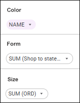
Point colors, sizes, and forms in visualizer are determined by values of elements of added dimensions/facts.
Setting trend lines is available only for visualizers of the Indicator type.
To set trend line, drag the required dimensions and/or facts to the Trend Line area of the Fields group. As a result, the list of trend lines displays the added dimensions and/or facts:

To reorder the added fields, use the Up and Down items in the drop-down menu of the Actions button.
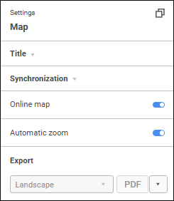
Setting geoobjects is available only for visualizers of the Map type.
NOTE. To set geoobjects, one can use only data from the Dimensions group.
To set geoobjects:
Drag the required dimension to the Geoobjects area of the Fields group.
Double-click the required dimension.
As a result, the list of geoobjects displays the added dimension:

Geoobjects are displayed as points on a map.
Setting latitude and longitude is available only for visualizers of the Map type.
NOTE. To set latitude and longitude, one can use only data from the Facts group.
Set latitude or longitude:
Select the
 Georole item in the drop-down menu of the Actions button for the fact and select the Latitude or Longitude option.
Drag the required fact to the Latitude or the Longitude area of the Fields group.
As a result, the list of latitudes and longitudes displays the added facts:

Latitude and longitude determine latitude and longitude coordinates of geoobjects according to the rule:
If latitude value is positive, the coordinate is taken by north latitude, otherwise it is taken by south latitude.
If longitude value is positive, the coordinate is taken by east longitude, otherwise it is taken by west longitude.
The Arithmetic Mean aggregation method is set for the added facts by default. To change aggregation method, select the required method in the drop-down list of the Aggregation item in the drop-down menu of the Actions button:
Arithmetic mean (AVG).
Minimum (MIN).
Maximum (MAX).
Operations with Fields
To change role of the field that is used in creating a visualizer, open the drop-down menu of the Actions button and select the radio button:
Fact. When the radio button is selected for the fields with the String, Date, or Time data type, one can set up aggregation and select aggregation method: MIN, MAX, COUNT, or COUNTD. The MAX method is used by default.
Dimension. When the radio button is selected for the fields with any data type, one can set up dimension filter.
By default, a role is determined depending on the source field location: in the Dimensions or Facts group.
NOTE. Changing field role is available for facts and calculated fields, if information panel's data source is a data model. If visualizer field does not support the selected data source field role, the data source field will be automatically moved to allowed visualizer field.
Filter can be set up for all dimensions, except for the dimensions based on calculated facts.
To set dimension filter, use the Dimension Filter panel. For details see the Setting Up Dimensions and Element Selection section.
To set up level aggregation of calendar or hierarchical dimensions, execute the operations:
Add a calendar or hierarchical dimension to the Columns or Rows area of the Fields group.
Select the
 Level Aggregation item in the drop-down menu of the Actions button of the added dimension. The Calendar Level Aggregation dialog box opens:

The dialog box displays the list of added facts with aggregation methods.
Select aggregation methods for each fact in the Aggregation Method drop-down list. The Sum aggregation method is set by default.
If required, select the Aggregate by Selection in Dimension checkbox to aggregate levels only by dimension selections. The checkbox is deselected by default, and levels are aggregated by all dimension elements.
After executing the operations, aggregation is set up for each fact of the added calendar or hierarchical dimension.
The Sum aggregation method is set for facts by default. To change aggregation method, select the required method in the drop-down list of the Aggregation item in the drop-down menu of the Actions button:
Sum (SUM).
Arithmetic mean (AVG).
Minimum (MIN).
Maximum (MAX).
Number of values (COUNT).
Number of different values (COUNTD).
Standard deviation based on sample (STDDEV).
Median (MEDIAN).
Standard Deviation based on the entire population (STDDEVP).
Features of setting fact aggregation:
The following aggregation methods are available for the Latitude and Longitude fields:
Arithmetic mean (AVG).
Minimum (MIN).
Maximum (MAX).
Aggregation methods that are set up for source facts are set for calculated facts added to visualizers.
Setting up data format is available for facts, calculated fields and calculated facts.
The specified data format settings are applied to formatting of table elements and tooltips on charts.
To change data format:
Execute one of the operations on the control panel:
Select the fact, calculated fact, or calculated field in the Facts group on the control panel.
Add facts, calculated facts, or calculated fields to the Fields group on the control panel.
Select the Data Format item in the drop-down menu of the
Actions button for fact, calculated field, or calculated field.
After executing the operations the Data Format Settings dialog box opens:

The dialog box displays data type and fact or calculated field name.
Select data format in the Format drop-down list:
Number. If number format is used, values are displayed as integer or real numbers with the specified number of decimal places and thousands separator.
Percentage. If percentage format is used, number values are multiplied by 100 and the "%" character is added. Values entered into a cell in this format are processed in different ways depending on the way the "%" character is used. For example, when 40% is entered, the cell displays 40%, but the cell value is 0.4. When 40 is entered, the cell displays 4000%, but the cell value is 40.
Custom. Default value. It contains code views of all available data formats.
Depending on the selected format, different settings are available:
When the custom data format is selected, in the Template drop-down list select one of the basic formats using special reserved characters (format code).
If no format suits you, you can add a custom one. To form the integer and/or the fractional part, include the following templates to the section:
#. Only significant numbers are shown, non-significant zeroes are not displayed.
0. Non-significant zeroes are displayed if the number of value positions is less than the number of zeroes in the format.
" " (<space>). If there is space character between # and/or 0, the thousands separator mode is enabled. A number is divided into three numbers via spaces. If spaces are inserted after integer part template, each space decreases digit capacity of the displayed number by three, which corresponds to displaying in thousands if there is one space. For example, the "0" template will show "10 000" number as "10".
Fractional part template is set after the "," character.
If the fractional part of a number contains more digits than there are templates in the format, the number is rounded so that the number of positions matches the number of templates. If the integer part of a number contains more digits than there are templates in the format, all significant positions are shown.
Examples of number templates:
Format |
Initial value |
Displayed value |
| # | 5 | 5 |
| 00 | 5 | 05 |
| # # | 10 1000 |
10 1 000 |
| #,0# | 12 12,557 |
12,0 12,56 |
| # #,000 | 150 | 150,000 |
| #<space> | 10000 | 10 |
| #<space>,00 | 100 | 0,10 |
| #,0E+00 | 1000 | 1,0E+003 |
For percentage and number data formats:
Set the number of displayed decimal places:
Auto. Automatic detection of the number of displayed decimal places is set by default as in the source.
Manually. Set the number of displayed decimal places in the edit box using the
 and
and  buttons. The number of decimal places is displayed as in the source by default.
Select the Thousands Separator checkbox to display thousands separators (spaces). The checkbox is deselected by default.
To apply data format settings to all facts with the same data type, select the Assign for All Facts of This Type checkbox. The checkbox is displayed in the Data Format Settings dialog box opened in the Facts group on the control panel. The checkbox is deselected by default.
To apply data format settings to all visualizers with this fact, calculated fact, or calculated field, click the Apply button.
Features of displaying totals data format:
If the visualizer displays row or column totals calculated based on facts, fact format is applied to total values by default.
If totals are calculated based on a dimension element, in which data of different facts has the same format, total values are displayed in the fact format.
If totals are calculated based on a dimension element, in which data of different facts has different formats, total values are displayed in the custom format using the # ##0.################# template.
To delete the added field, execute one of the operations:
Select the
 Delete item in the drop-down menu of the
  Actions button.
Drag the field to the Dimensions group or the Facts group.
Side Panel
The side panel is used to set up displaying of visualizers or slides.
To show the side panel, press the  Settings button on the toolbar. The side panel is hidden by default.
To hide the visualizer's side panel, release the  Settings button on the toolbar.
The settings on the panel depend on the selected slide or type of selected visualizer:
General settings available for various visualizer types and slides:
To set up visualizers via a system assembly in the Fore language:
Select the visualizer.
Click the
 Copy Identifier button on the side panel.
Use the Dashboard system assembly in the Development Environment tool to work with information panel.
NOTE. When replacing visualizer type using the Fore language with the type that is not included in the list of supported chart types, the side panel displays only title settings and background color settings.
To set up title of the selected visualizer or slide:
Toggle the Show Title switch to active state in the Title group on the side panel. The switch is toggled to inactive state by default, and title is not shown.
Enter title text. Visualizer type and its number on the slide is used as a default name for this visualizer type.
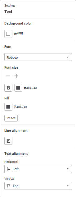
Set text parameters:
Font. Select one of the available fonts in the drop-down list.
Font Size. Set the required font size. Size is set in points, it can be entered manually or using the keyboard. buttons. The range of available values: [6; 36].
Font Color. Select font color in the drop-down palette. One can select standard and custom colors. The palette contains only standard colors by default.
To create a custom color:
Click the
 Add Color button. The advanced color palette opens.
Select a color in the advanced color palette, use color picker to select color on a browser page, or set color code in the RGB or HEX format.
After executing the operations the custom color is created and added to the palette.
To delete custom color from the palette, select the Delete item in the selected color's context menu.
NOTE. The maximum possible number of custom colors in the a palette is 23.
Font Style. Select font style in the button's drop-down menu:
B. Bold.
I. Italic.
U. Underline.
When the button is pressed, the corresponding font style is used. Several styles can be used simultaneously, for example, pressed B and I buttons result in bold italic font style.
Select one of the title text alignment options in the drop-down menu of the Position button:
 . Left.
 . Center.
 . Right.
 . By width.
After executing the operations, the specified title settings are applied for the selected visualizer or slide.
To hide the title, toggle the Show Title switch to inactive state in the Title group on the side panel.
To reset the determined settings and restore the default style, click the Reset button.
If title text is deleted, the default title is shown: [Visualizer type][Visualizer type number].
If a default title is set for the visualizer, a title corresponding to new visualizer type will be set on visualizer type change.
The example of visualizer with and without title:


Displaying in the title element selection by fixed and excluded dimensions located in the Filter area on the control panel is available for all visualizers, except for indicators.
To display filter values in visualizer title:
Select the Show Filter Values checkbox in the Title group on the side panel. The checkbox is deselected by default. When the checkbox is selected, visualizer title displays selection by fixed and excluded dimensions with non-empty and non-full selection. The maximum number of displayed rows for each fixed and excluded dimension is 4. Full text of dimension selection is displayed in a tooltip on mouseover on the title.
Set text parameters for displayed element selection:
Font. Select one of the available fonts in the drop-down list.
Font Size. Set the required font size. Size is set in points, it can be entered manually or using the keyboard. buttons. The range of available values: [6; 36].
Font Color. Select font color in the drop-down palette. One can select standard and custom colors. The palette contains only standard colors by default.
To create a custom color:
Click the
Add Color button. The advanced color palette opens.Select a color in the advanced color palette, use color picker to select color on a browser page, or set color code in the RGB or HEX format.
After executing the operations the custom color is created and added to the palette.
To delete custom color from the palette, select the Delete item in the selected color's context menu.
NOTE. The maximum possible number of custom colors in the a palette is 23.
Font Style. Select font style in the button's drop-down menu:
B. Bold.
I. Italic.
U. Underline.
When the button is pressed, the corresponding font style is used. Several styles can be used simultaneously, for example, pressed B and I buttons result in bold italic font style.
To reset the determined settings and restore the default style, click the Reset button.
Select the Shorten Values List checkbox to manage selection output format. The checkbox is selected by default.
When the checkbox is selected, the selection format is the following:
[dimension_name]: [name_of the first_selected_element]..[name_of the last_selected_element] (Selected [number _selected] of [total_elements])
When the checkbox is deselected, the selection format is the following:
[dimension_name]: [element 1], [element 2], [element 3] …
For a calendar dimension located in the Filter area, ranges of selected elements are displayed in the title.
After the element selection is changed using the Dimension Filter panel or visualizer synchronization, element selection in the title will be updated.
When the Show Filter Values checkbox is selected, visualizer export is executed as follows:
Full element selection by fixed and excluded dimensions will be exported to PDF and XLSX regardless of the status of the Shorten Values List checkbox.
Element selection by fixed and excluded dimensions will be exported to PNG according to the status of the Shorten Values List checkbox.
Set up visualizer synchronization on slide
The following synchronization options are available when working with visualizers:
Synchronization by Selection. It can be used to simultaneously manage selections of identical dimensions of several visualizers located on one or several slides.
Synchronization by Selected Data. It can be used to rebuild visualizers on the slide according to the selected data.
Sorting setup is available for all visualizer types, except for scatter charts, Sankey charts, maps, indicators, text, and images.
To show sorting settings, toggle the Use Sorting switch to active state in the Sorting group on the side panel. The Use Sorting switch is inactive by default, and sorting settings are not displayed.
Set up sorting:
Select sorting method:
Rows. Sorting is executed by rows.
Columns. Sorting is executed by columns.
Select row or column for sorting in the Sort Row or Sort Column drop-down list.
Select sorting type:
No Sorting. No sorting.
Descending. Descending sorting.
Ascending. Ascending sorting.
As a result, sorting is set up for the selected visualizer.
NOTE. When sorting settings are hidden, the configured sorting is kept.
To set up font color, select the required color in the drop-down color palette.
The default font color is #54575b in the HEX format.
The settings available for various visualizer types are given in the sections:
See also:
Adding Visualizers and Working with Them | Adding Slides and Working with Them | Synchronizing Visualizers on Slide