Tool interfaces in the web application and in the desktop application are identical, and differences in functionality are given in appropriate comments.
The visualizer is used to display data as a bubble chart.
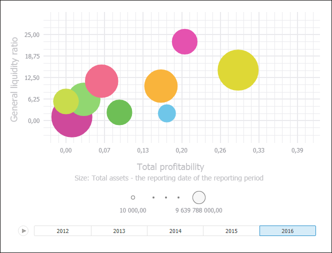
A bubble chart is a scatter chart, in which data points are replaced with bubbles. Bubble size is an additional data dimension.
IMPORTANT. Before getting started with the visualizer make sure that system requirements to client computer for the desktop application and to BI server for the web application. The web application supports work with visualizers if BI server is installed on Windows 10 or later. Visualizer appearance may differ depending on the graphic libraries in use (DirectX 11 or OpenGL 3.1).
Category axes and value axes match in a bubble chart. Horizontal and vertical axes are value axes.
In addition, in Foresight Analytics Platform, a bubble chart contains an animated timeline, which displays the frequency of values.
A bubble chart enables the user to display sets of four values:
The first value: by X axis.
The second value: by Y axis.
The third value: bubble size.
The fourth value: bubble color.
To insert the visualizer, select:
The Bubble Chart item in the drop-down list of the Visualizers button on the Home ribbon tab.
The Bubble Chart button in the Visualizers group on the Insert ribbon tab.
The Bubble Chart item in the drop-down menu of the New Block item in the dashboard's context menu.
Then set data source for a bubble chart and set up dimensions.
Example of the Bubble Chart visualizer:
All operations with objects described in the Building Dashboard and Inserting and Setting Up Visualizers sections are available for the Bubble Chart visualizer.
 Display side panel tabs to set up bubble chart
See also:
Inserting and Setting Up Visualizers
