 To display tabs
Axes are chart components that are used to organize data on a chart.
Headers of table rows and columns form a coordinate grid that enables the user to determine address of each cell. The similar function is executed with by the category axis (X) and the value axis (Y) on a chart. Category axes and value axes match on a bubble chart. Horizontal and vertical axes are value axes.
To set up chart axis parameters, use the X Axis and Y Axis side panel tabs. The sets of parameters match on both tabs.
Make sure that the side panel is displayed.
Select a bubble chart in the working area.
Select the Format radio button on the side panel and go to the X Axis or the Y Axis tab.

Determine the following settings for bubble chart axis on the tab:

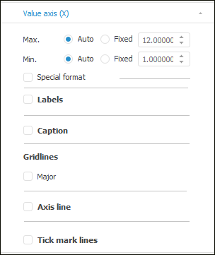
 Maximum and minimum axis value
Set minimum and maximum axis values by selecting one of the radio buttons:
Auto. Default value. Maximum or minimum value is calculated automatically based on the source data. To round value and automatically calculate intervals between major gridlines, select the Auto radio button during gridline setup.
Fixed. Set maximum or minimum value using the value editor or the keyboard.
To set up format of the data displayed in axes:
Select the Special Format checkbox in the desktop application, or go to the Number Format group of settings in the web application.
Select one of the supported data formats in the drop-down list:
General.
Number.
Currency.
Date.
Time.
Percentage.
Exponential.
Text.
Additional.
Custom.
For detailed description of number formats see the Setting Up Data Format section.
If it is required to display large values on the axis, they can be scaled. Therefore, they will take less space on the axis. Values are scaled according to the formula: X = A * B, where A is initial value, B - scale coefficient.
Select data scaling coefficient in the Scale drop-down list:
None. B = 1.
Hundreds. B = 0.01.
Thousands. B = 0.001.
Millions. B = 0.000001.
Billions. B = 0.000000001.
Trillions. B = 0.000000000001.
For example, the axis displays the values: 45000, 46000, and so on. After the Thousands scale is applied, the axis displays the following values: 45, 46, and so on.
To display tick mark labels, select the Labels checkbox. After this the labels font setup is available:
Font type. Use the drop-down list to select one of the fonts available in the operating system.
Size. Use the drop-down list to select font size or enter the custom size using the keyboard.
Font style. Click the buttons that determine font style:
B. Bold.
I. Italic.
U. Underlined.
When the button is pressed, the corresponding font style is used.
Font color. Select font color in the drop-down palette. To determine a new font color, click the Range button in the standard color palette and select the color in the extended color palette.
To show axis caption, select the Caption checkbox. Axis caption setup becomes available:
Special Text. To enter a special caption, select the checkbox and enter the text to display in the axis caption area.
NOTE. By default, a bubble chart axis caption matches the name of the element of the dimension, which is a metrics by the X and Y axes.
Font type. Use the drop-down list to select one of the fonts available in the operating system.
Size. Use the drop-down list to select font size or enter the custom size using the keyboard.
Font style. Click the buttons that determine font style:
B. Bold.
I. Italic.
U. Underlined.
When the button is pressed, the corresponding font style is used.
Font color. Select font color in the drop-down palette. To determine a new font color, click the Range button in the standard color palette and select the color in the extended color palette.
A gridline is a set of lines that are perpendicular to the axis. Major gridlines go from each major axis tick mark through the entire chart plot area, minor gridlines go from each minor tick mark.
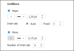
To display gridlines, select the Major checkbox:

After the checkbox is selected, major and minor gridline parameters can be set up. By default, minor gridlines are displayed with major ones. If required, deselect the Minor checkbox to hide minor gridlines.
To set up gridlines, set the parameters:
Color. In the drop-down palette select the color for major or minor gridlines or select a new color in the advanced color palette.
Type. In the drop-down list select the type of major or minor gridlines: solid, dotted, dashed, dash-dot, dash-dot-dot.
Width. Set width of major or minor gridlines.
NOTE. Line width can be set in different measurement units but the edit box always shows the value in points (1/72 inch).
Intervals. Set the number of intervals between major gridlines by selecting one of the radio buttons:
Auto. Default value. The number of intervals will be calculated automatically based on source data. To round values of the calculated intervals, select the Auto radio button during the setup of maximum and minimum axis values.
Fixed. Set the number of intervals using the value editor or the keyboard.
Number of Intervals. Set the number of intervals between minor gridlines using the value editor or the keyboard.
After executing the actions, the bubble chart displays major and minor gridlines according to the specified parameters.
Select the Axis Line checkbox to show axis lines.
After the checkbox is selected, it is available to set up axis line parameters: color and line width.
Select the Tick Mark Lines checkbox to show tick mark lines.
Major tick marks are perpendicular ticks on the axis line that contain labels; minor tick marks are ticks without labels located on the axis line between major tick marks.
After the checkbox is selected, it is available to set up tick mark line parameters: color and line width.
See also: