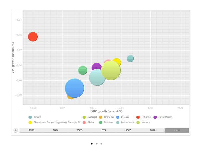
A bubble chart is a scatter chart, in which data points are replaced with bubbles.
To work with a bubble chart:
In the Analytical Queries (OLAP) tool tap the Bubble Chart button at the center of the page top panel.
In the Dashboards tool:
Tap the bubble chart title.
Go to the full-screen mode of blocks and select a block with the bubble chart.

To work with dimensions, use the Layout panel at the left page edge.
A bubble chart enables the user to display sets of four values, depending of the selected metrics:
The first value: by X axis.
The second value: by Y axis.
The third value: bubble size.
The fourth value: bubble color.
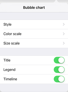
To set up bubble chart parameters, tap the  button at the top right corner of the express report or dashboard page.
After executing the operation, the Bubble Chart dialog box opens:

See also: