To set up layout for table, sidehead, and heading, use the Layout group of parameters on the settings panel.

Open the Layout group of parameters
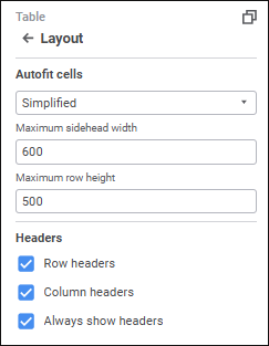
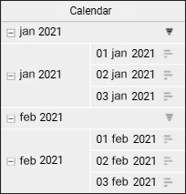
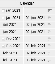
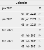
To open the Layout group of parameters on the parameters panel:
Select table element.
Press the
Settings button on the toolbar. The settings panel is hidden by default.
Select the required table element type in the drop-down menu of the settings panel title.
Layout options depend on the selected area type:


Set parameters for the Table element:
Select the mode for adjusting cell size in the drop-down list:
No. No autofit.
First by Width, Then by Height. Firstly, column size is autofit, then row size is autofit.
First by Height, Then by Width. Firstly, row size is autofit, then column size is autofit.
By Width Only. The minimum required width is set to show text of the longest cell in the table column.
By Height Only. The minimum required height is set to show text of the highest cell in the table row.
Automatically. Autofit is executed automatically according to the determined parameters:
Maximum Rows in Cell. When the switch is toggled to active state, column width is adjusted so that no more than N rows specified in the box will be required to show text of the longest row in the cell column. The default value - 8.
Minimum Columns. When the switch is toggled to active state, the table will always display the minimum N columns specified in the box. The default value - 1.
Simplified. Default value. Simultaneous autofit of width, height and visible data. Autofit is applied for 20 rows/columns from the beginning, middle and end of the table:
Maximum Sidehead Width. Set sidehead width. The default value - 600.
Maximum Row Height. Set row height. The default value - 500.
To show or hide sidehead or heading headers, use the checkboxes:
Row Headers. When the checkbox is selected, sidehead is displayed; when the checkbox is deselected, corner and sidehead are hidden.
Column Headers. When the checkbox is selected, heading is displayed; when the checkbox is deselected, corner and heading are hidden.
Always Show Headers. When the checkbox is selected, the sidehead or heading are displayed if there is no selection in heading/sidehead dimensions. When the checkbox is deselected, a cell with the No Data value is displayed instead of the table. Selection may be absent if the dimension is linked to parameter.
All checkboxes are selected by default.
Set parameters for the Sidehead and Heading elements:
To display dimension levels in different strings without repetition of parent elements in the sidehead/heading, select the Multilevel Sidehead or the Multilevel Heading checkbox.

Level elements to separate rows/columns
To arrange elements of different levels in different columns or rows, select the Level Elements to Separate Columns /Rows checkbox.
NOTE. Arranging elements of different levels in different columns/rows depends on the use of multilevel sidehead/heading. When the Multilevel Sidehead/Multilevel Heading checkbox is selected or deselected, the Level Elements to Separate Columns/Level Elements to Separate Rows checkbox is automatically selected or deselected. When the Multilevel Sidehead/Multilevel Heading checkbox is deselected, one can select manually the Level Elements to Separate Columns/Level Elements to Separate Rows checkbox.
The figure shows the source table sidehead (left) and the table sidehead after arranging elements of different levels in different columns (right):

To show or hide duplicate cells in the data table, select or deselect the Show Duplicate Cells checkbox. Duplicate cells are shown by default. If the checkbox is deselected, level name is displayed in a separate row before level elements and in a merged cell opposite to level elements.
When the Merge checkbox is selected, duplicate elements will be shown only for the first cell of the level; when the checkbox is deselected, elements will be repeated for each level element.
The table where the Level Elements to Separate Columns and Show Duplicate Cells checkboxes are selected is shown on the left, the table with the Level Elements to Separate Columns, Show Duplicate Cells and Merge checkboxes are selected on the right:

To set up displaying and calculation of totals:
Select the Totals checkbox. Default totals or the last configured totals are applied.
Click the
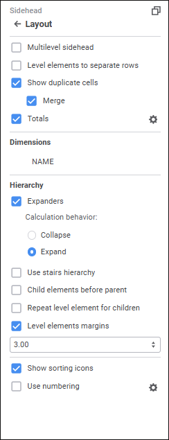
Settings button next to the Totals checkbox, and the Row Totals/Column Totals
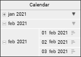
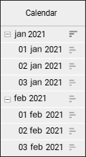
 group of parameters is displayed.
To show or hide totals for this dimension, select or deselect the Show Total checkbox in the dimension's context menu in the Layout group of parameters on the settings panel.
To show or hide totals for this dimension, select or deselect the Show Total checkbox in the dimension's context menu in the Layout group of parameters. The checkbox is selected by default. The checkbox is available if the Totals checkbox is selected.
To make the table look more compact, use context menu items of the selected dimension in the Dimensions area:
Merge with Previous. It is available if table sidehead or heading contains several dimensions.
Tuck Elements. It is available only for merged dimensions of table sidehead or heading.
Set Up. It is available on setting up element tucking.
To set up displaying of the hierarchy, select or deselect the checkboxes:
Expanders. The checkbox is selected by default. Show or hide expanders for parent elements of hierarchy.
To determine expander behavior on report refresh, select one of the radio buttons:
Collapse. Dimension hierarchy is collapsed on report refresh.
Expand. Default value. Dimension hierarchy is expanded on report refresh.
The example of a table with expanders:

When expanders are hidden, all collapsed child elements will be expanded in the table:

Use Stairs Hierarchy. The checkbox is deselected by default. If several dimensions are located by columns or rows, it is recommended to use stairs hierarchy to separate dimension elements in the sidehead or heading.
The example of a table without stairs hierarchy:

The example of a table with stairs hierarchy:

Child Elements before Parent. The checkbox is deselected by default. Place child elements before parent ones:

Repeat Level Element for Children. The checkbox is deselected by default. Place parent elements before and after children:

Level Element Paddings. Padding for child element names. The checkbox is selected by default, and the padding 3 mm is set. To change the padding, select its size or enter it in the value editor.
The table below shows the margin 15 millimeters and child elements are displayed before the parent ones:

To show sorting icons in rows and/or columns, select the Show Sorting Icons checkbox for heading and sidehead. After the checkboxes are selected, sorting icons
/
are displayed in row/column headers. The checkboxes are selected by default. When any of the icons is consequently pressed, its view is changed, therefore the sorting type is changed:
. Descending sorting (for text values - from Z to A).
. Ascending sorting (for text values - from A to Z).
Sorting by rows only is available for the Sidehead area type, and sorting by column only is available for the Heading area type.
NOTE. If there are several dimensions in the heading or sidehead, sorting is applied only to the bottommost or rightmost heading or sidehead level.
To set up numbering:
Select the Use Numbering checkbox. The default numbering or the last configured numbering will be applied.
Click the
Settings button next to the checkbox name. The Set Up Numbering dialog box opens.
The checkbox is deselected by default, and numbering is not used.
See also:
Setting Up Data Visualization | Setting Up the Table Visualizer