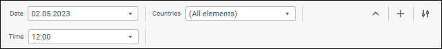
A control is an object that is used to manage data, shown data entry form objects, and it enables the user to change data entry form parameters.
To set up controls, use the Controls panel.
Operations with the Controls panel:

Show or hide the Controls panel
To show the Controls panel, click the
Controls button on the Home toolbar tab.
To hide the Controls panel:
Release the
Controls button on the Home toolbar tab.
Select the Close item in the drop-down menu of the
Panel Position button on the Controls panel.
Click the
Close button if it is located at the top below the toolbar.
Panel display options are saved when data entry form is saved.
To change position of the Controls panel, select the option in the drop-down menu of the
Panel Position button. Available methods:
Top. The panel is displayed at the top below the toolbar:

If controls do not fit the Controls panel when the panel is positioned at the top, the panel is expanded by default:

To collapse the panel, click the
Collapse button:

To display the panel as expanded again, click the
Expand button.
Left. The panel is displayed at the left as a side panel:

The selected panel position is saved when data entry form is saved.
Controls can be set up on data entry form editing and include the following operations:
To add a control, click the
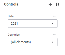
Add Control button on the Controls panel. The parameter editor window opens.
To edit control properties, select the
Edit item in the control's context menu on the Controls panel. The parameter editor window opens.
To reorder controls, on the Controls panel drag the control to the required position.
Controls can be resized only if the Controls panel is positioned at the top.
To change width of a control, drag its right border in the required direction on the Controls panel.

Manage displaying of hidden controls
A control is considered as hidden if the displayed sheet is not determined in control's settings.
To manage displaying of hidden controls, select the Show Hidden checkbox in the drop-down menu of the
Panel Position button on the Controls panel.
If the Show Hidden checkbox is selected, the Controls panel will display the hidden controls, which names will be highlighted in grey.
To delete a control, select the
Delete item in the control's context menu on the Controls panel. The control will be deleted from the panel.
Controls can be used to execute the following operations, including on opening a data entry form for view:

Set up dimension element selection
To set up dimension selection, execute one of the operations:
Use the mouse to select or deselect the element.
Select the required selection option in the dimension element's context menu:
Select All. It selects all dimension elements.
Deselect All. It deselects all dimension elements.
Edit Selection. It sets selection by criterion.
Select Descendants by Level. It selects all elements on the same level with the specified dimension element.
Select All Descendants. It selects all descendant elements.
Deselect Descendants. It deselects all descendant elements.
Select Level. It selects dimension level.
Deselect Level. It deselects dimension level.
Apply Selection Schema. It sets the selected selection schema in the drop-down list.
Select Group. It selects the selected groups of elements of dimension in the drop-down list.
One can use the following commands for the dimensions without hierarchy: Select All, Deselect All, Edit Selection, Apply Selection Schema, and Select Group.
NOTE. One can select selection schema and group of elements if selection schema, groups of elements are set up in dictionaries.
To change selection by selection criterion, select the Edit Selection item in the element's context menu.
The Edit Selection dialog box opens:

The selection area for the calendar dimension is named Select Elements by Attribute.
To edit selection by selection criterion:
Select the attribute or level, for which criterion will be set. The default attribute is that is set as name. The calendar dimension is set to display the highest level by default, excluding the root level.
Select radio button of the required attribute to determine criterion type. The available criterion type depends on the selected attribute type:
By Text. It is available for string attribute type. In the search box enter the text containing attribute values of elements to be selected: One can search by the following substitutions:
%. It can be used with any character sequence.
_. It can be used with any single character.
Select the Match Case checkbox to make search case sensitive.
Select the Match Whole Word checkbox to search words that match exactly the entered text.
Equal.
Not Equal.
Greater Than. It is available for the types: Date and Time, Integer, Real, Date.
Greater or Equal. It is available for the types: Date and Time, Integer, Real, Date.
Less Than. It is available for the types: Date and Time, Integer, Real, Date.
Less Than or Equal. It is available for the types: Date and Time, Integer, Real, Date.
Between. It is available for the types: Date and Time, Integer, Real, Date.
Enter a value in the box or set a value range if the Between condition type is selected. Value editor will depend on attribute type. When logical type is selected, one can select between true and false.
By List. It is available for the String and Integer attribute types. Enter a list of attribute values in the box. The list can be copied from clipboard. Elements are searched taking into account case and full match with the entered text.
Click the Check button to selected the elements matching the search criterion in the dimension element display area. To display only selected elements, toggle the Show Only Selected switch to active state. If only child elements are selected, they will be displayed with parent elements.
Click the Apply button to apply the new selection.

Expand/collapse hierarchy of list of dimension elements
To expand or collapse hierarchy of a dimension elements list, select the Expand All or Collapse All item in the element's context menu.
To search for a dimension element, enter the searched text in the
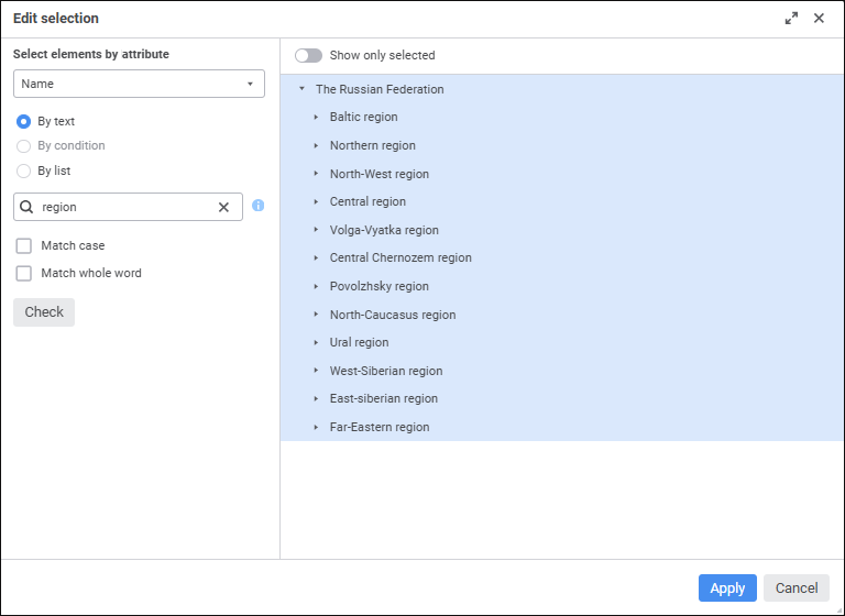
Search string in the dimension element's drop-down list. Search is executed automatically as the searched text is entered in the search string. The elements containing the specified substring are displayed as a list with their parent and child elements.
To reset search results, click the
Clear button.
See also:
Setting Up Data Entry Form Parameters | Using Interactive Selection Controls