Menu item structure in the navigation bar can be set up on the Navigation Structure page in the business application creation wizard.
To open the business application creation wizard, select the ready business application in the object navigator and opens it for edit:
Select the Edit item in the business application's context menu
Select the Edit in a New Tab item in the business application's context menu
Select the Edit in a New Window item in the business application's context menu
Press F4.


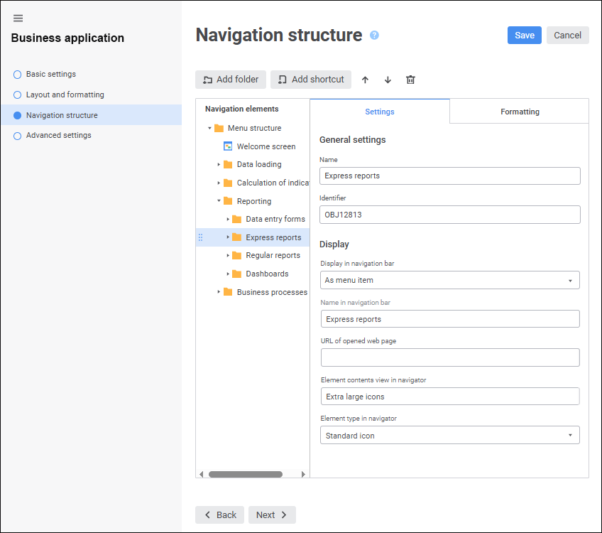
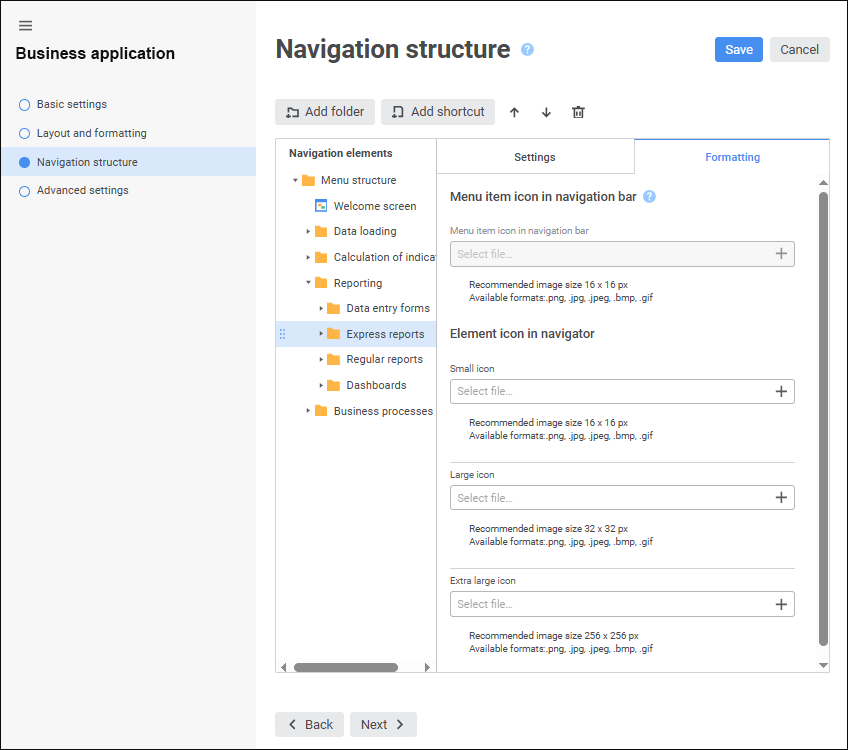
The Navigation Elements area contains the hierarchy of menu items that will be displayed on the navigation bar. Menu items are folders and object shortcuts contained in the internal structure of business application. The Settings tab contains basic properties and element display options. The Formatting tab can be used to set up element formatting: load icon of the menu item displayed on the navigation bar and load custom element images displayed in the business application object navigator.
Create a navigation structure:
To add a folder to navigation structure:
Select the Menu Structure root folder or the child element, to which a folder will be added.
Click the Add Folder button.
After executing the operations a folder is added to navigation structure.
NOTE. The hierarchy of child elements can be of any nesting level but the navigation bar displays only two-level structure.
To add an object shortcut to navigation structure:
Select the Menu Structure root folder or the child element, to which a shortcut will be added.
Click the Add Shortcut button. The Select Object dialog box opens:

To search for an object:
Change object display option in the drop-down menu of the
Object Displaying button if required:
Name. Default value. Only object names are displayed.
Identifier. Only object identifiers are displayed.
Name and Identifier. Object names and identifiers are displayed.
Start typing object name or identifier in the search string, depending on the selected object display option.
Select the object in the internal structure of business application.
Click the Apply button.
After executing the operations an object shortcut is added to navigation structure.
To reorder elements in navigation structure, select the element and execute one of the operations:
Click the
Up button to move the element one position up.
Click the
Down button to move the element one position down.
Elements can also be reordered by dragging to the required position.

Set up element basic properties
To set up basic properties of the selected element, change the parameters on the Settings tab:
Name. When a folder is added, it has the default name. When an object shortcut is added, element name matches with object name.
Identifier. It is created automatically on adding a folder or an object shortcut. An identifier may include only Latin letters, digits, underscore character and should not start with numbers.
NOTE. Element settings in the menu structure are linked to object identifiers. It is recommended to change object identifier in the menu structure in the business application editing wizard to save the determined settings. When object identifier of the menu structure is changed outside the business application editing wizard, the determined settings are reset to default element settings.
To set up displaying of the selected element, set the parameters:
Display in Navigation Bar. In the drop-down list select display option for the element of the first or the second level of the navigation structure:
Do not Show. Default value. It is displayed only in the business application object navigator. When this option is selected, the Element Type in Navigator parameter is available.
NOTE. If the folder contains an object, that is set for a custom button in the data entry form, then on its opening using the custom button, the navigation bar and navigation menu will not be displayed. For details see the Features of Displaying Elements subsection.
As Menu Group. It is displayed in the navigation bar as a menu group containing child elements. A menu group can be collapsed or expanded in the navigation bar. When this option is selected, the Name in Navigation Bar and the URL of Opened Web Page parameters are available.
NOTE. The parameter is available only for the first-level element.
As Menu Item. It is displayed on the navigation bar as a menu item contained in the group or navigation structure root. If the menu item is a folder, it can contain child elements. When this option is selected, the Name in Navigation Bar, the URL of Opened Web Page, and the Element Contents View in Navigator parameters are available.
Name in Navigation Bar. Set an alternative name for the element of the first or the second nesting level displayed only in the web application. Alternative name can be used if element has long name and its name cannot be fully displayed in the navigation bar, and for translation of element name in different languages.
NOTE. The parameter is available if the As Menu Group or As Menu Item element display option is selected.
URL of Opened Web Page. Specify URL of the web page that will open in a new window on clicking the element of the first or the second level of the navigation structure.
The example of web page URL:
https://help.fsight.ru/en/help.htm
NOTE. The parameter is available if the As Menu Group or As Menu Item element display option is selected.
Element Contents View in Navigator. In the drop-down list select the element contents view in the business application object navigator:
Large Icons.
Small Icons.
List.
Table.
Extra Large Icons. Default value.
NOTE. The parameter is available if the As Element Item display option is selected.
Element Type in Navigator. In the drop-down list select element type in the business application object navigator:
Standard Icon. Default value. It depends on object type.
Preview. Object contents preview is displayed for the object created using the Dashboards, Analytical Queries (OLAP), Reports and Information Panels tools if the Extra Large Icons object display option is set in the object navigator.
NOTE. To display element preview in the business application object navigator, make sure that the Allow Displaying of Objects as Icons Without Taking Into Account Object Access Permissions checkbox is selected in the security manager.
Custom Icon. Element images are displayed that were loaded on the Formatting tab on the Menu Structure page.
NOTE. The parameter is available only for the second-level element.
To set up formatting of the selected element, set the parameters on the Formatting tab:
Menu Item Icon in Navigation Panel. Load icon of the element of the first or the second level of navigation structure, which will be displayed on the navigation bar, using the
Select File button. Allowed icon size: 16*16 pixels. Available formats: SVG, PNG, JPG, JPEG, BMP, GIF.
If a custom icon is not loaded for the element, a default icon
will be displayed.
NOTE. To display icons of the elements located only on the first level of navigation structure, select the Disable Displaying of Second-Level Hierarchy Icons checkbox.
To reset the loaded icon, click the
Delete button.
NOTE. The parameter is available if the Show Icons in Navigation Bar checkbox on the Layout and Formatting page.
Element Icon in Navigator. Load the images that will be displayed for element depending on object display mode in the business application object navigator, using the
Select File button. Available formats: PNG, JPG, JPEG, BMP, GIF.
Small Icon. Recommended image size: 16*16 pixels.
Large Icon. Recommended image size: 32*32 pixels.
Extra Large Icon. Recommended image size: 256*256 pixels.
Predefined images are used by default.
To reset the loaded image, click the
Delete button.
NOTE. The parameter is available if the Custom Icon navigator element type is selected on the Settings tab. If the element type changes for Standard Icon or Preview, the loaded images are reset.
If the image used as an element icon in the navigator was loaded in the designer of business application in the desktop application, it will be displayed in the business application creation wizard in the web application. Otherwise, the image that was loaded in the web application will not be displayed in the designer of business application in the desktop application.
To delete the selected element, click the
Delete button. After the operation is confirmed, the element will be deleted.
To save the determined settings, click the Save button.
After setting up navigation structure select start object and event handler.
See also:
Building Business Application in the Web Application | Selecting Start Object and Event Handler