 Open the designer
Menu structure can be set up on the navigation bar on the Menu Structure page in the designer of business application.
Click the  Edit button in the Open group on the Home ribbon tab.
Select the Edit item in the business application's context menu.
Press F4.
The left part of the page contains the hierarchy of menu items that will be displayed on the navigation bar. Menu items are folders and object shortcuts contained in the internal structure of business application.
Create a menu structure:
To add a folder to the menu structure:
Select the Menu Structure root folder or the child element, to which a folder will be added.
Click the Create > Add Menu Item button.
After executing the operations a folder is added to the menu structure.
NOTE. The child elements hierarchy can be of any nesting level, but the navigation bar displays only two-level hierarchical structure.
To add a shortcut to object to menu structure, execute the operations in the object navigator:
Open business application for view.
Select the Menu Structure folder and create an object shortcut contained in the internal structure if business application in the root folder and child folders:
Click the New Object > Shortcut button in the Create group on the Home ribbon tab.
Select the Create > Shortcut item in the object navigator's context menu.
After executing the operations an object shortcut is added to the menu structure.
To reorder folders in the menu structure, select the folder and execute one of the operations:
Click the  Up button to move the folder one position up.
Click the  Down button to move the folder one position down.
One can also reorder folders by dragging them to the required position.
 Set up element basic properties
To set up basic properties of the selected element, change parameters if required:
Name. When a folder is added, it has the default name. When an object shortcut is added, element name matches with object name.
Identifier. It is created automatically on adding a folder or an object shortcut. An identifier may include only Latin letters, digits, underscore character and should not start with numbers.
NOTE. Element settings in the menu structure are linked to object identifiers. It is recommended to change object identifier in the menu structure in the business application editing wizard to save the determined settings. When object identifier of the menu structure is changed outside the business application editing wizard, the determined settings are reset to default element settings.
To set up displaying of the selected element, set the parameters:
Name in Navigation Bar. Set an alternative name for the element of the first or the second nesting level displayed only in the web application. Alternative name can be used if element has long name and its name cannot be fully displayed in the navigation bar, and for translation of element name in different languages.
NOTE. The parameter is available if the As Menu Group or As Menu Item element display option is selected.
URL of Opened Web Page. Specify URL of the web page that will open in a new window on clicking the element of the first or the second level of the navigation structure.
The example of web page URL:
https://help.fsight.ru/en/help.htm
NOTE. The parameter is available if the As Menu Group or As Menu Item element display option is selected.
Display in Navigation Bar. Select display option for the element of the first or the second level of the navigation structure:
Do not Show. Default value. It is displayed only in the business application object navigator. When this option is selected, the Element Type in Navigator parameter is available.
NOTE. If the folder contains an object, that is set for a custom button in the data entry form, then on its opening using the custom button, the navigation bar and navigation menu will not be displayed. For details see the Features of Displaying Elements subsection.
As Menu Group. It is displayed in the navigation bar as a menu group containing child elements. A menu group can be collapsed or expanded in the navigation bar. When this option is selected, the Name in Navigation Bar and the URL of Opened Web Page parameters are available.
NOTE. The parameter is available only for the first-level element.
As Menu Item. It is displayed on the navigation bar as a menu item contained in the group or navigation structure root. If the menu item is a folder, it can contain child elements. When this option is selected, the Name in Navigation Bar, the URL of Opened Web Page, and the Element Contents View in Navigator parameters are available.
Element Contents View in Navigator. Select the element contents view in the business application object navigator:
Small Icons.
Large Icons.
Extra Large Icons. Default value.
List.
Table.
NOTE. The parameter is available if the As Element Item display option is selected.
Element Type in Navigator. Select element type in the business application object navigator:
Standard Icon. Default value. It depends on object type.
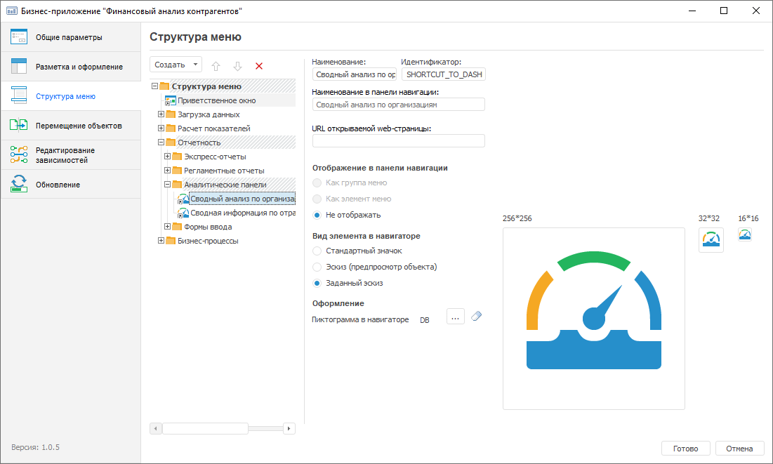
Thumbnail (object preview). Object contents preview is displayed for the object created using the Dashboards, Analytical Queries (OLAP), Reports and Information Panels tools if the Extra Large Icons object display option is set in the business application object navigator.
NOTE. To display element preview in the business application object navigator, make sure that the Allow Displaying of Objects as Icons without Taking into Account Object Access Permissions checkbox is selected in the security manager.
Specified Thumbnail. A custom element thumbnail loaded in the Formatting section is displayed in the business application object navigator.
NOTE. The parameter is available if the Do not Show element display option is selected.
Custom icon loading is available in the Formatting section for an element of the first or the second level if the As Menu Group or As Menu Item element display option is selected, and the Show icons in navigation bar checkbox is selected on the Layout and Formatting page. The second-level element icon depends on the state of the Disable Displaying of Second-Level Hierarchy Icons checkbox on the Layout and Formatting page.
To load a custom element icon:
Click the Select button. The standard file selection dialog box opens.
Select an icon with 16*16 pixels size in the format: PNG, JPEG, BMP, GIF, or SVG.
After executing the operations the custom element icon is loaded.
If a custom icon is not loaded for the element, a default icon will be displayed:
In the business application 10.x for elements of the first and the second levels -  .
.
In the business application 9.x:
For first-level elements -  .
.
For second-level elements -  .
.
To reset the loaded icon, click the  Clear button.
Custom element thumbnail loading is available in the Formatting section if the Do not Show element display option is selected, and the Specified Thumbnail element type is used. A thumbnail is displayed as element icons in the business application object navigator. Predefined thumbnails are used by default.
To load a custom element thumbnail or edit the predefined element thumbnail:
Click the  Select button. The Select Thumbnail dialog box opens:
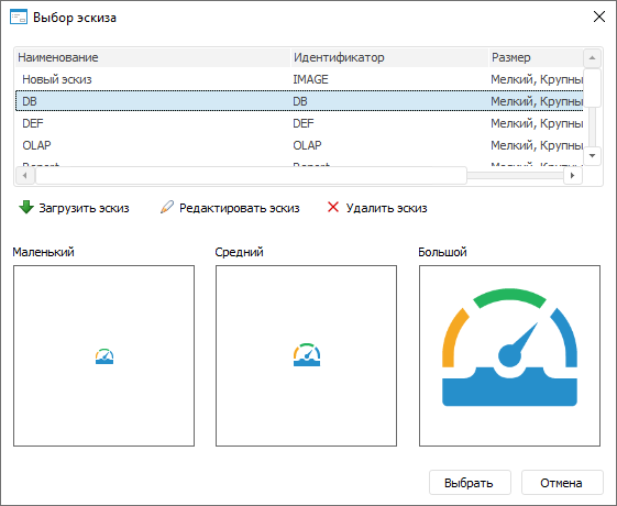
Load the new or edit the predefined thumbnail in the list:
To load a new thumbnail, click the  Load Thumbnail button. The Load/Edit Thumbnail dialog box opens:
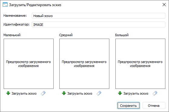
Set new thumbnail parameters:
Name. Enter thumbnail name.
Identifier. Enter thumbnail identifier.
Load the image with required size using the Load Thumbnail button:
Small. 16*16 pixels.
Medium. 32*32 pixels.
Large. 256*256 pixels.
NOTE. If the size of loaded images differs from the specified one, it will be automatically modified to the required one.
To remove the loaded image, click the Clear button.
To save the thumbnail, click the Save button.
To edit the predefined thumbnail, click the  Edit Thumbnail button and edit the image in the Load/Edit Thumbnail dialog box that opens.
To delete the thumbnail, click the  Delete Thumbnail button.
Click the Select button.
After executing the operations, the loaded or predefined element thumbnail is displayed in the business application object navigator.
If the image used as a thumbnail, was loaded in the designer of business application in the desktop application, it will be displayed in the business application creation wizard in the web application. Otherwise, the image that was loaded in the web application will not be displayed in the designer of business application in the desktop application.
To delete the selected element, click the Delete button. After the operation is confirmed, the element will be deleted.
To save the specified settings, click the Finish button. After the button is clicked, the designer closes.
After setting up menu structure edit dependencies of business application objects from used extensions of Foresight Analytics Platform.
See also:
Building Business Application in the Desktop Application | Editing Dependencies