Value editors are used to conveniently enter or select values of:
Visualizers' parameters in a dashboard.
Data source parameters of express report.
Parameters and of regular report.
Parameters and of information panel.
The Value Editor Parameters dialog box:
NOTE. The set of displayed parameters depends on the selected editor type.
Lists and trees:
The hierarchical list displays a set of possible values as a hierarchical list (or tree).
Set editor parameters:
Default Value. Set default value. This value must be included in a set of values specified in the list of available values.
Available Values. This box is used to create a tree of available values:
To add a node, select the Add Node item in the drop-down menu of the Add button. In the added box enter node name.
The node is added to the first level if this is the first added element, or to the same level with the selected element.
To add a child element of the selected element, select the Add Subelement item in the drop-down menu of the Add button. In the added box enter element name.
To rename the element in the web application, select
the Rename item in the drop-down menu of the  Settings button.
To delete the selected element, select the  Delete button or
select the Delete item in the drop-down menu of the Settings button.
Delete button or
select the Delete item in the drop-down menu of the Settings button.
To delete all tree elements in the desktop application, click the Clear button.
The list allows for selecting a value from the previously determined list of values.
Set editor parameters:
Default Value. Set default value. This value must be included in a set of values specified in the list of available values.
Allow Edit. If the checkbox is selected, the value that is absent in the drop-down list can be entered into the editor box.
Available Values. This box is used to create a list of predefined values:
To add a value, click the
 Add button. In the displayed box enter
a value.
Add button. In the displayed box enter
a value.
To rename the element in
the web application, select the Rename item in the drop-down
menu of the Settings button.
To delete the selected element,
select the Delete button or select the
Delete item in the drop-down menu of the
Settings button.
To delete all list elements in the desktop application, click the Clear button.
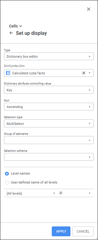
The dictionary box editor shows and sets values using a drop-down list with dictionary elements.
Set editor parameters:
Dictionary. Use the drop-down list to select a dictionary, which elements are displayed in the editor.
Display as Range Calendar. Select the checkbox if it is required to connect a calendar with a configurable date range. The checkbox is available if a calendar dictionary is selected as a dictionary, and the MultiSelect or MultiSelectStandart option is selected.
Dictionary Attribute Controlling Value. Use the drop-down list select a dictionary attribute that is used to transfer a value to parameter. For example, the dictionary displays element names, and parameter takes integer values. In this case the parameter will definitely need to take values of the Identifier attribute. The Identifier(ID) attribute is used by default.
The selected attribute should have a unique index. It is required to restore selection:
In regular report controls that use dictionary box editor to control parameter values.
In dictionary parameter box editor if a dictionary is refreshed in the view mode.
Otherwise, selection will not be restored.
Sort. In the drop-down list select sorting by name for dictionary elements:
<None>. Dictionary elements are not sorted.
Ascending. Dictionary elements are sorted in ascending and alphabetical order or by text values of numbers.
Descending. Dictionary elements are sorted in descending and alphabetical order or by text values of numbers.
Dictionary Structure and Selection. The Dictionary Structure and Selection group of parameters cannot be set if a controlled dimension was set during control setup. Set a group of elements, selection schema and selection method of the dictionary:
Group of Elements. Select a group of dictionary elements in the drop-down list. The list includes groups of elements created for the current dictionary.
Selection Schema. Use the drop-down list to select the dictionary selection schema. The list includes selection schemas created for the current dictionary.
Selection Type. In the drop-down list select the type of dictionary elements' selection:
SingleSelect. Single selection: only one element can be selected.
SingleSelectNullable. Single selection with the ability to set empty value.
MultiSelect. Multiple selection.
To invert element selection, click it.
Clicking the element while holding down the SHIFT key deselects all elements and selects elements (except for the collapsed ones), positioned between the focused element and the clicked one.
Clicking while holding down the CTRL key selects or deselects the element and all dependent elements. When the context menu is opened in the element area, the element is focused but not selected.
MultiSelectStandart. Multiple selection. Clicking an element selects only selected element.
To select multiple elements, hold down the SHIFT or CTRL keys while clicking elements.
Clicking the element while holding down the SHIFT key deselects all elements and selects elements (except for the collapsed ones), positioned between the focused element and the clicked one.
Clicking with holding down the CTRL key selects or deselects the element.
None. If the selection type is not specified, the MultiSelect selection is used by default.
Multiple Selection. The parameter is available in the desktop application only for calendar dictionaries, for which the MultiSelect, MultiSelectStandart or None selection type is set. Select multiple selection type in the drop-down list:
Elements Only. Default value. Multiple selection is set only for dictionary elements.
Levels Only. Multiple selection is set only for dictionary levels.
Elements and Levels. Multiple selection is set for dictionary elements and levels.
Level Names. Set names for levels in the drop-down list. Select radio button to show dictionary attributes or custom name:
To display dictionary attributes that will be used on creating level names, specify:
Level. In the drop-down list select the level, for which name is set up.
Name. In the drop-down list select the attribute that determines name.
The name specified for the [all] element of the Level field is applied to all levels except for those, which got a special name.
NOTE. The Name attribute is used by default for all levels.
To show custom level names, determine:
Custom name of all levels. In the field determine the name that will be displayed for all levels in the drop-down list. If multi-user name is set, displaying of parameters cannot be set up.
Insert Attribute. In the drop-down list select the attribute that will be added to name.
Edit boxes:
The string editor displays and sets text value in a one-line edit box.
Set editor parameters:
Default Value. Determine the editor value to be displayed by default. A string may contain up to 2 Gb of data. String text is specified without quotation marks.
Maximum Length. Set the maximum number of characters that can be entered into the editor box.
Read Only. If the checkbox is selected, the value cannot be edited.
The masked string editor limits the range of characters that can be entered and determines format (or template) of the entered value. This editor type can be used to enter phone numbers, postal and other codes, identifiers, and so on.
An input mask enables the user to insert numbers, letters, or other characters automatically, such as when you want parentheses around the zip code or a hyphen inside the telephone number.
Set editor parameters:
Default Value. Set default value. A string may contain up to 2 Gb of data corresponding to mask. String text is specified without quotation marks.
Maximum Length. Select the number of characters that can be entered into the editor box.
Mask. Set a mask for edit box. A mask should include characters that determine entering a character into selected position, and it may also include automatically displayed text. To include text constants, characters and spaces into a mask, enter them into the required position:
| Mask symbol | Description |
| a/A | Letters and numbers are allowed to be inserted into this position. |
| d/D | Only numbers are allowed to be inserted into this position. |
| c/C | Only letters are allowed to be inserted into this position. |
For example, the Series AACCDD mask allows (but does not require from the user) for six characters to be entered. The first two symbols may be any letter or number; the second two symbols are letters only, and the third two symbols are numbers only. The Series text is also automatically displayed.
Input Template. Determine the template, based on which data should be entered into the editor. A template should include underscore characters (_) in positions, to which various characters are entered, and text constants if there are any in the mask.
Allowed Symbols. Determine the set of characters that can be entered into the edit box. For example, if "AK23" is set:
Only numbers 2 or 3 are allowed to be inserted into the positions allowing to enter numbers.
Only letters A or K are allowed to be inserted into the positions allowing to enter letters.
Only digits 2 or 3 and letters A or K are allowed to be inserted into the positions allowing to enter digits and letters.
The decimal editor determines decimal type values using an edit box with scroll buttons.
Set editor parameters:
Default Value. Determine the editor value to be displayed by default. This value must be in the range of available values determined for the editor. If the range of available values for the slider is not set, the value must be in the range [-179228162514264337593543950335; 179228162514264337593543950335].
Minimum Value. Determine minimum allowed value.
Maximum Value. Determine maximum allowed value.
Value can be Empty. When the checkbox is selected, one can enter an empty value in the box.
The editor displays and sets identifier values.
Set editor parameters:
Value can be Empty. The checkbox is deselected by default. If the checkbox is selected, identifier value can be empty.
When creating identifiers, follow the rules:
Identifier should consist of only Latin letters, numbers and underline character.
The first symbol should be letter or underline symbol.
Lower-case and upper-case letters are considered as equal.
Maximum length of identifier is 255 characters.
The integer editor enables the user to determine integer values using edit box with scroll buttons.
Set editor parameters:
Default Value. Determine the editor value to be displayed by default. This value must be in the range of available values determined for the editor. If the range of available values for the editor is not set, the value must be in the range [-2147483648; 2147483647].
Minimum Value. Determine minimum allowed value.
Maximum Value. Determine maximum allowed value.
Value can be Empty. When the checkbox is selected, one can enter an empty value in the box.
Logical values:
A radio button (or checkbox) sets the logical value: if the checkbox is selected, the value is True, if it is deselected, the value is False.
Set editor parameters:
Label Caption. Determine checkbox label caption.
Default Value. Determine the checkbox default state: selected (True), or deselected (False).
Like a radio button, the Boolean values editor has only two positions: True and False, but the position is selected in a drop-down list.
Set editor parameters:
Default Value. Select the default value in a drop-down list: True or False. If the value is not specified, a default value False is displayed in the box.
Date and time:
The time editor displays and sets time values.
Set editor parameters:
Default Value. Determine the time value that is displayed in the editor by default. This value must be in the range of available values determined for the editor. If the range of available values for editor is not set, the value must be in the range from 0:00 to 23:59.
Minimum Value. Determine minimum allowed time value.
Maximum Value. Determine maximum allowed time value.
The date editor displays and sets date values.
Set editor parameters:
Default Value. Determine the date to be displayed in the editor by default. This value must be in the range of available values determined for the editor. If the range of available values for editor is not set, the value must be in the range from 01.01.1600 to 31.12.3000.
Minimum Value. Determine minimum allowed date.
Maximum Value. Determine maximum allowed date.
Show Drop-Down Calendar. When the checkbox is selected, the value editor displays calendar opening button to select a date.
The date and time editor in the web application or the date/time editor in the desktop application combines functions of date editor and time editor with all their parameters.
Set editor parameters:
Default Value. Determine the time and date value to be displayed in the editor by default. This value must be in the range of available values determined for the editor. If the range of available values for editor is not set, the value must be in the range from 01.01.1600 00:00 to 31.12.3000 23:59.
Minimum Value. Determine minimum allowed date and time value.
Maximum Value. Determine maximum allowed date and time value.
Show Drop-Down Calendar. When the checkbox is selected, the value editor displays calendar opening button to select a date.
If value editor is used to set up values of object parameters, take into account the following features:
The last values, which were entered to the editor by user, are automatically saved to the registry. On the next using of editor, saved values are displayed.
If default value is set for the editor and there is a value saved to the registry, saved value is displayed on opening the editor.
The Editor Example string can be used to preview the selected parameters. Consider the following when working with this element:
On opening the dialog box or on clicking the Refresh button, the editor refreshes to the state specified in the dialog box.
The editor is an example for check and is not used to set some value.
If a minimum and maximum values are set, the Editor Example string is locked for setting values below the minimum and over the maximum values.
Default values specified for the following editor types are substituted only after cell activation: Hierarchical List, List, Checkbox Editor, Masked String Editor, Slider for Real Values, Slider for Decimal Values, Slider for Integer Values, Decimal Editor, Boolean Values Editor.
Depending on the control type the selected value is applied differently.

 Controls that
enable the user to enter values using the keyboard
Controls that
enable the user to enter values using the keyboard
The specified value is applied on:
Focus loss.
Pressing the ENTER key.
For controls
that contain buttons that are used to change values
The value changes on:
Clicking this button.
Using the PAGE UP and PAGE DOWN keys.
Scrolling the mouse wheel.
The selected value in the controls that contain buttons that are used to change values is applied with:
The delay of 0.555 seconds, on changing the value by means of one of the mentioned actions.
NOTE. If the SHIFT key is pressed, value is not applied. To apply the value, release the SHIFT key, in this case the value is applied without delay.
On losing the focus, if the event occurred earlier than the delay time.
On pressing the ENTER key, if the event occurred earlier than the delay time.
The value changes on:
Navigating the elements by means of the PAGE UP, PAGE DOWN keys and on pressing the SPACE key.
Selecting elements with the mouse.
The value for controls with drop-down lists is applied on collapsing the drop-down area. The area is collapsed on:
Pressing the ENTER key.
Clicking outside the component.
Selecting elements with the mouse in the single selection mode. The area is collapsed in the multiple selection mode on:
Pressing the ENTER key.
Clicking outside the component.
Controls/Parameters
with expandable lists when calendar dictionary is used
Calendars with a configurable data range are available only when the following conditions are satisfied:
Integer data type is set for the parameter.
The Dictionary Box Editor editor type is selected in the Set Up Display dialog box, a calendar with a configurable date range is specified as a dictionary.
NOTE. A calendar is available for the calendar dictionaries, which have direct order of dictionary elements, and do not use shift and/or conversion of names of dictionary elements.
The MultiSelect or MultiSelectStandart selection type is selected in the Set Up Display dialog box.
The Display as Range Calendar checkbox is selected in the Set Up Display dialog box.
After executing the operations the special box with period start and end dates is displayed:

To set a date range:
Click the  Open Calendar button:
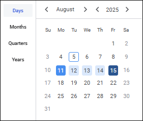
Select the calendar dictionary level to work with. For example: days, months, quarters, or years. One can work only with the levels that were determined in calendar dictionary. Calendar grid values change according to the selected calendar dictionary level.
NOTE. The date range in the box depends on the selected level with selected elements.
Select period start and end dates.
To reset the date range, click the  Clear button.
See also: