Controls Settings
To set up controls, use the settings panel.

 Show or hide the panel
To show the panel:
Select the
 Edit item in the context menu of the control selected on the control filter panel.
Open the side panel, then select the control.
The control setup panel opens. The panel is hidden by default.
To hide the panel, release the  Settings button on the toolbar.
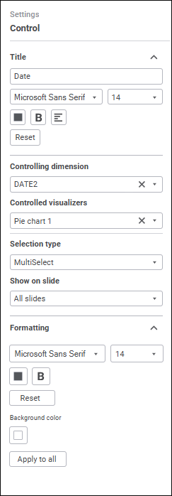
The number of displayed settings depends on the position of the selected control.
The following control settings are available:
Title
The Control<Number> name is displayed by default.
To rename the title:
Select the controlling dimension/parameter.
Enter the new title name.
Set title text formatting parameters.
Set font options:
Font. Select one of the available fonts in the drop-down list.
Font Size. Set the required font size. Size is set in points, it can be entered manually or using the keyboard. The range of available values: [6; 36].
Font Color. Select font color in the drop-down palette. One can select standard and custom colors. The palette contains only standard colors by default.
To create a custom color:
Click the
 Add Color button. The advanced color palette opens.
Select a color in the advanced color palette, use color picker to select color on a browser page, or set color code in the RGB or HEX format.
After executing the operations the custom color is created and added to the palette.
To delete custom color from the palette, select the Delete item in the selected color's context menu.
NOTE. The maximum possible number of custom colors in the a palette is 23.
Font Style. Select font style in the button's drop-down menu:
B. Bold.
I. Italic.
U. Underline.
When the button is pressed, the corresponding font style is used. Several styles can be used simultaneously, for example, pressed B and I buttons result in bold italic font style.
Text Alignment. Select a text alignment option in the button's drop-down menu:
 . Left.
 . Center.
 . To the right edge.
To reset the determined settings and restore the default style, click the Reset button.
General Settings
To set up the element depending on the selected control method, select the value in the Control Method drop-down list:
Default value. The element controls the data source dimension.
Available settings:
Controlling Dimension. In the drop-down list select the dimension that will be controlled by the control. The list contains all dimensions of all information panel slides.
To quickly search for the required dimension by name, use search. Enter the text to be searched in the search string. Search is executed automatically while the searched text is entered into the search string. The list will display only the dimensions, which names contain the entered text.
Controlled Visualizers. The setting is available after the controlling dimension is selected. In the drop-down list select the visualizers that use the controlled dimension matching the controlling dimension by name or identifier. The list contains visualizers of all information panel slides that use the controlled dimension.
To quickly search for the required visualizer by name, use search. Enter the text to be searched in the search string. Search is executed automatically while the searched text is entered into the search string. The list will display only the visualizers, which names contain the entered text.
To select all visualizers, select the Select All item in the list's context menu. To deselect all visualizers, select the Deselect All item in the list's context menu.
Selection Type. In the drop-down palette select the control selection type:
SingleSelect. Single selection: only one element can be selected.
SingleSelectNullable. Single selection with the ability to set empty value.
MultiSelect. Multiple selection. To invert element selection, click the element. Clicking the element while holding down the SHIFT key deselects all elements and selects the elements (except the collapsed ones) that are located between the focused element and the clicked element. Clicking the element while holding down the CTRL key deselects or deselects the element and all dependent elements. When the context menu is opened in the element area, the element is focused but not selected.
MultiSelectStandart. Multiple selection. Clicking the element selects only the chosen element. To select several elements, click the elements while holding down the SHIFT or CTRL key. Clicking the element while holding down the SHIFT key deselects all elements and selects the elements (except the collapsed ones) that are located between the focused element and the clicked element. Clicking the element while holding down the CTRL key deselects or deselects the element.
None. Selection type is not set, the MultiSelect option is used by default.
The element controls the information panel parameter.
Available settings:
Controlled Parameter. In the drop-down list select the parameter that will be controlled by the control.
To change appearance and behavior of the parameter value editor, click the Editor Parameters button. The Set Up Display dialog box opens:
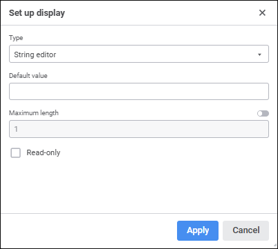
The following parameter display types are available:
Hierarchical list.
Checkbox editor.
String editor.
Masked string editor.
Dictionary box editor.
Time editor.
Date editor.
Time and date editor.
Decimal editor.
Identifier editor.
Boolean values editor.
Integer editor.
List.
The appearance of the Set Up Display dialog box may vary depending on the selected display type.
The default display type is set according to the selected parameter type.
In the Show on Slide drop-down list select the information panel slides, which will show this control. The list contains names of all slides of the current information panel and the All Slides option is selected.
NOTE. The Show on Slide setting is available for the controls located on the filter panel.
Formatting
Determine the control formatting settings:
Set text parameters:
Font. Select one of the available fonts in the drop-down list.
Font Size. Set the required font size. Size is set in points, it can be entered manually or using the keyboard. The range of available values: [6; 36].
Font Color. Select font color in the drop-down palette. One can select standard and custom colors. The palette contains only standard colors by default.
To create a custom color:
Click the
Add Color button. The advanced color palette opens.Select a color in the advanced color palette, use color picker to select color on a browser page, or set color code in the RGB or HEX format.
After executing the operations the custom color is created and added to the palette.
To delete custom color from the palette, select the Delete item in the selected color's context menu.
NOTE. The maximum possible number of custom colors in the a palette is 23.
Font Style. Select font style in the button's drop-down menu:
B. Bold.
I. Italic.
U. Underline.
When the button is pressed, the corresponding font style is used. Several styles can be used simultaneously, for example, pressed B and I buttons result in bold italic font style.
Text Alignment. Select a text alignment option in the button's drop-down menu:
- . Left.
- . Center.
- . To the right edge.
To reset the determined settings and restore the default style, click the Reset button.
The setting is available for the control located in the working area of the information panel.
Select the control alignment option in the drop-down list:
Top. The control is located at the top of the working area cell.
Center. Default value. The control is located at an equal distance from the top and bottom borders of the working area cell.
Bottom. The control is located at the bottom of the working area cell.
To reset the settings and restore the default style, click the  Delete button.
Set the color formatting of the control. To do this, in the drop-down color palette select the color of:
Fill.
Element on mouseover. It is available only for the Dimension/Parameter control method with the Drop-down List parameter display type.
Select element. It is available only for the Dimension/Parameter control method with the Drop-down List parameter display type.
To set a custom color:
Click the
Add Color button in the standard color palette and select the color in the advanced color palette.Select a color in the advanced color palette, use color picker to select color, or set color code in the RGB or HEX format.
After executing the operations the custom color is added to the palette.
NOTE. The maximum possible number of custom colors in the a palette is 23.
To delete custom color from the palette, select the Delete item in the selected color's context menu.
To reset the current border color settings and restore the default style, click the Default Color button.
Select border color in the drop-down color palette. If required, specify border fill opacity percent. One can select standard and custom colors. The palette contains only standard colors by default.
To set a custom color:
Click the
Add Color button in the standard color palette and select the color in the advanced color palette.Select a color in the advanced color palette, use color picker to select color, or set color code in the RGB or HEX format.
After executing the operations the custom color is added to the palette.
NOTE. The maximum possible number of custom colors in the a palette is 23.
To delete custom color from the palette, select the Delete item in the selected color's context menu.
To reset the current border color settings and restore the default style, click the Default Color button.
To apply the current settings to all controls, click the Apply to All button.
NOTE. The Apply to All setting is available for the controls located on the filter panel.