The TreeList component is used to display tree-like hierarchical structures, such as the object inheritance tree.
This component is implemented by the TreeList class. The nodes are implemented by the TreeNode class, while the TreeColumn class implements the columns. The collection of columns is implemented by the TreeColumns class, the collection of nodes is implemented by the TreeNodes class. TreeColumns and TreeNodes classes are inherited from the base class. List.
Component functionality:
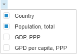
The component enables the user to manage column displaying using the drop-down list at the top right corner. Mark the checkboxes next to column headings to select the checkboxes to be displayed:
Displaying the lines that link tree nodes.
Collapsing and expanding nodes.
Collection of nodes is sorted on clicking on the column header. The nodes are sorted by the selected column. If the  icon is displayed after clicking the heading, the nodes are sorted in descending order. If the
  icon is displayed, nodes are sorted in ascending order.
Filtering the collection of nodes.
Tooltip setup for column nodes and headers.
Dragging columns.
Node dragging (also between several trees on one page).
Availability of vertical and horizontal scrollbars if required, virtual scrolling mode.
Selecting a tree area with the mouse (nodes in this area are also selected).
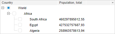
This component looks as follows:
Example of Creating the TreeList Component
Example of dynamic creation of TreeList component
| Constructor name | Brief description | |
 |
TreeList | The TreeList constructor creates an instance of the TreeList component. |
| Property name | Brief description | |
 |
ActiveColor | The ActiveColor property determines color of active tree node. |
|
ActiveFont | The ActiveFont property determines font parameters of active tree node. |
|
ActiveParentColor | The ActiveParentColor property determines selection color for parent nodes of the active tree element. |
|
AreaSelect | The AreaSelect property determines whether tree area can be selected with the mouse. |
|
CaptionVisible | The CaptionVisible property determines whether header row is displayed. |
|
CheckBoxes | The CheckBoxes property determines whether checkboxes are displayed for component nodes. |
|
ChildrenCount | The ChildrenCount property contains the number of nodes in the root branch. |
|
Columns | The Columns property sets collection of columns for the component. |
|
ContentColor | The ContentColor property determines background color for tree node contents. |
|
ContentFont | The ContentFont property determines font parameters of tree nodes. |
|
CutOverflow | The CutOverflow property determines whether to show an ellipsis instead of the text that overflows the box. |
|
DblClickExpand | The DblClickExpand property determines whether a tree node expands on double-click. |
|
DragAndDropDelay | The DragAndDropDelay property determines how long the user must hold mouse cursor over a node while holding down mouse button to activate the Drag&Drop mode. |
|
DragAndDropDetectDistance | The DragAndDropDetectDistance property determines the distance, after which the Drag&Drop mode is enabled. |
|
DragAndDropMode | The DragAndDropMode property sets the Drag&Drop mode. |
|
EmptySelection | The EmptySelection property determines whether all tree nodes can be deselected. |
|
EnableColumnsMenu | The EnableColumnsMenu property determines whether menu icon is visible in the tree header and the option to call a menu managing column visibility. |
|
EnableDragAndDrop | The EnableDragAndDrop property determines whether nodes can be moved using the Drag&Drop method. |
|
EnableEdit | The EnableEdit property determines whether values in table cells can be edited. |
|
EnableHighlight | The EnableHighlight property determines whether tree elements highlighting is available. |
|
EnableKeyNavigation | The EnableKeyNavigation property determines whether the user can navigate the list using the keyboard. |
|
EnableResizeColumn | The EnableResizeColumn property determines whether column width can be changed. |
|
EnableSearch | The EnableSearch property determines whether tree elements can be searched. |
|
EnableSelectedHighlight | The EnableSelectedHighlight property determines whether selected tree nodes can be highlighted. |
|
EnableSortColumns | The EnableSortColumns property determines whether column values can be sorted. |
|
FilterCaseSensitive | The FilterCaseSensitive property determines whether filtering is case-sensitive. |
|
FilterDeSelect | The FilterDeSelect property determines whether selection of nodes is reset on filtering. |
|
FirstShiftSelectClearing | The FirstShiftSelectClearing property sets the mode, at which each mouse click on the node with the held down SHIFT key deselects all nodes except for the pressed one. |
|
HighlightColor | The HighlightColor property sets a color of tree element highlighting. |
|
HighlightFont | The HighlightFont property sets font for a highlighted tree node. |
|
HoverColor | The HoverColor property determines a color of the tree node, to which the cursor is pointed. |
|
HoverFont | The HoverFont property determines font parameters of the tree node, to which the cursor is pointed. |
|
IgnoreRightPadding | The IgnoreRightPadding property determines whether the right padding is ignored. |
|
ImageList | The ImageList property sets the ImageList non-visual component. |
|
IsCSMultiSelect | The IsCSMultiSelect property determines whether it is possible to select multiple objects using the SHIFT and CTRL keys. |
|
KeepHasChild | The KeepHasChild property determines changing of displaying a hierarchical tree and changing the HasChild property for nodes when the Drag&Drop mode is active. |
|
LoadingTimeout | The LoadingTimeout property determines the time interval, in which the tree is loaded. |
|
MultiSelect | The MultiSelect property determines whether multiple elements can be selected. |
|
Nodes | The Nodes property sets a collection of nodes. |
|
RightButtonSelect | The RightButtonSelect property determines whether a node can be selected on clicking the right mouse button. |
|
RowSelect | The RowSelect property determines whether the row is highlighted when a row element is selected. |
|
SearchColor | The SearchColor property determines color of text to search. |
|
SearchFont | The SearchFont property determines font parameters of text to search. |
|
SelectedHighlightColor | The SelectedHighlightColor property determines a color for highlighting of the selected tree nodes. |
|
SelectedHighlightFont | The SelectedHighlightFont property determines font of a highlighted selected tree node. |
|
SelectEditorText | The SelectEditorText property determines whether edited text should be selected. |
|
ShowColumns | The ShowColumns property determines whether columns are displayed. |
|
ShowGridLines | The ShowGridLines property determines whether table gridlines are displayed. |
|
ShowLines | The ShowLines property determines whether lines that link a node and its children are displayed. |
|
ShowToolTips | The ShowToolTips property determines whether tooltips are displayed on hovering the cursor on a tree node. |
|
SortSequence | The SortSequence property sets sorting change order. |
|
UseCtrlSelect | The UseCtrlSelect property determines whether multiple nodes can be selected while holding down the CTRL key. |
|
UseShiftSelect | The UseShiftSelect property determines whether multiple neighbor nodes can be selected while holding down the SHIFT key. |
|
WordWrap | The WordWrap property determines whether node text is wrapped. |
| Method name | Brief description | |
|
beginUpdate | The beginUpdate method disables rerendering of tree until the endUpdate method is called. |
|
checkSelection | The checkSelection method deselects all tree nodes except for the last selected one. |
|
clearSelection | The clearSelection method deselects all tree nodes. |
|
collapseAll | The collapseAll method collapses all tree nodes. |
|
deleteNode | The deleteNode method deletes a hierarchical tree node. |
|
deSelectAll | The deSelectAll method deselects selected elements. |
|
deSelectLevel | The deSelectLevel method deselects elements of the specified level. |
|
endUpdate | The endUpdate method refreshes a tree and starts rerendering. |
|
expandAll | The expandAll method expands all tree nodes. |
|
expandToKeyNode | The expandToKeyNode method finds a node with the specified key in the tree and expands the tree at node's level. |
|
expandToNode | The expandToNode method expands all nodes down to the specified one. |
|
filter | The filter method filters nodes in a hierarchical tree. |
|
find | The find method searches for a tree element. |
|
findText | The findText method returns the tree node, which value fully matches the passed value. |
|
getAllCollapsedKeys | The getAllCollapsedKeys method returns the array of keys that belong to all collapsed tree nodes and nodes without children. |
|
getAllExpandedKeys | The getAllExpandedKeys method returns an array of keys that belong to all expanded tree nodes. |
|
getAllNodes | The getAllNodes method returns a one-dimensional array that contains all tree nodes and their current sorting order. |
|
getAllSelectedKeys | The getAllSelectedKeys method returns an array of keys that belong to all selected tree nodes. |
|
getCaptionHeight | The getCaptionHeight method returns height of column headers. |
|
getFirstVisibleIndex | The getFirstVisibleIndex method returns index of the first visible tree node. |
|
getFocusedNode | The getFocusedNode method returns focused node. |
|
getFullTreeHeight | The getFullTreeHeight method returns tree height. |
|
getHasSecondLevel | The getHasSecondLevel method determines whether a tree has child nodes. |
|
getHorizontalScroll | The getHorizontalScroll method returns horizontal scrollbar. |
|
getLastFound | The getLastFound method returns the last found node. |
|
getLastSearch | The getLastSearch method returns the last searched string. |
|
getMaximalWidthForColumn | The getMaximalWidthForColumn method returns maximum width of contents stored in visible rows of a column. |
|
getMaximalWidthForColumnFull | The getMaximalWidthForColumnFull method returns maximum width of contents stored in all rows of a column. |
|
getNodeByIndex | The getNodeByIndex method returns tree node by its index. |
|
getNodeByKey | The getNodeByKey method returns a first level node by its key. |
|
getNodeLevel | The getNodeLevel method determines the level that contains the specified node. |
|
getNodes | The getNodes method returns an object of the PP.Ui.TreeNodes class that contains hierarchical tree nodes. |
|
getOptimalWidthForColumn | The getOptimalWidthForColumn method returns optimum column width. |
|
getPixelHeight | The getPixelHeight method returns height value (in pixels) for a tree component. |
|
getPixelWidth | The getPixelWidth method returns width value (in pixels) for a tree component. |
|
getRootNode | The getRootNode method returns an object associated with the tree root. |
|
getSelectedNodes | The getSelectedNodes method returns selected nodes. |
|
getSelectedNodesCount | The getSelectedNodesCount method returns the number of selected tree nodes. |
|
getSort | The getSort method returns an object that contains sorting parameters. |
|
getSortColumn | The getSortColumn method returns number of the column, which data is sorted. |
|
getSortMethod | The getSortMethod method returns a sorting method. |
|
getSortProperty | The getSortProperty method returns name of the node property, by which sorting is executed. |
|
getSortRecursive | The getSortRecursive property determines whether data in child nodes is also sorted. |
|
getTopMargin | The getTopMargin method returns margin for the topmost node. |
|
getTopShift | The getTopShift method returns offset of the topmost node. |
|
getVerticalScroll | The getVerticalScroll method returns vertical scrollbar. |
|
getVisibleNodes | The getVisibleNodes method returns a one-dimensional array that contains currently visible tree nodes. |
|
getVisibleNodesCount | The getVisibleNodesCount method returns the number of currently displayed tree nodes. |
|
highlight | The highlight method highlights the specified text in tree node labels. |
|
isDraging | The IsDraging method determines whether dragging is enabled. |
|
isEditing | The IsEditing method determines whether editing is enabled. |
|
isSelecting | The IsSelecting method determines whether selecting is enabled. |
|
redraw | The redraw method fully rerenders hierarchical tree. |
|
removeFocus | The removeFocus method removes focus from a node. |
|
removeHover | The removeHover method disables effects of the node that appear on hovering the cursor on it. |
|
scrollToNode | The scrollToNode method scrolls the tree down to the specified node. |
|
selectAll | The selectAll method selects all tree nodes. |
|
selectLevel | The selectLevel method selects all nodes of the specified level. |
|
setExpandedByKeys | The setExpandedByKeys method expands nodes by their keys specified in the keys array. |
|
setExpandedForNode | The setExpandedForNode method expands or collapses the node depending on the passed value. |
|
setHoveredNode | The setHoveredNode method sets the node that is displayed as if hovered. |
|
setSelectedByKeys | The setSelectedByKeys method sets selection for all tree nodes with the specified keys. |
|
showSearch | The showSearch method opens the search field. |
|
sort | The sort method sorts tree elements by column. |
|
startEditing | The startEditing method activates edit mode for the selected node. |
|
update | The update method refreshes displayed tree. |
| Event name | Brief description | |
 |
BeforeCollapse | The BeforeCollapse event occurs before collapsing a tree node. |
|
BeforeExpand | The BeforeExpand event occurs before expanding a tree node. |
|
CheckBoxClick | The CheckBoxClick event occurs on clicking a checkbox. |
|
CheckedChanged | The CheckedChanged event occurs on selecting or deselecting the checkbox. |
|
Collapse | The Collapse event occurs on collapsing tree nodes. |
|
ColumnVisibilityChanged | The ColumnVisibilityChanged event occurs after changing visibility of a tree column. |
|
ColumnVisibilityChanging | The ColumnVisibilityChanging event occurs on changing visibility of a tree column. |
|
Expand | The Expand event occurs on expanding nodes. |
|
FilterChanged | The FilterChanged event occurs after filtering hierarchical tree nodes. |
|
Finding | The Find event occurs when element search is started. |
|
Found | The Found event occurs when a tree element is found. |
|
LoadSubNodesOf | The LoadSubNodesOf event occurs on loading the node to the tree. |
|
MouseDownNode | The MouseDownNode event occurs on clicking and holding the mouse button down over component node. |
|
NodeClick | The NodeClick event occurs on clicking a list element. |
|
NodeDblClick | The NodeDblClick event occurs on double-click on a list element. |
|
NodeDrag | The NodeDrag event occurs during dragging of a node. |
|
NodeDragEnd | The NodeDragEnd event occurs when the user finishes dragging the node. |
|
NodeDragFinished | The NodeDragFinished event occurs after node is placed to a new position. |
|
NodeDragStart | The NodeDragStart event occurs when the user starts dragging a node (when the user clicks and holds down the mouse button). |
|
NodeEditCanceled | The NodeEditCanceled event occurs when the user cancels editing. |
|
NodeEdited | The NodeEdited event occurs after editing a node name. |
|
NodeEditFinish | The NodeEditFinish event occurs after finishing editing of hierarchical tree node. |
|
NodeEditing | The NodeEditing event occurs in the process of editing a value in a table cell. |
|
NodeHovered | The NodeHovered event occurs on hovering over a node. |
|
NodeUnHovered | The NodeUnHovered event occurs after a tree node is unhovered with the mouse. |
|
SelectionChanged | The SelectionChanged event occurs after the element is selected. |
|
SelectionChanging | The SelectionChanging event occurs when an element is being selected. |
|
Sort | The Sort event occurs on sorting a collection of tree nodes. |
|
SortChanged | The SortChanged event occurs after finishing editing of hierarchical tree column sorting. |
|
SortChanging | The SortChanging event occurs on changing of hierarchical tree column sorting. |
|
ToolTipShowing | The ToolTipShowing event occurs when the cursor hovers on the hierarchical tree node. |
| Property name | Brief description | |
|
Anchors | The Anchors property determines position of the component placed within container. |
|
Animation | The Animation property determines component animation parameters. |
|
Bottom | The Bottom property determines a bottom margin if a component is placed inside LayoutPanel. |
|
Content | The Content property determines component contents. |
|
ContextMenu | The ContextMenu property determines a component's context menu. |
|
Data | The Data property is used to store any custom data. |
|
Enabled | The Enabled property determines whether a component can be used. |
|
Height | The Height property determines component height. |
|
IsRTL | The IsRTL property determines whether component elements are aligned to the right. |
|
IsVisible | The IsVisible property determines whether a component is displayed. |
|
Left | The Left property determines a left margin if a component is placed inside GridPanel. |
|
Opacity | The Opacity property determines component transparency. |
|
Parent | The Parent property determines a parent component of a control. |
|
ParentNode | The ParentNode property determines a parent DOM node. |
|
ResourceKey | The ResourceKey property determines a component resource key. |
|
Right | The Right property determines a right margin if a component is placed inside LayoutPanel. |
|
Rotate | The Rotate property determines a component rotation angle. |
|
ShowToolTip | The ShowToolTip property determines whether a tooltip of the component can be displayed. |
|
Style | The Style property determines a component style. |
|
TabIndex | The TabIndex property determines the order of the control element passing inside the container. |
|
Tag | The Tag property determines a JSON object associated with the component. |
|
ToolTip | The ToolTip property determines text of component tooltip. |
|
Top | The Top property determines a top margin if a component is placed inside GridPanel. |
|
Value | The Value property determines a component value. |
|
Width | The Width property determines component width. |
| Method name | Brief description | |
|
The addClass method adds a CSS class to the component. | |
|
addEventHandler | The addEventHandler method adds an event handler to a DOM node. |
|
The addStateClass method adds a CSS class to the component and removes the previous CSS class. | |
|
The addToNode method adds a component to the specified node. | |
|
bindEvents | The bindEvents method subscribes an element to all available events. |
|
The getAnchorFlags method returns JSON object that contains settings of the current component's position. | |
|
The getClass method returns the current CSS classes of the component. | |
|
The getCssStyle method returns style for the specified node. | |
|
The getDomNode method returns main DOM node of the component. | |
|
The getFocused method determines whether the component is focused. | |
|
getIsBinded | The getIsBinded method returns whether an element is subscribed to all DOM node events. |
|
The hide method hides a control. | |
|
The hideToolTip method clears tooltip timeout and hides the tooltip if it is shown. | |
|
refreshStyle | The refreshStyle method refreshes element CSS styles. |
|
The removeClass method removes CSS class from the component. | |
|
removeEventHandler | The removeEventHandler method removes event handler from DOM node. |
|
removeFromDOM | The removeFromDOM method removes node from the DOM structure. |
|
The removeStateClasses method removes CSS classes of the component. | |
|
The setDraggable method determines whether a component can be dragged on the HTML page. | |
|
The setFocus method sets the component focus. | |
|
The setIsHovered method sets up component displaying only on mouseover. | |
|
The setSize method establishes the sizes of the component. | |
|
The show method displays a control. | |
|
unBindEvents | The unBindEvents method unsubscribes an element from all standard events. |
|
The updatePosition method updates size and position when absolute positioning based on the current parameters is used. | |
|
The updateSize method updates the component size on changing the size of the container that contains the component. |
| Event name | Brief description | |
|
Drag | The Drag event occurs on clicking and holding the mouse button. |
|
DragEnd | The DragEnd event occurs when dragging the component finishes. |
|
DragStart | The DragStart event occurs when dragging the component starts. |
|
OnContextMenu | The OnContextMenu event occurs on calling context menu of the component. |
|
SizeChanged | The SizeChanged event occurs after the component is resized. |
|
SizeChanging | The SizeChanging event occurs during component resize. |
| Property name | Brief description | |
|
The Id property determines a repository object identifier. |
| Method name | Brief description | |
|
clone | The clone method creates an object copy. |
|
dispose | The dispose method deletes the component. |
|
getHashCode | The getHashCode method returns hash code of repository object. |
|
getId | The getId method returns repository object identifier. |
|
getSettings | The getSettings method returns repository object settings. |
|
getTypeName | The getTypeName method returns the name of the object type without the namespace, to which it belongs. |
|
isEqual | The isEqual method determines whether the specified object is equal to the current repository object. |
|
isLive | The isLive method determines validity of repository object. |
|
removeAllEvents | The removeAllEvents method removes all object event handlers by the specified context. |
|
setId | The setId method determines a repository object identifier. |
|
setSettings | The setSettings method determines repository object settings. |
|
defineProps | The defineProps method creates get and set methods from name array for the specified class. |
|
keys | The keys method returns array of methods and properties names for the specified object. |
See also: