 Table item in the drop-down menu of the
  Add Visualizer button in the working area.
The Table visualizer is used to display data as a table.
To insert the visualizer, select the  Table item in the drop-down menu of the
  Add Visualizer button in the working area.
Then add or select a data source in the Sources drop-down list in the upper part of the side panel.
NOTE. All operations given in the Adding Visualizers and Working with Them article are available for the Table visualizer.
Table structure consists of several main elements, each of them has its own settings:
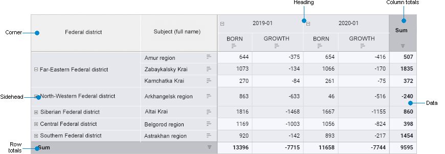
Corner. The top left cell of the table that enables the user to show dimension names in rows and columns.
Sidehead. The table element that shows names of dimension elements located in rows.
Heading. The table element that shows names of dimension elements located in rows.
Data. The table element that consists of data cells.
Row/column totals. The table element that consists of row/column totals.
NOTE. The Row Totals and Column Totals table elements are displayed if displaying of row/column totals is enabled for table.
To set up a table element, select it.
To create a table, use the boxes:
For details see the Setting Up Title section.
To show empty lines, toggle the Empty Line switch to active state. The switch is inactive by default, and empty lines are not displayed.
For details see the Sorting section.
To exclude unnecessary row or column from table:
Select header of the row or column to exclude.
Select the Exclude item in the context menu of the selected row or column header.
As a result, the row or column is excluded from the table.
To exclude all data from table except for the selected:
Select the cell, row, column, or cell/row/column range in the table, which data must be displayed in the table.
Select the Exclude the Rest item in the selected cells' context menu.
As a result, all data except for the selected is excluded from the table.
To quickly sort data without the settings panel, use sorting buttons in row/column headers:
 None. No sorting.
 Descending. Ascending sorting.
 Ascending. Ascending sorting.
Growth indicator shows changes of value in the cell relative to other values.
To display growth indicators for rows or columns:
Select the Growth Indicator radio button.
Select the For Rows or For Columns display option. The For Rows radio button is selected by default.
Growth indicators will be displayed in the table by rows or columns. Simultaneous displaying of growth indicators by rows and columns is unavailable.
To hide growth indicators, toggle the Growth Indicator switch to inactive state.
Features of displaying growth indicators:
When building growth indicators by rows, the first cell column located relative to table sidehead is skipped.
When building growth indicators by columns, the first cell row located relative to table heading is skipped.
If the previous row/column cell is empty or contains the value that is not equal to the current one, growth indicator is not displayed for such cell.
If several dimensions are arranged by rows/columns and several elements are selected in any of them except for the first one, displaying of growth indicators by rows/columns is unavailable.
If displaying of grand totals and/or subtotals is enabled for the table, growth indicators are not displayed for such cells.
On export of table to XLSX growth indicators are not exported.
The example of displaying growth indicator for rows:

Green arrows show that the value in a cell is greater than the value in a cell to the left. Red arrows show that the value in a cell is less than the value in a cell to the left.
The example of displaying growth indicator for columns:
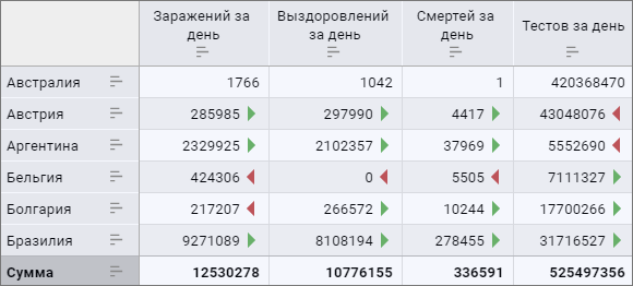
Green arrows show that the value in a cell is greater than the value in an upper cell. Red arrows show that the value in a cell is less than the value in an upper cell.
Sparklines are small charts located inside a visualizer. Sparklines can be used to show trends in data series. Sparklines are used to visually present large datasets. Sparklines can be displayed for table columns, rows, and totals.
To set up sparkline:
Toggle the Sparkline switch to active state. The switch is inactive by default, sparklines are not displayed.
Select sparkline display option:
By Rows. The checkbox is selected by default. Sparklines are displayed by table rows.
By Columns. Sparklines are displayed by table columns.
Show for Totals. Sparklines are displayed for totals.
NOTE. To display sparklines by totals, row/column totals should be set up.
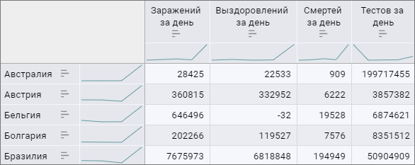
Sparklines are displayed as a line chart for table columns and totals.
To hide sparklines, toggle the Sparkline switch to inactive state.
Features of displaying sparklines:
If the whole row/column contains only one cell with value, the sparkline is not displayed.
If some cells are empty, the sparkline is displayed with gaps.
If displaying of subtotals is enabled for table, sparkline is displayed for such cells.
On export of table to XLSX, cells with sparklines are displayed as empty.
The example of using sparklines for rows and columns:
Totals can be used to display total values by rows and/or columns.
To calculate and display totals, select the checkbox:
By Rows. Grand totals calculated by all table rows are displayed.
By Columns. Grand totals calculated by all table columns are displayed.
Grand Total. Grand totals calculated by all columns/rows are displayed. The checkbox is selected by default. The Grand Total checkbox becomes available for use if the By Rows and/or By Columns checkboxes are selected.
NOTE. If the grand total matches the subtotal by hierarchy/levels, it is recommended to disable displaying of grand total to avoid duplicated data.
Totals are not calculated by default.
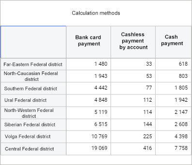
The example of table without totals:
The example of table with row totals:
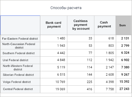
The example of table with column totals:
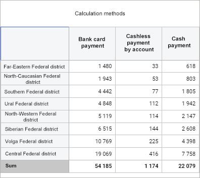
Subtotals can be used to display totals by hierarchy and/or by levels.
To calculate and display subtotals:
Enable displaying of row/column totals.
Select subtotal display option:
By Hierarchy. Total names contain names of hierarchy parent elements.
By Levels. Total names contain names of levels.
Subtotals are not calculated by default.
The By Hierarchy and By Levels checkboxes are relevant if elements of hierarchical dimension of different levels of hierarchy are displayed in the table.
The example of table with grand totals:

The example of table with subtotals by hierarchy:

The example of table with subtotals by levels:
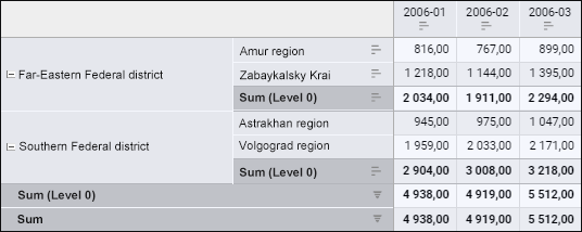
The example of table with subtotals by hierarchy and by levels:
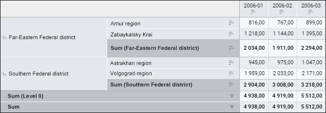
The setup is executed using the styles on the settings panel:
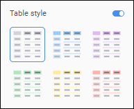
To select a table style:
Toggle the Table Style switch to active state. The switch is inactive by default.
In the Table Style group select one of the available styles.
After executing the operations the selected style sis applied to the table.
To disable the applied table style, toggle the Table Style switch to inactive state.
NOTE. Table style has a lower priority than fill of single elements.
For details about setting up table elements see the Formatting Table and Its Elements section.
See also:
Adding Visualizers and Working with Them | Selecting and Setting Up Visualizer Data Source | Setting Up Data Visualization
 Table elements