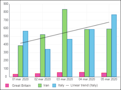
A data series is a chart element that is a data array. A chart is based on a set of data series. Chart data series are displayed graphically, for example, as a set of multicolor columns. A chart data series which has a name is highlighted in a specific color and an icon specified in the legend.
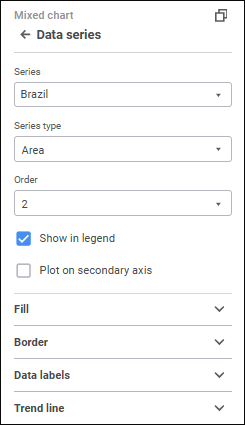
To set up chart data series, use the Data Series group in settings panel.

To open the Data Series group of parameters
To open the Data Series group of parameters:
Select a chart.
Press the
Settings button on the toolbar.
Select the required group of parameters.

The setting is available for all chart types, except for scatter charts and Sankey charts.
The Series drop-down list contains the All value by default. This value is used to determine settings applied for all series displayed in a chart. To set up a specific series, select it in the Series drop-down list. To set up all series, select the All series. Note that the setting determined for the All series do not overwrite the settings determined manually for a specific series.
The number of displayed settings depends on the chart or series type.
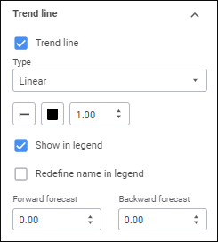
The parameters that are available for a specific series and for the All series:
To change series type of mixed and radar charts, select the type in the Series Type drop-down list:
Line. The series is shown as a line.
Column. The series is shown as a column. It is available only for mixed charts.
Area. The series is shown as a colored area.
Line smoothing is used to eliminate broken line effect that appears on plotting line and radar charts, and the Line series type of mixed chart.
To smooth chart's linear series, select the Smooth Line checkbox.
Series fill is available for all chart types, except for line charts and series types, except for Line.
To set up series fill, open a drop-down palette and select fill type in the drop-down list:
No Fill. Fill is not used.
Automatic Fill. Default value. Automatic solid fill is used.
Solid Fill. Select solid fill color for the plot area in the drop-down palette. If required, specify fill opacity percent.
Two-Color Fill. Select start and end colors of two-color gradient in the drop-down palette. If required, specify tilt angle and fill opacity percent.
Heterogeneous Fill. Select basic fill color with linear gradient in the drop-down palette. If required, specify fill opacity percent.
Hatching Fill. Execute the operations:
Select solid fill color in the drop-down palette. If required, specify fill color and hatching color transparency percent.
Select texture option in the Hatching drop-down list.
Select hatching color in the drop-down color palette.
If the All value is selected in the Series drop-down list, the checkboxes will be available depending on the fill type in use:
Select Color. The checkbox is available for solid and heterogeneous fill. When the checkbox is selected, the selected color fill is applied to the chart.
From, To. The checkboxes are available for two-color fill. When each checkbox is selected, the selected color two-color fill is applied to the chart.
NOTE. If any chart series has its own fill, it remains regardless of the checkbox state. To apply the specified fill to the entire chart, click the For All button.
All checkboxes are deselected by default.
Series border fill is available for all chart types, except for line charts and all series types, except for Line.
To set up a data series border, set the following:
Line Type. Select line type in the drop-down list.
Line Color. Select line color in the drop-down palette
Line Width. Set the required line width using the keyboard or the value editor.
Series line setup is available for line chart series and for series of the Line type in mixed and radar charts.
To set up a series line, set the following:
Line Type. Select line type in the drop-down list.
Line Color. Select line color in the drop-down palette
Line Width. Set the required line width using the keyboard or the value editor.
A marker is a single value of a data array displayed as a point of a shape.
To set up displaying of series markers, make sure that the Markers checkbox is selected on the parameters panel.
Setting up displaying of markers is available for line chart series and for series of the Line type in mixed and radar charts. The mentioned chart types should be two-dimensional.
Set the parameters:
Type. Select a marker type in the drop-down list:
Diamond. Markers are shown as diamonds.
Inverse Triangle. Markers are shown as inverse triangles.
Triangle. Markers are shown as upward triangles.
Circle. Markers are shown as circles.
Square. Markers are shown as squares.
Line. Markers are displayed as dashes.
Size. Set marker size in millimeters using the keyboard of the value editor.
Auto Rotate. Select the checkbox to tilt markers at a tangent to a chart series line. When the checkbox is deselected, markers are positioned vertically.
NOTE. Marker automatic rotation is available only for the Inverse Triangle and the Triangle types.
Fill. Specify fill color in the drop-down palette. If required, specify fill opacity percent in the Opacity box. To reset marker fill, click the
No Color button.
Border. Set up border displaying:
Type. Select a border type in the drop-down list.
Color. Select border solid fill color in the drop-down palette:
Width. Set line width using the keyboard or the value editor.
After executing the operation, markers are displayed for the data series according to the specified parameters.
If required, deselect the Markers checkbox to hide data series markers from the chart.
The parameters that are available for the selected series:
Reordering chart series is available if the Bind to Source checkbox is deselected.
In the Order drop-down list select the series sequence order in a chart. Series numbering starts with one. The order of a series on a chart determines the order of its displaying in the legend.
To set up displaying a series in a chart, use the Show in Legend checkbox. The checkbox is selected by default, and a series is displayed in the legend.
Data labels contain information about data series or single data points and make it easier to understand a chart.
To display labels for a selected series, select the Data Labels checkbox.
For detailed description of data label setup see the Data Labels section.
A secondary axis is an auxiliary value axis, which can display:
Values of data series that strongly differ from other series' values.
Series values presented on the chart as a different data type.
To plot a series on a secondary value axis, select the Plot on Secondary Axis checkbox. After the checkbox is selected, the settings panel displays the Value Axis (Secondary) group of parameters that is used to set up secondary axis.
NOTE. Plotting a series on secondary axis is available for all chart types, except for radar charts, pie charts, and doughnut charts.
For details about secondary axis setup see the Chart Axes section.
Trend lines can be used to graphically display data trends and predict their changes.

To display a trend line, select the Trend Line checkbox.
NOTE. Trend line setup is available for the following charts: column charts, bar charts, line charts, mixed charts, and area charts.
After the checkbox is selected, the trend line parameters setup panel is displayed:

Set the parameters:
Type. Select trend line type in the drop-down list:
Linear. It is applied in simple cases when data series points are located close to the trend line. The linear type of trend line is applicable to the value that increases or decreases at a constant speed.
Logarithmic. The logarithmic trend line describes well the value that increases or decreases quickly at the beginning and then gradually stabilizes. The logarithmic trend line can be used both for negative and positive data values.
Exponential. The exponential trend line is a curved line that should be used when data values rise or fall at constantly increasing rates. However, for the data that contain zero or negative values, this trend line type cannot be used.
Power. The power trend line gives the best results when used with data sets that compare measurements that increase at a specific rate. An example of such a dependency is the acceleration of a race car at 1-second intervals. If there are zero or negative value in the data, power trend line type cannot be used.
Average. The trend line that passes through the data series mean. Such trend line enables the user to view dynamics of changing the considered value depending on the mean value.
Peak Values. The following trend lines are plotted: the line that goes through the maximum value of data series and the line that goes through the minimum value of data series.
Line Type. Select line type in the drop-down list.
NOTE. Trend line type selection is available only for two-dimensional chart types.
Line Color. Select line color in the drop-down palette
Line Width. Set the required line width using the keyboard or the value editor.
To set up displaying a trend line in the legend, use the Show in Legend checkbox. The checkbox is selected by default, and a trend line is displayed in the legend.
To redefine trend line name in the legend, select the Redefine Name in Legend checkbox and set a new line name. It is available only when the Show in Legend checkbox is selected.
Depending on the trend line type selection, additional fields will be available:
Forward Forecast/Backward Forecast. Set the required number of forecasting steps using the keyboard or the value editor. This setting is available for all trend line types, except for Average and Peak Values.
Peak Interval. Set the required interval, at which peak values of the series are calculated, using the keyboard or the value editor. This setting is available for trend lines of the Peak Values type.
To apply settings of the All series for all series, including the series with custom settings, click the For All button.
See also: