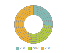
A doughnut chart shows size of elements belonging to one data series proportionally to sum of elements.
Each data group is shown as a circle divided into sectors. The first data series is shown in the center of the chart. If percents are shown in data labels, each circle should make up 100%.
Example of doughnut chart:

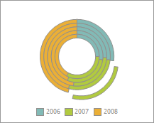
In the edit mode, it is possible to change the position of the outermost sectors. To do this, grab a sector and drag it to the required distance. The entire chart size is reduced:

The following chart parameters can also be changed in the edit mode:
Additional parameters setup is available for this chart type.
See also:
Chart Types | Pie Chart | Setting Up General Chart Parameters | Setting Up Additional Parameters | Setting Up Chart Components