A pie chart shows size of elements belonging to one data series proportionally to sum of elements.
Each group of data is displayed as a circle that is divided into sectors, which angular sizes are proportional to data element values.
The example of pie charts (regular and 3D):
In the edit mode, it is possible to change the position of the outermost sectors. To do this, grab a sector and drag it to the required distance. The entire chart size is reduced. The following chart parameters can also be changed in the edit mode:
Features that are available for this chart type:
Merging parts of chart sectors into one. To enable this, use a secondary histogram and secondary pie chart.
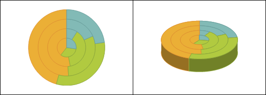
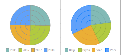
Displaying series in doughnuts. Below are examples of the pie chart, for which displaying of series in doughnuts (left) and in sectors (right) is set up:
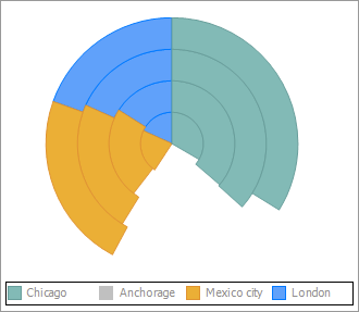
On excluding a data series in the pie chart via the default legend, the chart is not rebuilt, creating empty spaces:
NOTE. The pie chart can be rebuilt using only legend elements by the Fore language.
See also:
Chart Types | Setting Up General Chart Parameters | Setting Up Chart Components