Box charts are used to analyze one or several data sets in the graphical view. This type of chart can be used to compare distributions between several data groups or sets. For each data group or data set the following calculations are made: center statistics (median, average) and range statistics (quartiles, standard deviations) for various periods of time and the selected values are displayed on the chart.
The complete data set is always used on plotting a chart. The following chart plotting modes are available:
One displays the summary statistics of the data set calculated automatically.
One displays the summary statistics of the data set calculated manually. Series of this chart should be strictly ordered. The following are mandatory: Minimum, Lower Quartile, Median, Upper Quartile, Maximum, Average Value. Additional summary statistics are displayed as linear series.
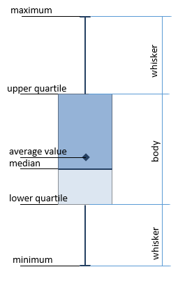
A box chart consists of candles with body and whiskers:
The candle body is set by the upper and lower quartile and median.
The candle's whiskers are specified by the minimum and maximum values:
The lower whisker is built on the minimum point to the lower quartile.
The upper whisker is built from the upper quartile to the maximum point.
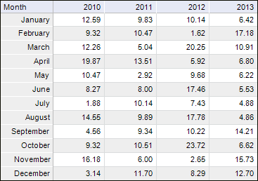
Consider an example of the chart displaying summary statistics of data set calculated automatically. Source data for the Sales Result of Machines, mil. rub. chart:
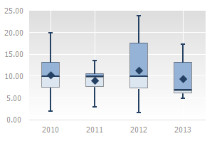
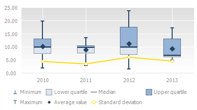
Displaying of data as a box chart:
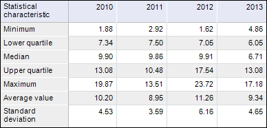
To plot a chart displaying the calculated summary statistics, use the same source data. All statistic data should be calculated and strictly ordered in the table:
Displaying of data as a box chart:
The following chart parameters can also be changed in the edit mode:
NOTE. The width of the candle bodies is calculated automatically. The line width of maximum and minimum is fixed.
See also:
Chart Types | Setting Up General Chart Parameters | Setting Up Chart Components