A stock exchange charts is mostly used to illustrate changes of stock prices. This chart can also be used to present scientific data. For example, stock exchange charts can be used to show fluctuation of daily and yearly temperatures.
To create a stock exchange chart, correctly arrange output data. Order of series is strictly determined. The following options of series combination are available depending on a chart:
High rate, low rate, closing rate.
Opening rate, high rate, low rate, closing rate.
Volume, high rate, low rate, closing rate.
Volume, opening rate, high rate, low rate, closing rate.
By default, the chart displays:
High Rate and Low Rate as triangular markers.
The dash links maximum and minimum values from the High Rate and Low Rate series.
Closing Rate as label in this dash plane.
Volume as a column that is built on the primary axis.
NOTE. On using the Volume series, the rest of the series are built on the secondary axis. Series location by rows is set automatically.
Simultaneous use of the Opening Rate and Closing Rate series is displayed as a block.
NOTE. If the Opening Rate series value is greater than the Closing Rate series value, the block is colored with the Closing Rate color, otherwise the block is colored with the Opening Rate series color.
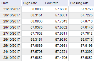
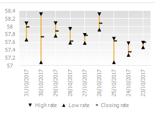
Consider an example of the chart, which uses three series: High Rate, Low Rate, Closing Rate.
The source data "Dollar exchange rate frequency, rub" for the chart:
Stock exchange chart view:
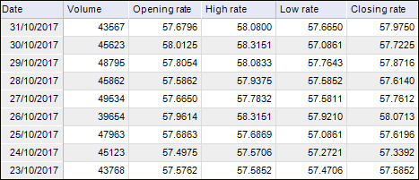
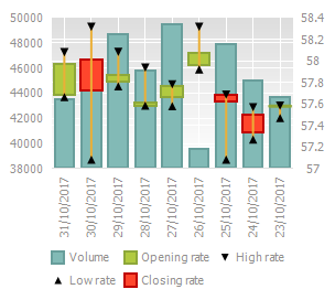
Consider an example of the chart, which uses five series: Volume, Opening Rate, High Rate, Low Rate, Closing Rate.
The source data "Dollar exchange rate frequency, rub" for the chart:
Stock exchange chart view:
The following chart parameters can also be changed in the edit mode:
See also:
Chart Types | Setting Up General Chart Parameters | Setting Up Chart Components