3D histograms with groups are used to show data changes for a particular time period or to compare data.
3D histogram shows value of each element as a horizontal or vertical column, the length of which is proportional to the element value. Each data group has individual set of columns in the chart, each data series is marked with specific color specified in the legend.
Such histograms enable the user to compare data points by horizontal axis and height axis.
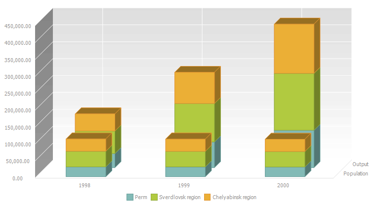
On plotting a histogram, series dimensions are displayed to the width axis. Series dimensions should be more than one, data is grouped in the series name displayed via the dash. On plotting a histogram with groups containing stacked values, stacked values are grouped for the first series dimensions, their names are displayed to the width axis by using the dash and the last dimension is displayed in the legend.
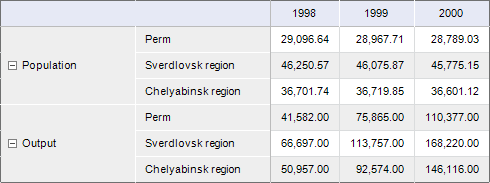
Consider the example of plotting a 3D histogram with groups. The initial data is Social and Economic Indicators of Regions:

The example of displaying 3D histogram with groups:

The example of displaying stacked 3D histogram with groups:

NOTE. Stacked 3D histogram with groups is not available for the Reports and Time Series Analysis tools.
The following chart parameters can also be changed in the edit mode:
Additional parameters setup is available for this chart type.
See also:
Chart Types | Setting Up General Chart Parameters | Setting Up Chart Components