Formatting setup in data entry forms enables the user to highlight data that did not pass control.
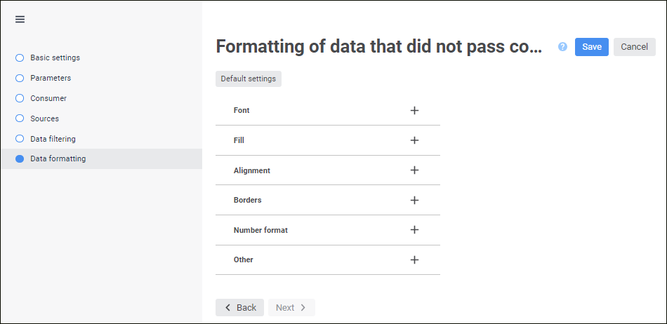
To set up formatting style, use the Formatting of Data That did not Pass Control page in the control block editing wizard:
Use the following tabs to set a style:
Set font options:
Font. Select one of the available fonts in the drop-down list. If required, one can load custom fonts.
Font size. Set the required font size. The size is set in points, and it can be selected in the drop-down list or entered manually. The range of available values: [6; 36].
Color. Select text color in the drop-down palette or set it in the RGB or HEX format.
Font Style. Select font style:
B. Bold.
I. Italic.
U. Underline.
S. Strikethrough.
When the button is pressed, the corresponding font style is used. Several styles can be used simultaneously, for example, pressed B and I buttons result in bold italic font style.
Cell text alignment. Set text alignment relative to the cell:
Left. Default value.
Center.
Right.
By width.
Only one option can be selected.
To set up fill, set the parameters:
Fill Color. Select the following in the drop-down menu of the Fill Color button:

Fill Type. The option is available for regular reports, data entry forms, information panels, and calculation blocks:
No Fill. Default value.
Solid Fill.
Two-Color Fill. It is available for regular reports, data entry forms, and calculation blocks.
Fill Color:
To use solid fill, select a color in the color palette or set it in the RGB or HEX format.
To use two-color fill, select a start and end color in the color palette or set it in the RGB or HEX format.
Fill Color Transparency. Change fill color transparency using the slider or enter the value in the box.
Fill Tilt Angle. Enter two-color fill tilt angle.
Hatching Type. If required, add hatching. The parameter is set to No Hatching by default. The drop-down list contains all available hatching types.
Hatching Color. The parameter is displayed after a hatching type is selected. Select color in the drop-down palette or set it in the RGB or HEX format.
To determine a method for inside cell alignment, use the Alignment group of settings. Cell value can be aligned horizontally and vertically with selected rotation angle and paddings from the cell borders. Wrap method can also be selected for string values.
Set the options of value position within a cell:
Alignment. Set value alignment method:
Horizontal. Available options:
By Value. Alignment depends on the cell(s) contents. If a cell contains only numbers (including thousands separators, decimal separators, and the percent sign), it is right-aligned; otherwise, it is left-aligned. Default value.
Left. The value is aligned to the cell's left border.
Center. The value is aligned at the same distance from the left and right cell border taking into account defined paddings.
Right. The value is aligned to the cell's right border.
By Width. The value is aligned to fit cell width.
Vertical. Available options:
Top. The value is aligned to the cell's top border.
Center. The value is aligned at the same distance from the top and bottom cell border taking into account defined paddings.
Bottom. The value is aligned to the cell's bottom border. Default value.
Paddings. Set paddings between contents and cell borders: in each box set padding size for the corresponding cell border.
Text Rotation. Set text tilt angle in a cell.
Wrap Text. Set text wrapping in cells:
Do not Hyphenate. The text is not wrapped. The entire text is displayed as a single line.
By Words. Cell text is wrapped. The width of a cell determines where line breaks occur.
There are the following cell border options:
Show borders. The parameter is used to show and hide cell borders. The following options are available:
 . Show all borders.
 . Show only external borders.
 . Show only internal borders.
 . Do not show borders.
Multiple selection is available for the options that determine one border type:
 . Show internal horizontal border.
 . Show internal vertical border.
 . Show left border.
 . Show right border.
 . Show top border.
 . Show bottom border.
Line Type. Select line type in the drop-down list.
Fill Color. Select the following in the drop-down menu of the Fill Color button:
Fill Type. The option is available for regular reports, data entry forms, information panels, and calculation blocks:
No Fill. Default value.
Solid Fill.
Fill Color. Select color in the color palette or set it in the RGB or HEX format.
Fill Color Transparency. Change fill color transparency using the color transparency slider or enter the value in the box.
To change data format settings, select one of the supported data formats in the drop-down list. Depending on the selected format, different settings are available:
General. Equal to canceling formatting. If the General format is selected, the following settings are available:
Decimal Separator. Select separator type in the drop-down list.
Number. Default format. If the Number format is selected, the following settings are available:
Decimal Places. Select the number of displayed decimal places.
Negative Numbers. Select format of displaying negative numbers.
Thousands Separator. Set the checkbox to apply the thousands separator option. The checkbox is deselected by default.
Decimal Separator. Select separator type in the drop-down list.
Thousands Separator. Select separator type in the drop-down list.
Percentage. If the Percentage format is selected, the following settings are available:
Decimal Places. Select the number of displayed decimal places.
Decimal Separator. Select separator type in the drop-down list.
If percentage format is used, number values are multiplied by 100 and the "%" character is added. Values entered into a cell are processed in different ways depending on the way the "%" character is used. For example, when 40% is entered, the cell displays 40%, but the cell value is 0.4. When 40 is entered, the cell displays 4000%, but the cell value is 40.
Currency. If the Currency format is selected, the following settings are available:
Decimal Places. Sets the number of displayed decimal places.
Symbol. Sets currency symbol.
Negative Numbers. Select format of displaying negative numbers.
Decimal Separator. Select separator type in the drop-down list.
Thousands Separator. Select separator type in the drop-down list.
Date. If the Date format is selected, the following settings are available:
Type. Select date display format in the drop-down list.
Time. If the Time format is selected, the following settings are available:
Type. Select time display format in the drop-down list.
Exponential. This format is used to show a number in exponential format. If the Exponential format is selected, the following settings are available:
Decimal Places. Select the number of displayed decimal places.
Decimal Separator. Select separator type in the drop-down list.
Text. Equal to canceling formatting. Text format is selected by default for the cells containing non-numeric values.
Additional. If the Additional format is selected, the following settings are available:
Type. To automatically convert value, select the preset option:
Zip code.
Telephone number.
Table number.
Custom. It contains code views of all available data formats. If the Custom format is selected, the following settings are available:
Type. To automatically convert value, select the preset option:
Currency. Select currency display format in the drop-down list.
Date and Time. Select time display format in the drop-down list.
Numbers. Select number display format in the drop-down list.
Other. Select other display format in the drop-down list.
Decimal Separator. Select separator type in the drop-down list.
Thousands Separator. Select separator type in the drop-down list.
To set up cell editor, set data display parameters as a special string containing editor type, default value, and so on. The string can be edited:
In the Set Up Cell Editor box.
In the Set Up Display dialog box. To open the dialog box, click the  Set Up Display button:

Setting up cell editor is identical to setting up value editor. By default, data display parameter is selected in accordance with the selected format.
To display always active cell editor, deselect the Show Editor Only on Activated Cell checkbox. The checkbox is selected by default, and the editor is displayed only on activated cell.
Determine other settings:
To fill in empty or zero cells, enter text, number, or characters in corresponding boxes. The values, with which empty cells are filled, including numeric ones, will not be saved in the data source.
To manage cell edit locking, hide cell contents or deny selection, set the options:
Locked. When the checkbox is selected, cell contents will be locked for editing.
Hide Formulas. When the checkbox is selected, cell contents with formulas will be hidden and cannot be edited. Data obtained as a result of formula calculation should be displayed in the cell.
Deny Selection. When the checkbox is selected, the cell becomes unselectable on opening the form in the view mode. The context menu for this cell will not be called. While trying to select cell denied for selection, the focus remains on the previously selected cell till the next cell available for selection is selected. One can move by available cells in the table using the keyboard. When the cell range where there are unselectable cells is selected, all unselectable cells remain unselected.
Tooltip Text. Enter tooltip text for a locked cell.
To determine whether cell contents should be printed, select or deselect the Print Cell checkbox. When the Print Cell checkbox is deselected, the cell contents is not printed. Text, hyperlinks, and background color or pattern are not exported. This checkbox is selected for all cells by default.
To reset the specified style and restore the default style, click the  Reset Settings button.
NOTE. When a data entry form is built and when a calculation algorithm is selected, the custom style settings are determined for data that did not pass control. These settings have a higher priority comparing to style settings in the control block. For example, if font settings are determined in the data entry form and control block, the font settings from the data entry form are used for data formatting.
See also:
Inserting and Setting Up Control Blocks

 Font
Font