A bubble chart is a scatter chart where data points are replaced with bubbles and its color and sizes serve as additional data dimensions. A bubble chart does not have the category axis. The horizontal and vertical axes are value axes. In addition, a bubble chart contains an animated timeline, which displays the frequency of values.
IMPORTANT. Before getting started with the visualizer make sure that system requirements to client computer are met for the desktop application, and to BI server for the web application. The web application supports visualizers if BI server is installed in Windows 10 or later. The visualizer may look differently depending on the DirectX 11 or OpenGL 3.1 graphics libraries in use.
To display express report data as a bubble chart, click the ![]() Bubble Chart button on the View ribbon tab. The top right corner of the working area displays the
Bubble Chart button on the View ribbon tab. The top right corner of the working area displays the ![]() Bubble Chart button, clicking which displays report data as a bubble chart.
Bubble Chart button, clicking which displays report data as a bubble chart.
To hide the bubble chart, release the ![]() Bubble Chart button in the working area.
Bubble Chart button in the working area.
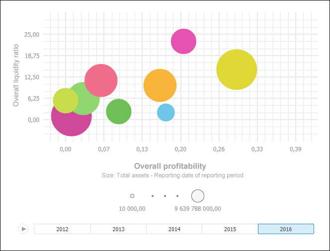
Example of bubble chart:
Get started with a bubble chart by setting up dimensions.
See also:

 Set up plot area
 button, to pause animation, click the
  button. To navigate along the timeline, use:
 left and right buttons in the web application.