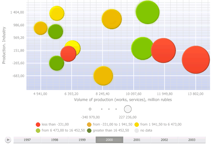
A bubble chart is a scatter chart where data points are replaced with bubbles and its color and sizes serve as additional data dimensions. A bubble chart does not have the category axis. The horizontal and vertical axes are value axes. In addition, a bubble chart contains an animated timeline, which displays the frequency of values.
To display express report data as a bubble chart, click the ![]() Bubble Chart button on the View ribbon tab. The
Bubble Chart button on the View ribbon tab. The ![]() Bubble Chart button appears in the top right corner of the working area,
and clicking the button presents the report data as a bubble chart.
Bubble Chart button appears in the top right corner of the working area,
and clicking the button presents the report data as a bubble chart.
To hide a bubble chart, release the ![]() Bubble Chart button in the working area.
Bubble Chart button in the working area.
Example of bubble chart:

To start timeline animation, click the ![]() button,
to pause animation, click the
button,
to pause animation, click the ![]() button. To move along the timeline, use the
button. To move along the timeline, use the ![]() slider.
slider.
To zoom in the bubble chart scroll up, to zoom out scroll down.
The user can move along the plot area of the zoomed in bubble chart by clicking the left mouse button while holding down the CTRL key.
Get started with a bubble chart by setting up dimensions.
See also: