Data Series Point Format
A data series point is a separate data series value that shows value from the data array, based on which the data series is built.
To set up data series point formatting parameters, use the Data Series Point Format group of parameters on the side panel.
 Open the Data Series Point Format group of parameters

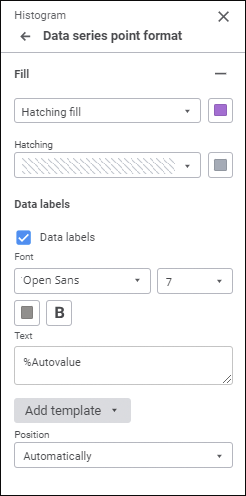
NOTE. The number of displayed parameters depends on the chart or series type.
The tab contains the following point parameters:
Fill.
Point Fill
To set up point fill, open the drop-down palette and select fill type in the drop-down list:
NOTE. Point fill is available for histograms, mixed charts, and pie charts.
No Fill. Fill is not used.
Automatic Fill. Default value. Automatic solid fill is used.
Solid Fill. Select a solid fill color for the point in the drop-down palette. If required, specify fill opacity percent.
Two-Color Fill. Select the start and the end colors of two-color gradient in the drop-down palette. If required, specify tilt angle and fill opacity percent.
Heterogeneous Fill. Select a solid fill line gradient color in the drop-down palette. If required, specify fill opacity percent.
Hatching Fill. Execute the operations:
Select solid fill color in the drop-down palette. If required, specify fill color and hatching color transparency percent.
Select texture option in the Hatching drop-down list.
Select hatching color in the drop-down color palette.
One can select standard and custom colors in the drop-down palette. The palette contains only standard colors by default. To create a custom color, use the advanced color palette that is available after clicking the  Add Color button. The maximum possible number of custom colors in the palette is 23. To delete custom color from the palette, select the Delete item in the selected color's context menu.
To reset fill settings, click the  Delete button.
Point Data Labels
To display labels for the selected series, select the Data Labels checkbox.
Determine the settings:
Label Font
Determine font settings:
Font. Select one of the available fonts in the drop-down list. If required, one can load custom fonts.
Font Size. Select the required font size. Size is set in points, it can be selected in the drop-down list or entered using the keyboard. The range of available values: [8; 36].
Color. Select font color in the drop-down palette. One can select standard and custom colors. The palette contains only standard colors by default.
To create a custom color:
Click the
Add Color button. The advanced color palette opens.
Select a color in the advanced color palette, use color picker to select color on a browser page, or set color code in the RGB or HEX format.
After executing the operations the custom color is created and added to the palette.
NOTE. The maximum possible number of custom colors in the a palette is 23.
To delete custom color from the palette, select the Delete item in the selected color's context menu.
Font Style. Select font style:
B. Bold.
I. Italic.
U. Underline.
When the button is pressed, the corresponding font style is used. Several styles can be used simultaneously, for example, pressed B and I buttons result in bold italic font style.
Label Text
A custom text, template can be set for the label, or combination of both. To enter text and templates, use the Text box.
To add a template to the label text:
Click the Add Template button.
In the drop-down list select one of the available text templates.
After executing the operations the selected template will be added to label text after the cursor.
Available templates:
%PointNo. Point number.
%PointName. Point name.
%SerieNo. Series number.
%SerieName. Series name.
%Data. Custom data format. Format can be set up using the Fore language.
%PercentPartHundredth. Cumulative shares.
%PercentPart. Percentage cumulative shares.
%PercentHundredth. Shares are ratio of the series point value to sum of values for this point in all series.
%Percent. Percent shares are ratio of the series point value to sum of values for this point in all series, shown as a percentage.
%Part. Cumulative value.
%YValue. Point value along the Y axis.
%XValue. Point value along the X axis.
%Value. Point value.
%Autovalue. Default value. Automatic value format. Series point value will be used for all charts except the pie charts. The ratio of a series point and a sum of values of the same point of all series is used for pie charts, secondary pit charts and secondary histogram.
Label Position
The following data label position options are available for points:
Automatically.
Center.
Inside end.
Outside end.
Inside base.
Custom label position.
NOTE. The Left, Top, Right, and Bottom options are available for line charts, scatter charts, bubble charts, stepped charts, radar charts, area charts. The Inside End, Outside End, and Inside Base options are not available.
When the Custom label position option is selected, the following can be determined:
Horizontal label position. In the drop-down list select horizontal label position option:
Right.
Center.
Left.
The Center option is selected by default.
Vertical label position. In the drop-down list select vertical label position option:
Bottom.
Center.
Top.
The Center option is selected by default.
Label offset. Set label offset length relative to a series horizontally, vertically and label offset percentage relative to column length.
Total
To display waterfall chart columns as totals, select the Total checkbox. When the checkbox is selected, the column changes color for the color selected for totals and is offset to the X axis.
The checkbox is available for all chart points.
The checkbox can also be selected in the series point's context menu.