Chart Axes
Axes are chart components that are used to organize data on a chart. Headers of table rows and columns form a coordinate grid that enables the user to determine each cell's address. The similar function is executed with by the category axis (X) and the value axis (Y) on a chart. Axes are shown on all charts, except pie and doughnut charts, secondary histograms and secondary pie charts.
A secondary axis is an auxiliary value axis, which can display:
Values of data series that strongly differ from other series' values.
Series values shown on the chart in different types of data (for example, price and volume).
One or several data series can be shown in the secondary axis.
A grid is a set of lines perpendicular to the axis. Major gridlines start from each major tick mark and cross the entire chart plot area, minor gridlines start from each minor tick mark.
Major tick marks are labeled perpendicular strokes at the axis line, while minor tick marks are strokes that bear no labels, positioned on the axis line between the major tick marks.
To set up chart axes, use the Category Axis (X), Value Axis (Y) and Value Axis (Secondary) tabs on the side panel.
NOTE. To set up radar chart axes, use the Value Axis group of parameters.
 Open the Category Axis (X), Value Axis (Y), and Value Axis (Secondary) group of parameters

 Parameters button on the toolbar, then select the required group.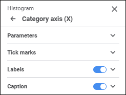
Settings depend on the selected axis and chart.
Determine the settings:
Parameters
Set up axis parameters:
Position axis between tick marks
Reverse order or categories/values
 Add Color button. The maximum possible number of custom colors in the palette is 23. To delete custom color from the palette, select the Delete item in the selected color's context menu.
Tick Marks
Set up tick marks:
Labels
To set up axis tick mark labels, toggle the Labels switch to active state and determine the parameters:
Automatic intervals between labels
To reset label settings, toggle the Labels switch to inactive state.
Caption
It is available for all charts, except radar charts.
To display caption, toggle the Caption switch to active state:
The axis caption area will be displayed near the axis. Enter the text in the axis caption area. It is available for all chart types, except secondary pie charts, secondary histograms, 3D pie chart with absolute values, stock exchange charts, histograms with fluctuation intervals, box charts, box charts with linear series.
Enter caption text in the Caption Text box to display in on the chart. It is available for secondary pie charts, secondary histograms, 3D pie charts with absolute values, stock exchange charts, histograms with fluctuation intervals, box charts, box charts with linear series.
Determine caption settings:
 Delete button.
To hide the caption, toggle the Caption switch to inactive state.
Caption Formatting Quick Setup
To quickly set up caption formatting, use the Formatting tab on the toolbar:

Select the caption on the chart and set the parameters:
 Font Color button and select text color in the drop-down color palette. One can select standard and custom colors. The palette contains only standard colors by default. To create a custom color, use the advanced color palette that is available after clicking the
  Font Color button changes for the selected color.
 Fill Color button. The color palette opens. Select a fill method:
 No Color button. Fill is not used by default.
 Fill Color button changes to the selected color, and if two-color fill is selected, it changes to the gradient.
 Left
Left Center
 Right
RightQuick setup of the caption is available for all chart types, except secondary pie charts, secondary histograms, 3D pie charts with absolute values, stock exchange charts, histograms with fluctuation intervals, box charts, box charts with linear series.
To set mixed caption formatting, change font options of the selected text part. The action is available only during the quick setup of caption formatting.