Create a new web form
A web form is a main tool for creating a visual interface of web applications. The interface is created by placing various components on a web form. Each web form has a corresponding unit, which contains form class description. Class name should match the value of the name property of the web form.
Web forms are based on the React framework written in the JavaScript language and CSS Flexbox technologies. Application code of web forms is written in the Fore language. Properties and methods of web forms as repository objects are described by the IWebForm interface, as development environment components - by the IWebFormComponent interface.
Web forms by default open modally relative to the place where they are opened. The maximum number of modal web forms opened relative to each other is five. To change web form work mode, use the modal property that is available in the design mode.
NOTE. Working with web forms is available only in the web application. When working with web forms take into account work features.
To toggle between the web form and the macro window, press F7/SHIFT+F7 or click the  /
/ buttons in the right part of the development environment window.
To display the components panel, click the  button in the left part of the development environment window. To place a component on a web form, click the component on the components panel, then click on the form where it should be added. The Properties/Events panel is used to set component properties and event handlers. The list of available properties includes only the properties that can be changed in the web form design mode. The component code contains only the properties that can be changed on web form execution.
The web form has different properties and methods available in the design mode and execution mode.
text. Text displayed in the web form title.
name. Web form name.
alignItems. Align flex components relative to the Y axis. Available values:
flex-start. Components are aligned at the beginning of the Y axis.
center. Components are centered along the Y axis.
flex-end. Components are aligned at the end of the Y axis.
color. Web form background color.
flexDirection. The main axis, along which flex components will be arranged. The value is set relative to the parent component, which stores flex components. Available values:
column. Default value. Components are arranged vertically.
row. Components are arranged horizontally.
imageCollection. The collection of images that will be used by web form components. The following file formats can be used: BMP, GIF, JPG, JPEG, PNG, ICO, SVG. The added images will be displayed without compression and in original size, take it into account during file selection. The components that use images:
justifyContent. Align components relative to the main axis. Available values:
flex-start. Default value. Components are shifted to the beginning of the main axis.
center. Components are centered along the main axis.
flex-end. Components are shifted to the end of the main axis.
space-around. Components are uniformly distributed along the main axis with equal free space around them. Visual free space between the outmost components and axis borders will be less because free space between components consists of two free spaces of each component.
space-between. Components are uniformly distributed along the main axis. The first element is at the beginning of the axis, the last component is at the end.
modal. Indicates whether web form works modally. If the value is True, the web form opens modally relative to the repository or the object, from which it opens. If the value is False, the web form opens in a new browser tab.
padding. Distance between web form borders and its components. Property values affect the position of elements relative to parent element: position = relative.
popupMenu. Context menu displayed for web form. As a value, specify one of the PopupMenu components located on the form.
size. Web form sizes.
NOTE. The flexDirection, aligments, justifyContent properties affect position of the components, for which the position property is set to relative.
Properties:
Clipboard. Web form clipboard.
Color. Web form background color.
Enabled. Indicates whether web form is available for the user.
PopupMenu. The context menu displayed in the component. As a value, specify one of the PopupMenu components located on the form.
StartupObject. Description of the currently running object.
Text. Text displayed in the web form title.
Visible. Indicates whether web form is visible.
Methods:
Close. It closes the current web form.
ShowObject. It opens the specified repository object.
onShow. The event occurs before displaying web form.
onCommand. The event occurs when web form gets a command that can be sent using the SendCommand method.
To visually format a web form, use components.
See also:
Developing User Application | Web Form Work Features | Web Form Components
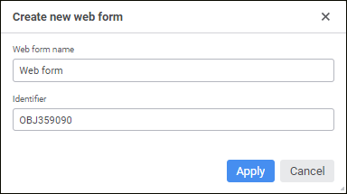
 Create button in the main menu and select object type on the