The Speedometer component is a visual component designed to graphically show a data set using a marked scale. An arrow that moves around the axis shows indicator values.
The Speedometer component is implemented by the Speedometer class.
To show a specific set of data this component uses:
Radial scale.
Indicator that moves around the circle within the specified limits.
The user can select different colors for each data range, to show sector positions, for example, green sector color for a tolerable value, and red sector color for critical values.
Minimum and maximum values (upper and lower limit) are defined on each chart.
The user can define range colors to classify data. For example, the user can define a range named Best that consists of values between 60 and 100 and assign a unique color to this range to distinguish it from other ranges.
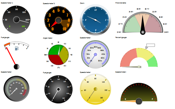
Various speedometer appearances are shown in the figure below:
The component can be shown as a fuel gauge unit:
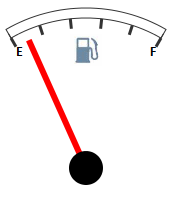
The example of creating a speedometer is given on the Example of Creating a Fuel Gauge Unit page.
Speedometer displayed as a hand watch:
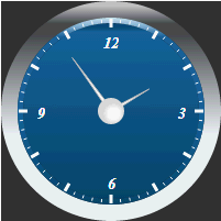
The example of creating is given on the Example of Creating Hand Watch page.
Example of Creating a Speedometer with a Wizard
| Constructor name | Brief description | |
 |
Speedometer | The Speedometer constructor creates an instance of the Speedometer component. |
| Property name | Brief description | |
 |
Background | The Background property determines brush for speedometer background fill. |
|
BaseHeight | The BaseHeight property determines base height of speedometer. |
|
BaseWidth | The BaseWidth property sets base width of the speedometer. |
|
Borders | The Borders property determines an array of elements that set speedometer rendering parameters. |
|
BorderStyle | The BorderStyle property sets style of speedometer borders. |
|
Center | The Center property determines a marker for rendering speedometer center. |
|
CenterLabel | The CenterLabel property determines a central text label of speedometer. |
|
CenterPosition | The CenterPosition property determines coordinates of speedometer center. |
|
Markers | The Markers property determines an array of elements that set parameters of rendering speedometer markers. |
|
NumberFormat | The NumberFormat property determines speedometer data format. |
|
OuterRadius | The OuterRadius property determines speedometer radius. |
|
Padding | The Padding property determines component paddings. |
|
Scales | The Scales property determines an array of elements that set speedometer scale rendering parameters. |
|
TimeLineStep | The TimeLineStep property determines a current step of timeline. |
| Method name | Brief description | |
|
calcCenterPosition | The calcCenterPosition method calculates coordinates of speedometer center. |
|
calcOuterRadius | The calcOuterRadius method calculates speedometer radius if this radius is not set relative to the container size. |
|
getArrowById | The getArrowById method returns arrow by its ID. |
|
getChildren | The getChildren method returns an array of speedometer children. |
|
getInstance | The getInstance method returns an instance of the current speedometer. |
|
getOpacityEnabled | The getOpacityEnabled method returns indication that the speedometer uses opacity. |
|
getState | The getState method returns speedometer scale settings. |
|
getSVGNode | The getSVGNode method returns SVG element that is used to render a speedometer. |
|
paint | The paint method paint background and borders of SVG element according to the settings. |
|
redraw | The redraw method rerenders a speedometer. |
|
redrawScales | The redrawScales method rerenders all speedometer scales. |
|
refreshView | The refreshView method refreshes speedometer view based on the specified settings. |
|
setMasterSettings | The setMasterSettings method applies the specified speedometer settings. |
| Event name | Brief description | |
 |
Loaded | The Loaded event occurs after speedometer loading. |
|
Refreshed | The Refreshed event occurs after speedometer view is refreshed. |
| Property name | Brief description | |
|
Background | The Background property determines a brush for element background fill. |
|
Border | The Border property determines a brush for element borders. |
|
BorderEnabled | The BorderEnabled property determines whether speedometer element has a border. |
|
BorderStyle | The BorderStyle property determines style of element borders. |
|
BorderWidth | The BorderWidth property determines element border width. |
|
MajorArrow | The MajorArrow property determines main arrow for speedometer scale. |
|
Name | The Name property sets name for speedometer scale pointer. |
|
OpacityEnabled | The OpacityEnabled property determines whether element transparency settings are used. |
|
Shadow | The Shadow property determines element shadow. |
| Method name | Brief description | |
|
calcOffset | The calcOffset method calculates radial offset from the scale center. |
|
calcSize | The calcSize method calculates marker size. |
| Property name | Brief description | |
|
Anchors | The Anchors property determines position of the component placed within container. |
|
Animation | The Animation property determines component animation parameters. |
|
Bottom | The Bottom property determines a bottom margin if a component is placed inside LayoutPanel. |
|
Content | The Content property determines component contents. |
|
ContextMenu | The ContextMenu property determines a component's context menu. |
|
Data | The Data property is used to store any custom data. |
|
Enabled | The Enabled property determines whether a component can be used. |
|
Height | The Height property determines component height. |
|
IsRTL | The IsRTL property determines whether component elements are aligned to the right. |
|
IsVisible | The IsVisible property determines whether a component is displayed. |
|
Left | The Left property determines a left margin if a component is placed inside GridPanel. |
|
Opacity | The Opacity property determines component transparency. |
|
Parent | The Parent property determines a parent component of a control. |
|
ParentNode | The ParentNode property determines a parent DOM node. |
|
ResourceKey | The ResourceKey property determines a component resource key. |
|
Right | The Right property determines a right margin if a component is placed inside LayoutPanel. |
|
Rotate | The Rotate property determines a component rotation angle. |
|
ShowToolTip | The ShowToolTip property determines whether a tooltip of the component can be displayed. |
|
Style | The Style property determines a component style. |
|
TabIndex | The TabIndex property determines the order of the control element passing inside the container. |
|
Tag | The Tag property determines a JSON object associated with the component. |
|
ToolTip | The ToolTip property determines text of component tooltip. |
|
Top | The Top property determines a top margin if a component is placed inside GridPanel. |
|
Value | The Value property determines a component value. |
|
Width | The Width property determines component width. |
| Method name | Brief description | |
|
The addClass method adds a CSS class to the component. | |
|
addEventHandler | The addEventHandler method adds an event handler to a DOM node. |
|
The addStateClass method adds a CSS class to the component and removes the previous CSS class. | |
|
The addToNode method adds a component to the specified node. | |
|
bindEvents | The bindEvents method subscribes an element to all available events. |
|
The getAnchorFlags method returns JSON object that contains settings of the current component's position. | |
|
The getClass method returns the current CSS classes of the component. | |
|
The getCssStyle method returns style for the specified node. | |
|
The getDomNode method returns main DOM node of the component. | |
|
The getFocused method determines whether the component is focused. | |
|
getIsBinded | The getIsBinded method returns whether an element is subscribed to all DOM node events. |
|
The hide method hides a control. | |
|
The hideToolTip method clears tooltip timeout and hides the tooltip if it is shown. | |
|
refreshStyle | The refreshStyle method refreshes element CSS styles. |
|
The removeClass method removes CSS class from the component. | |
|
removeEventHandler | The removeEventHandler method removes event handler from DOM node. |
|
removeFromDOM | The removeFromDOM method removes node from the DOM structure. |
|
The removeStateClasses method removes CSS classes of the component. | |
|
The setDraggable method determines whether a component can be dragged on the HTML page. | |
|
The setFocus method sets the component focus. | |
|
The setIsHovered method sets up component displaying only on mouseover. | |
|
The setSize method establishes the sizes of the component. | |
|
The show method displays a control. | |
|
unBindEvents | The unBindEvents method unsubscribes an element from all standard events. |
|
The updatePosition method updates size and position when absolute positioning based on the current parameters is used. | |
|
The updateSize method updates the component size on changing the size of the container that contains the component. |
| Event name | Brief description | |
|
Drag | The Drag event occurs on clicking and holding the mouse button. |
|
DragEnd | The DragEnd event occurs when dragging the component finishes. |
|
DragStart | The DragStart event occurs when dragging the component starts. |
|
OnContextMenu | The OnContextMenu event occurs on calling context menu of the component. |
|
SizeChanged | The SizeChanged event occurs after the component is resized. |
|
SizeChanging | The SizeChanging event occurs during component resize. |
| Property name | Brief description | |
|
The Id property determines a repository object identifier. |
| Method name | Brief description | |
|
clone | The clone method creates an object copy. |
|
dispose | The dispose method deletes the component. |
|
getHashCode | The getHashCode method returns hash code of repository object. |
|
getId | The getId method returns repository object identifier. |
|
getSettings | The getSettings method returns repository object settings. |
|
getTypeName | The getTypeName method returns the name of the object type without the namespace, to which it belongs. |
|
isEqual | The isEqual method determines whether the specified object is equal to the current repository object. |
|
isLive | The isLive method determines validity of repository object. |
|
removeAllEvents | The removeAllEvents method removes all object event handlers by the specified context. |
|
setId | The setId method determines a repository object identifier. |
|
setSettings | The setSettings method determines repository object settings. |
|
defineProps | The defineProps method creates get and set methods from name array for the specified class. |
|
keys | The keys method returns array of methods and properties names for the specified object. |
See also: