To execute the example, create an HTML page, and in the HEAD tag add links to the following JS and CSS files:
PP.js.
PP.GaugeMaster.js.
PP.GraphicsBase.js.
PP.Charts.js.
resources.ru.js.
PP.css.
If Internet Explorer is used, also add the following JS and CSS files:
PP_IE7.css.
jquery.js.
The Fuel_icon.png file must be stored at the same level with the HTML page.
In the SCRIPT tag add the following script to create the Speedometer component:
var speedometer1 = {
    ParentNode: document.body,
    Loaded: function (speedometer) //initial component initialization
    {
        // increment step of arrow position
        var increment = .1;
        // Initialization of counter arrow variable
        var arrow = this.getScales(1).getArrows(0);
        // function that sets magnitude of counter arrow movement
        ticker = function () {
            arrow.setValue(arrow.getValue() + increment);
            if (arrow.getValue() >= 49.8)
                increment = -.1;
            if (arrow.getValue() <= .2)
                increment = .1;
        };
        // function that performs the ticker code many times  in equal time intervals set in milliseconds
        window.setInterval(ticker, 10);
    },
    ToolTip: {
        Content: "Angular Gauge"
    },
    Width: 200,
    Height: 200,
    CenterPosition: "100, 180",
    Center: //determining marker of speedometer center drawing
    {
        PPType: PP.Ui.CircleMarker,
        Size: 17, //use of CircleMarker
        Background: {
            PPType: PP.SolidColorBrush,
            Color: "#000000"
        },
    },
    OuterRadius: "150,150", //determining of speedometer radius
    Scales: //determining parameters that set displaying of speedometer scale
    [{
        ToolTip: {
            Content: "Scale"
        },
        Background: {
            PPType: PP.SolidColorBrush,
            Color: "#E9E9E9"
        },
        Size: 0,
        Length: -60,
        StartAngle: 150,
        MinValue: 0,
        MaxValue: 2,
        Values: [1],
        Labels: [""],
        MajorTick: {
            PPType: PP.Ui.ImageMarker, //use of ImageMarker
            Src: "Fuel_icon.png", //image path
            Height: "32", //image height
            Width: "32", //image width
            Style: PP.GaugeStyleLabels.Inner
        }
    }, {
        ToolTip: {
            Content: "Scale"
        },
        Background: {
            PPType: PP.SolidColorBrush,
            Color: "#E9E9E9"
        },
        Size: 0,
        Length: -60,
        StartAngle: 150,
        MinValue: 0,
        MaxValue: 50,
        Values: [0, 10, 20, 30, 40, 50],
        Labels: ["", "", "", "", "", ""],
        MajorTick: {
            PPType: PP.Ui.LineMarker, //use of LineMarker
            Border: {
                PPType: PP.SolidColorBrush,
                Color: "#333333"
            },
            Size: 10,
            Style: PP.GaugeStyleLabels.Inner,
            Offset: -5,
            BorderWidth: 3
        },
        Arrows: //determining of parameters of arrow display
        [{
            DimAttributeId: "attr1",
            PPType: PP.Ui.LineArrow, //use of LineArrow
            Radius: 140,
            Tail: 0,
            Size: 6,
            Border: {
                PPType: PP.SolidColorBrush,
                Color: "#FF0000"
            }
        }],
        Sectors: [{
            StartValue: 0,
            EndValue: 50,
            Background: {
                PPType: PP.SolidColorBrush,
                Color: "#FFFFFF"
            },
            StartSize: 10,
            EndSize: 10,
            Offset: -10,
            Border: {
                PPType: PP.SolidColorBrush,
                Color: "#333333"
            }
        }],
        Step: 1
    }, {
        ToolTip: {
            Content: "Scale"
        },
        Background: {
            PPType: PP.SolidColorBrush,
            Color: "#E9E9E9"
        },
        Size: 0,
        Length: -60,
        StartAngle: 150,
        MinValue: 0,
        MaxValue: 1,
        Values: [0, 1],
        Labels: ["E", "F"],
        LabelFont: {
            Size: 14,
            IsBold: true
        },
        RotateLabels: false,
        MajorTick: {
            PPType: PP.Ui.LineMarker, //use of LineMarker
            Border: {
                PPType: PP.SolidColorBrush,
                Color: "#333333"
            },
            Size: 10,
            Style: PP.GaugeStyleLabels.Inner
        }
    }]
};
var speed1 = new PP.Ui.Speedometer(speedometer1);
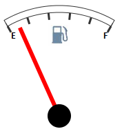
After executing the example the Speedometer component that looks as follows is added onto the HTML page:
See also: