The ListBox component is a list.
The component is implemented by the ListBox class.
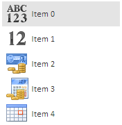
The component looks as follows:
Elements of the list are instances of ListItem and IconListItem components. The list may contain icons as it is shown on the picture above. Icons are contained in the file the address of which is specified in parameters of the ImageList non-visual component.
Example of creating the ListBox component.
The list may be located vertically or horizontally. The horizontal list looks as follows:
Elements of this horizontal list are icons implemented by the IconListItem class.
Example of creating the horizontal list.
Elements from one list may be transferred to another list with the help of the Drag&Drop mechanism.
Example of creating the ListBox component with the Drag&Drop mechanism.
| Constructor name | Brief description | |
 |
ListBox | The ListBox constructor creates an instance of the ListBox. |
| Property name | Brief description | |
 |
EmptySelection | The EmptySelection property determines whether an empty set of elements can be selected. |
|
EnableEdit | The EnableEdit property determines whether list elements can be edited. |
|
EnableKeyboard | The EnableKeyboard property determines whether the user can select list elements using UP and DOWN keys. |
|
ImageList | The ImageList property determines a set of icons for the ListBox component. |
|
IsScrollToSelected | The IsScrollToSelected property determines whether the list is scrolled up to the selected element. |
|
Items | The Items property contains an array of list elements. |
|
MultiSelect | The MultiSelect property determines whether multiple selection is available for list elements. |
|
Orientation | The Orientation property determines orientation of the ListBox component. |
|
SelectedIndex | The SelectedIndex property determines index of the selected list line. |
|
SelectedItem | The SelectedItem property determines the selected list element. |
|
SelectOnMouseDown | The SelectOnMouseDown property determines whether elements are selected on the mouse click. |
| Method name | Brief description | |
|
addItem | The addItem method adds a new element to list. |
|
beginUpdate | The beginUpdate method determines whether the list is updated. |
|
clear | The clear method removes all elements from the list. |
|
clearSelection | The clearSelection method is used to reset selection. |
|
endUpdate | The endUpdate method removes whether the list is updated. |
|
filterByText | The filterByText method filters list elements by string. |
|
getActiveItem | The getActiveItem method returns the selected list element. |
|
getItemByPoint | The getItemByPoint method returns list element by the specified coordinates. |
|
getLastItemClick | The getLastItemClick method returns the last selected list element. |
|
getLayoutItems | The getLayoutItems method returns an array of list elements. |
|
getScrollBox | The getScrollBox method returns scrolling region of elements list. |
|
getSelectedItems | The getSelectedItems method returns array of selected list elements. |
|
insertItem | The insertItem method adds an element to the position of the elements list set by the index parameter. |
|
removeItem | The removeItem method removes the element of the list by the specified index. |
|
scrollToItem | The scrollToItem method scrolls the list up to the item element. |
|
scrollToSelected | The scrollToSelected method scrolls the list up to the selected list element. |
|
selectItemById | The selectItemById method selects the element with the specified Id identifier. |
|
setSelectedFocus | The setSelectedFocus method sets focus on the element index. |
| Event name | Brief description | |
 |
ItemClick | The ItemClick event occurs on clicking a list element. |
|
ItemDeselected | The ItemDeselected event occurs on removing selection from list element. |
|
ItemEdited | The ItemEdited event occurs after completing editing of list element. |
|
ItemEditing | The ItemEditing event occurs on starting editing of list element. |
|
ItemMouseDown | The ItemMouseDown event occurs on pressing and holding down the mouse button on the element. |
|
ItemSelected | The ItemSelected event occurs on selecting a list element. |
|
SelectableSelected | The SelectableSelected event occurs on any click on the list element. |
| Property name | Brief description | |
|
Anchors | The Anchors property determines position of the component placed within container. |
|
Animation | The Animation property determines component animation parameters. |
|
Bottom | The Bottom property determines a bottom margin if a component is placed inside LayoutPanel. |
|
Content | The Content property determines component contents. |
|
ContextMenu | The ContextMenu property determines a component's context menu. |
|
Data | The Data property is used to store any custom data. |
|
Enabled | The Enabled property determines whether a component can be used. |
|
Height | The Height property determines component height. |
|
IsRTL | The IsRTL property determines whether component elements are aligned to the right. |
|
IsVisible | The IsVisible property determines whether a component is displayed. |
|
Left | The Left property determines a left margin if a component is placed inside GridPanel. |
|
Opacity | The Opacity property determines component transparency. |
|
Parent | The Parent property determines a parent component of a control. |
|
ParentNode | The ParentNode property determines a parent DOM node. |
|
ResourceKey | The ResourceKey property determines a component resource key. |
|
Right | The Right property determines a right margin if a component is placed inside LayoutPanel. |
|
Rotate | The Rotate property determines a component rotation angle. |
|
ShowToolTip | The ShowToolTip property determines whether a tooltip of the component can be displayed. |
|
Style | The Style property determines a component style. |
|
TabIndex | The TabIndex property determines the order of the control element passing inside the container. |
|
Tag | The Tag property determines a JSON object associated with the component. |
|
ToolTip | The ToolTip property determines text of component tooltip. |
|
Top | The Top property determines a top margin if a component is placed inside GridPanel. |
|
Value | The Value property determines a component value. |
|
Width | The Width property determines component width. |
| Method name | Brief description | |
|
The addClass method adds a CSS class to the component. | |
|
addEventHandler | The addEventHandler method adds an event handler to a DOM node. |
|
The addStateClass method adds a CSS class to the component and removes the previous CSS class. | |
|
The addToNode method adds a component to the specified node. | |
|
bindEvents | The bindEvents method subscribes an element to all available events. |
|
The getAnchorFlags method returns JSON object that contains settings of the current component's position. | |
|
The getClass method returns the current CSS classes of the component. | |
|
The getCssStyle method returns style for the specified node. | |
|
The getDomNode method returns main DOM node of the component. | |
|
The getFocused method determines whether the component is focused. | |
|
getIsBinded | The getIsBinded method returns whether an element is subscribed to all DOM node events. |
|
The hide method hides a control. | |
|
The hideToolTip method clears tooltip timeout and hides the tooltip if it is shown. | |
|
refreshStyle | The refreshStyle method refreshes element CSS styles. |
|
The removeClass method removes CSS class from the component. | |
|
removeEventHandler | The removeEventHandler method removes event handler from DOM node. |
|
removeFromDOM | The removeFromDOM method removes node from the DOM structure. |
|
The removeStateClasses method removes CSS classes of the component. | |
|
The setDraggable method determines whether a component can be dragged on the HTML page. | |
|
The setFocus method sets the component focus. | |
|
The setIsHovered method sets up component displaying only on mouseover. | |
|
The setSize method establishes the sizes of the component. | |
|
The show method displays a control. | |
|
unBindEvents | The unBindEvents method unsubscribes an element from all standard events. |
|
The updatePosition method updates size and position when absolute positioning based on the current parameters is used. | |
|
The updateSize method updates the component size on changing the size of the container that contains the component. |
| Event name | Brief description | |
|
Drag | The Drag event occurs on clicking and holding the mouse button. |
|
DragEnd | The DragEnd event occurs when dragging the component finishes. |
|
DragStart | The DragStart event occurs when dragging the component starts. |
|
OnContextMenu | The OnContextMenu event occurs on calling context menu of the component. |
|
SizeChanged | The SizeChanged event occurs after the component is resized. |
|
SizeChanging | The SizeChanging event occurs during component resize. |
| Property name | Brief description | |
|
The Id property determines a repository object identifier. |
| Method name | Brief description | |
|
clone | The clone method creates an object copy. |
|
dispose | The dispose method deletes the component. |
|
getHashCode | The getHashCode method returns hash code of repository object. |
|
getId | The getId method returns repository object identifier. |
|
getSettings | The getSettings method returns repository object settings. |
|
getTypeName | The getTypeName method returns the name of the object type without the namespace, to which it belongs. |
|
isEqual | The isEqual method determines whether the specified object is equal to the current repository object. |
|
isLive | The isLive method determines validity of repository object. |
|
removeAllEvents | The removeAllEvents method removes all object event handlers by the specified context. |
|
setId | The setId method determines a repository object identifier. |
|
setSettings | The setSettings method determines repository object settings. |
|
defineProps | The defineProps method creates get and set methods from name array for the specified class. |
|
keys | The keys method returns array of methods and properties names for the specified object. |
See also: