A label enables the user to locate various text data in a dashboard.
To insert a label, use:
The Label item in the drop-down menu of the Other button on the Home ribbon tab.
The Label button in the Other group on the Insert ribbon tab.
The Label item in the drop-down menu of the New Block item in the dashboard's context menu.
Example of the Image, Label and Visualizer blocks:

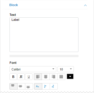
Use the Block tab on the side panel. The same parameters available for all dashboard objects are also available for a label. Additional settings are also available:

Text. Specify label text.
Font. Set up label font style:
Font. Select one of the fonts available in the operating system.
Font size. Set the required font size. The size is set in points, and it can be selected in the drop-down list or entered manually. Available values range: [1; 72].
Font style. Click the buttons that determine the font style:
B. Bold.
I. Italic.
U. Underline.
When the button is pressed, the corresponding font style is used. Several styles can be used simultaneously, for example, pressed buttons B and I result in bold italic font style.
Horizontal alignment of label. Set label alignment relative to its borders:
 Left. Default.
 Center.
 Right.
 Width.
Font Color. Select font color in the drop-down palette.
Vertical alignment of label. Set label alignment relative to its borders:
 To the top. Default.
 Center.
 To the bottom.
Orientation of label text. Determine text orientation:
 Horizontal from left to right. Default.
 Vertical from top to bottom.
 Vertical from bottom to top.
To manage the action executed on the label click, use the Command tab on the side panel. The commands available for the Button control, are also available for the label.
If a command is set for the label, the label text is underlined and on pointing to the label the cursor turns to ![]() .
.
See also: