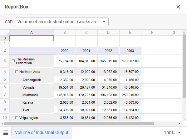
The ReportBox component is used to display and work with repository regular reports.
The component has different properties available in the design mode and in the web form execution mode.
name. Component name.
borderColor. Component border color.
coordinate. Coordinate of the top left corner of the component. Coordinates can be specified in pixels or percents relative to parent component sizes. The property is available if the position property is set to absolute.
enabled. Indicates whether the component is available for the user.
flexGrow. The property determines what proportion of container free space should be allocated for the component. If all components are set to 1, container free space is uniformly distributed between the components. If one of the components is set to 2, it occupies two times more free space, and so on. The property is available if the position property is set to relative.
mobj. The composite property, which sets a regular report key displayed in the component.
padding. Distance between component borders and component contents. Paddings can be specified in pixels or percents relative to component sizes.
popupMenu. The context menu displayed in the component. As a value, specify one of the PopupMenu components located on the form.
position. The method of component positioning on web form or inside container component. The property is set to absolute by default, the component has fixed position and size determined by the coordinate and size properties. If the property is set to relative, component position and sizes change depending on container component sizes. The coordinate property will be unavailable. Component position will be determined by the flexDirection, aligments, justifyContent properties of the parent component, and component sizes will change if the size property is set in percents.
showControlPanel. Indicates whether controls are displayed in the component.
showTabs. Indicates whether report sheet tabs are displayed.
showHeaders. Indicates whether row and column headers are displayed in table.
size. Component sizes. Sizes can be specified in pixels or percents relative to parent component sizes.
visible. Indicates whether the component is visible on running web form.
BorderColor. Component border color.
Color. Component background color.
Enabled. Indicates whether the component is available for the user.
PopupMenu. The context menu displayed in the component. As a value, specify one of the PopupMenu components located on the form.
Report. Regular report, used in the component.
Text. Text displayed in the component.
Visible. Indicates whether the component is available for the user.
The component has the onCellChange event that is generated on changing a cell value. The event does not provide information about the changed cell and is used to interact with other web form components. To get information about the changed cell, use the event handler of regular report and corresponding method of the ReportEvents class.
See also:
Creating a Web Form and Components Layout