The TreeCombo component is used to display tree-like hierarchical structures, such as an object inheritance tree, in the form of drop-down lists.
Select the component elements by clicking on the element icon or on the element itself, or pressing the SPACE key.
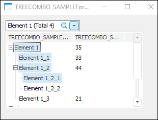
Double-clicking the column border automatically fits the left column. The column width is adjusted based on all elements that the node may contain (including expander, checkbox, icon, status icon, and node text).
By default, information on the element selection is displayed in the component editor. To update this information automatically, use the AutoUpdateInfo property. To display user data in the component editor, change the Text base property.
If search has been successful, the cursor will focus on the found element. Selection state depends on value of the FindMode property. Depending on the selected multiple selection mode, the element is added to selection using the SPACE key, or by holding down the CTRL key.
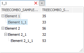
The user can also search for elements with the collapsed component drop-down list. When the component is focused, entering a set of characters creates a list of elements, which names contain this set of characters:
Elements are selected using the previously noted method, depending on the value specified in the SelectionMode property. Closing this dialog box applies the selection to the component.
The user can search for one or several words based on segments in any mode. To do this, separate the search combinations with whitespace character. The word order in the names of search elements is ignored.
In the form execution mode, click the header of the appropriate column to sort data by it. The data is sorted in the ascending direction. Double-clicking changes sorting direction. To sort data by multiple columns, click the headers of the required columns while holding down the CTRL key. The sorting order is as follows: the column, which header is clicked last, is sorted last.
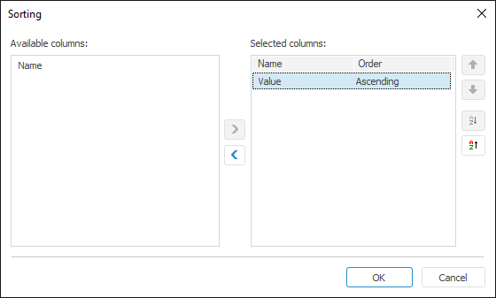
This dialog box opens when selecting the appropriate item from the context menu called in the column header area.
Move the columns that are used to sort by to the selection list. The  and
and  buttons are used to change sorting direction by the selected column. The
  and the
  buttons are used to change the sorting order. Columns at the top of the list are sorted first.
| |
Property name |
Brief description |
 |
Align |
The Align property determines behavior of the component when its parent component is resized. |
|
AllowDrag |
The AllowDrag property determines whether an object can be dragged from the component. |
|
AllowDrop |
The AllowDrop property determines whether the component can accept a dragged object. |
|
Anchors |
The Anchors property returns settings that determine the percentage of the size change for the current component when the parent component is resized. |
|
AnimationType |
The AnimationType property determines a type of animation to be used when component's combobox is expanded. |
|
AutoCheckParent |
The AutoCheckParent property determines whether the parent nodes of the component automatically receive an indefinite state if not all of the child elements are selected. |
|
AutoUpdateInfo |
The AutoUpdateInfo property determines whether information on selection is automatically refreshed in the component editor. |
|
BorderStyle |
The BorderStyle property determines a component border style. |
|
Brush |
The Brush property determines the brush that is used to fill component area. |
|
CancelOnEscape |
The CancelOnEscape property determines whether selection is canceled, and the list is closed when the ESC key is pressed. |
|
Checkboxes |
The Checkboxes property determines whether elements have checkboxes. |
|
ClientHeight |
The ClientHeight property is used to receive or specify the height of the component’s client area. |
|
ClientWidth |
The ClientWidth property is used to receive or specify the width of the component’s client area. |
|
CloseOnClick |
The CloseOnClick property determines whether the list is automatically closed when one of the elements is selected with a mouse click. |
|
CloseOnEnter |
The CloseOnEnter property determines whether the list is closed, and the selection is saved when the ENTER key is pressed. |
|
Color |
The Color property determines a component background color. |
|
ColumnClick |
The ColumnClick property determines whether column headers can be displayed as buttons. |
|
Columns |
The Columns property returns the component columns collection. |
|
ComponentCount |
The ComponentCount property returns the number of child components. |
|
Components |
The Components property returns the child component. |
|
Cursor |
The Cursor property determines the look of the cursor over the component. |
|
CustomMultiselectText |
The CustomMultiselectText property determines whether a custom template is used to form component text on multiple selection. |
|
CustomMultiselectTextTemplate |
The CustomMultiselectTextTemplate property determine the template, according to which component text will be formed on multiple selection. |
|
Data |
The Data property is used to store any custom data. |
|
Dropped |
The Dropped property returns the status of the drop-down list. |
|
DroppedListHeight |
The DroppedListHeight property determines height of the component's drop-down list. |
|
DroppedListWidth |
The DroppedListWidth property determines width of the component's drop-down list. |
|
DroppedPopupMenu |
The DroppedPopupMenu property determines the context menu, which is opened in the area of the components's drop-down list. |
|
DropTargetNode |
The DropTargetNode property determines the component node, over which the user is currently dragging another node. |
|
Enabled |
The Enabled property determines whether the component is available for the user. |
|
EnableFindDialog |
The EnableFindDialog property determines whether the standard element search dialog box opens on pressing CTRL+F or F3. |
|
FilterStyle |
The FilterStyle property determines a mode of creating a tree of filtered elements. |
|
FindEditVisible |
The FindEditVisible property determines whether a search field is displayed when the component drop-down list is expanded. |
|
FindMode |
The FindMode property determines a mode of marking found elements. |
|
Focused |
The Focused property returns True if the focus is set on the component. |
|
FocusedNode |
The FocusedNode property determines the node, which is currently focused. |
|
Font |
The Font property determines the set of characteristics describing the font that is used to display text. |
|
GridLines |
The GridLines property determines whether a grid is displayed. |
|
HeaderMenu |
The HeaderMenu property determines the context menu opened by clicking the component column header with the additional mouse button. |
|
Height |
The Height property determines component height. |
|
HelpContext |
The HelpContext property determines a unique index for the context help section for this component. |
|
HideSelection |
The HideSelection property determines whether the selected component element remains selected when the focus moves to another component. |
|
HighlightTrack |
The HighlightTrack property determines whether to highlight element on mouseover. |
|
Hint |
The Hint property determines a component tooltip text. |
|
HotTrack |
The HotTrack property determines whether the elements are underlined on mouseover. |
|
HotTrackAutoExpand |
The HotTrackAutoExpand property determines whether the state of child elements tree is changed on clicking the selected element. |
|
Images |
The Images property contains a list of images used for nodes rendering. |
|
InnerRoot |
The InnerRoot property returns parameters of inner root node of the tree. |
|
Left |
The Left property determines the coordinate of the left border of the component. |
|
Locked |
The Locked property determines whether it is possible to change selection and edit component elements. |
|
Name |
The Name property determines a component name. |
|
Nodes |
The Nodes property returns the component elements collection. |
|
Parent |
The Parent property determines a parent component. |
|
ParentColor |
The ParentColor property determines whether the component inherits the color of the parent component. |
|
ParentFont |
The ParentFont property determines whether the component uses the font of the parent component. |
|
ParentShowHint |
The ParentShowHint property determines whether a tooltip is displayed. |
|
PopupMenu |
The PopupMenu property determines the context menu opened by clicking the component with the additional mouse button. |
|
ReadOnly |
The ReadOnly property determines whether elements are available for editing. |
|
RowSelect |
The RowSelect property determines whether the whole row is highlighted when an element is selected. |
|
Scrolls |
The Scrolls property returns parameters of component's scrollbars. |
|
Selected |
The Selected property determines the last selected tree element. |
|
Selection |
The Selection property returns the tree element selection. |
|
SelectionMode |
The SelectionMode property determines a mode of selecting component elements. |
|
ShowButtons |
The ShowButtons property determines whether expand/collapse child elements buttons are displayed. |
|
ShowColumnHeaders |
The ShowColumnHeaders property determines whether column headers are displayed. |
|
ShowEditImage |
The ShowEditImage property determines whether the icon element is displayed in the component editor. |
|
ShowHint |
The ShowHint property enables and disables showing a component tooltip. |
|
ShowHints |
The ShowHints property determines whether tooltips are displayed when the mouse cursor hovers over elements. |
|
ShowLines |
The ShowLines property determines whether the line connecting a node with its children is displayed. |
|
ShowSystemHints |
The ShowSystemHints property determines whether a system tooltip is displayed for different component elements. |
|
SortColumn |
The SortColumn property determines index of the column, by which sorting is executed. |
|
Sorted |
The Sorted property determines whether it is possible to execute sorting by the column specified in the SortColumn property. |
|
SortType |
The SortType property determines a component sorting type. |
|
StateImages |
The StateImages property determines a source of icons for the selected elements. |
|
TabOrder |
The TabOrder property determines the component position in the tab order. |
|
TabStop |
The TabStop property determines whether the component is focused when the TAB key is pressed. |
|
Tag |
The Tag property is not used by the compiler. The user can change the value of the Tag property and use it as he wishes. |
|
Text |
The Text property determines the row identifying a component for the user. |
|
Top |
The Top property determines the coordinate of the top border of the component. |
|
Visible |
The Visible property determines visibility of the component during execution. |
|
Width |
The Width property determines component width. |
| |
Event name |
Brief description |
 |
OnAdded |
The OnAdded event occurs when a new element is added. |
|
OnBeginDrag |
The OnBeginDrag event occurs for a component when the user starts to drag an object from the component. |
|
OnBeginFilter |
The OnBeginFilter event occurs at the start of filtering of component elements list. |
|
OnBeginSearch |
The OnBeginSearch event occurs when elements are started to be searched in the component. |
|
OnChecked |
The OnChecked event occurs when the element checkbox is selected. |
|
OnChecking |
The OnChecking event occurs when the element checkbox is selected. |
|
OnClick |
The OnClick event occurs if the user clicks the component area. |
|
OnCollapsed |
The OnCollapsed event occurs after collapsing the hierarchy of the tree node children. |
|
OnCollapsing |
The OnCollapsing event occurs before collapsing the hierarchy of tree node children. |
|
OnColumnClick |
The OnColumnClick event occurs on mouse click on the component column header. |
|
OnCompareItems |
The OnCompareItems event occurs during comparison of two elements during custom element sorting. |
|
OnDblClick |
The OnDblClick event occurs if the user double-clicks the component area. |
|
OnDeleting |
The OnDeleting event occurs when the element is deleted. |
|
OnDragDrop |
The OnDragDrop event occurs for the component if the user drops a dragged object over it. |
|
OnDragEnter |
The OnDragEnter event occurs when a dragged object crosses the borders of this component. |
|
OnDragLeave |
The OnDragLeave event occurs when a dragged object leaves the borders of this component. |
|
OnDragOver |
The OnDragOver event occurs for the component when the user drags an object over it. |
|
OnDropDown |
The OnDropDown event occurs on expanding the component list. |
|
OnEdited |
The OnEdited event occurs on exiting the mode of editing the contents of the component current record field. |
|
OnEditing |
The OnEditing event occurs when switching to the mode of editing the field contents of the current component record. |
|
OnEnter |
The OnEnter event occurs when the component receives focus. |
|
OnExit |
The OnExit event occurs when the component loses focus. |
|
OnExpanded |
The OnExpanded event occurs after expanding the hierarchy of tree node children. |
|
OnExpanding |
The OnExpanding event occurs directly before expanding the tree node children hierarchy. |
|
OnFilter |
The OnFilter event occurs after the components list is filtered. |
|
OnFocusedChanged |
The OnFocusedChanged event occurs when the focus is moved to another component element. |
|
OnFocusedChanging |
The OnFocusedChanged event occurs before the focus is moved to another component node. |
|
OnGetHint |
The OnGetHint event occurs when a tooltip is displayed over the element, over which the mouse cursor is hovered. |
|
OnGetNodeImage |
The OnGetNodeImage event occurs on determining an image near the tree element. |
|
OnGetNodeStateImage |
The OnGetNodeStateImage event occurs on determining the state images near the tree element. |
|
OnHover |
The OnHover event occurs when the mouse cursor hovers over the element and this component element is underlined. |
|
OnHScroll |
The OnHScroll event occurs when horizontal scrollbar slider changes its position. |
|
OnKeyDown |
The OnKeyDown event occurs if the component is focused and a keyboard key is pressed. |
|
OnKeyPress |
The OnKeyPress event occurs if the component is focused when the user presses a character key. |
|
OnKeyPreview |
The OnKeyPreview event occurs prior to each event related to key pressing. |
|
OnKeyUp |
The OnKeyUp event occurs if the component is focused and the user releases any button previously pressed. |
|
OnMouseDown |
The OnMouseDown event occurs if the pointer is in component's area and a mouse key is pressed. |
|
OnMouseEnter |
The OnMouseEnter event occurs when mouse cursor enters the component area. |
|
OnMouseHover |
The OnMouseHover event occurs when mouse cursor is held in the component area. |
|
OnMouseLeave |
The OnMouseLeave event occurs when mouse cursor leaves the component area. |
|
OnMouseMove |
The OnMouseMove event occurs on moving the cursor over component. |
|
OnMouseUp |
The OnMouseUp event occurs on releasing mouse button when the cursor is in component area. |
|
OnMouseWheel |
The OnMouseWheel event occurs if the component is focused when the mouse wheel is rotated. |
|
OnRollUp |
The OnRollUp event occurs when the component list is collapsed. |
|
OnSearch |
The OnSearch event occurs after the element search in the component is finished. |
|
OnSelected |
The OnSelected event occurs after selecting a node. |
|
OnSelecting |
The OnSelecting event occurs before selecting a node. |
|
OnSelectionChanged |
The OnSelectionChanged event occurs when the component element selection is changed. |
|
OnUnselected |
The OnUnselected event occurs after deselecting a node. |
|
OnUnselecting |
The OnUnselecting event occurs before deselecting an element. |
|
OnVScroll |
The OnVScroll event occurs when vertical scrollbar slider changes its position. |
 button the search is executed. The search is executed in cycles by all the elements hierarchy.