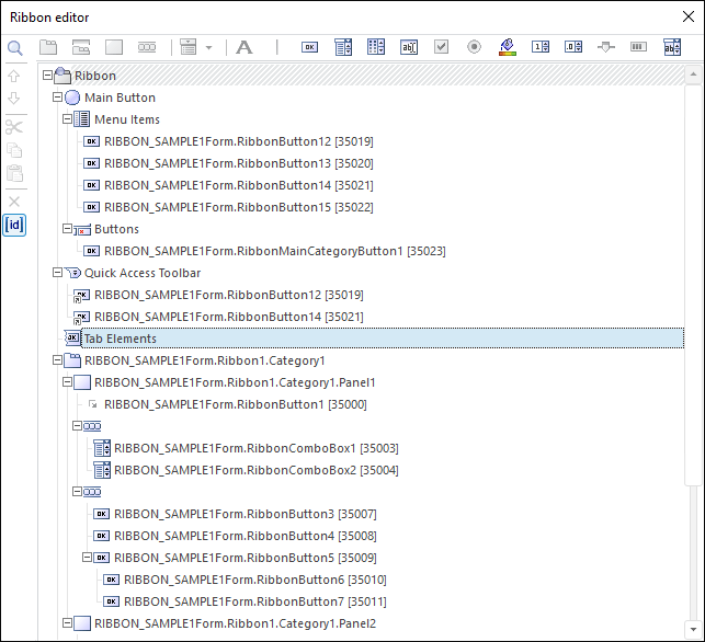
The ribbon editor opens on selecting the Edit context menu item of the Ribbon component:

The editor shows ribbon structure as a tree. By default, the tree shows elements representing key areas of the ribbon:
Ribbon. The top ribbon level where tabs and context tabs are created.
Main Button. The element that is used to set up an application button.
Menu Items. The element that is used to set up main menu items.
Buttons. The element that is used to set up additional buttons of the main menu.
Quick Access Toolbar. The element that is used to set up the quick access bar.
Tab Elements. The element that is used to set up general controls.

 General principles of work in editor
To create a ribbon, use editor menu buttons or context menu items. The editor menu consists of two parts. The upper part houses buttons for creating controls. The left part houses buttons for editing ribbon structure. Buttons availability changes automatically depending on the currently selected ribbon element. The ![]() button enables the user to show or hide unique identifier generated for each control. This identifier can be used to set up handler of the OnChange event of the Ribbon component. The
button enables the user to show or hide unique identifier generated for each control. This identifier can be used to set up handler of the OnChange event of the Ribbon component. The ![]() button controls displaying of the search string. The search is executed by control text. To find a control, enter required text and press the ENTER key or click the Find button. The found element is highlighted in the ribbon tree and its properties are displayed in the object inspector.
button controls displaying of the search string. The search is executed by control text. To find a control, enter required text and press the ENTER key or click the Find button. The found element is highlighted in the ribbon tree and its properties are displayed in the object inspector.
The ![]() and
and ![]() buttons enable the user to move control within its parent element. Elements created in the tree can also be moved using the Drag&Drop mechanism. Available places where the dragged element can be dropped are selected automatically depending on the element type. If the CTRL key is held down while dragging an element, this control is copied.
buttons enable the user to move control within its parent element. Elements created in the tree can also be moved using the Drag&Drop mechanism. Available places where the dragged element can be dropped are selected automatically depending on the element type. If the CTRL key is held down while dragging an element, this control is copied.
All control parameters are set up in the object inspector.
Context tabs are created at the upper level of the ribbon. Standard tabs are created at the upper level of the ribbon or within context tabs.
To create a context tab:
Select the Ribbon element or a previously created tab or context tab.
Click the ![]() button (Select the Add Context Category context menu item).
button (Select the Add Context Category context menu item).
A context tab is created at the upper level of the ribbon.
To create a tab:
Select the Ribbon element or a previously created tab or context tab.
Click the ![]() button (Select the Add Category context menu item).
button (Select the Add Category context menu item).
If a context tab was selected, the new tab is created within it. If a standard tab or the Ribbon element was selected, a new tab is created at the upper level of the ribbon.
In the object inspector in the LargeImages and SmallImages properties, determine large and small icons that will be used for tab controls.
Panels are created within tabs. To create a panel:
Select a tab.
Click the ![]() button (Select the Add Panel context menu item).
button (Select the Add Panel context menu item).
Panels can house various controls. When elements are added, they are arranged from top to bottom, from left to right.
Controls can be created on panels or can be components of other elements. The following controls can be added to the ribbon:
![]() - static text.
- static text.
![]() - delimiter.
- delimiter.
![]() - button.
- button.
![]() - combobox.
- combobox.
![]() - button for opening a component palette.
- button for opening a component palette.
![]() - text editor.
- text editor.
![]() - checkbox.
- checkbox.
![]() - radio button.
- radio button.
![]() - color selection button.
- color selection button.
![]() - integer editor.
- integer editor.
![]() - slider.
- slider.
![]() - progress bar.
- progress bar.
To insert a control, select a panel and click one of the editor menu buttons listed above (Select the Add context menu item).
If a control can have child elements, the ![]() button is available in the ribbon editor menu, and the context menu includes the Add Subelement group.
button is available in the ribbon editor menu, and the context menu includes the Add Subelement group.
NOTE. Different controls have different collection of available subelements.
A group is used to combine controls and arrange them horizontally as a single line. To add a group, click the ![]() button (select the Add Group context menu item). The following controls can be used for a group:
button (select the Add Group context menu item). The following controls can be used for a group:
Buttons.
Comboboxes.
Buttons that open a combobox.
Text editors.
Color selection buttons.
Integer editors.

 Set up main application button
To set up main application button, select the Main Button element. In the object inspector, in the Image property determine the image to be displayed on the main button.
To create main menu items, select the Menu Items element and create required subelements. Delimiters and buttons can be used as subelements. In the object inspector in the LargeImages and SmallImages properties select large and small items for the Menu Items element; these icons will be used for elements included into the main menu. Large icons use images with the size 32*32 pixels, small icons are 16*16 pixels.
An additional group of commands can be displayed in the main menu of the ribbon under other commands. This group can include maximum three controls. To set up an additional group, select the Buttons element and create required subelements. Only buttons can be used as subelements.
NOTE. Due to some peculiarities of implementation, the additional buttons created in the Buttons group are arranged in reverse order after starting the form. Consider this when creating a ribbon using the editor.
Quick access toolbar displays frequently used controls. To add an element to the quick access toolbar, select the required control in the ribbon editor, and drag it to subelement panel of the Quick Access Toolbar element. Visually a control shortcut is created.
The following elements can be placed on the quick access toolbar:
Panels.
Buttons.
Comboboxes.
Buttons for opening a component palette.
Text editors.
Checkboxes.
Radio buttons.
Color selection buttons.
Integer editors.
Sliders.
Progress bars.
General controls can be used to execute minor operations. To set up general controls, select the Tab Elements element and create required subelements for this element. The following elements can be used as general controls:
Buttons.
Comboboxes.
Buttons for opening a component palette.
Text editors.
Color selection buttons.
Integer editors.
See also: