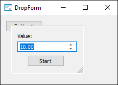
The DropForm component is used to create drop-down forms.
To provide component work, in the MetabaseObject property specify identifier of the repository form that is used as a drop-down form. Inserting the component into a form automatically opens a dialog box for selecting a form.
The form is expanded from the application code by means of the DropDown method. The view of the window, which displays the form, depends on the BorderStyle property value of the form connected in the component. If the property is set to FormBorderStyle.None, the form is displayed in a box without a frame. When another value is set, the form is framed. If the BorderStyle property is set to FormBorderStyle.Sizeable, the window can be resized.
NOTE. Changing the BorderStyle property value for the form used in the component is available at the form design stage.
Expanded drop-down form properties are available in the Form property. The expanded form can be collapsed by means of the RollUp method. The drop-down form is also collapsed when it loses focus.

| Property name | Brief description | |
 |
AnimationType | The AnimationType property determines a type of animation to be used when a form is expanded. |
 |
ComponentCount | The ComponentCount property returns the number of child components. |
 |
Components | The Components property returns the child component. |
 |
Data | The Data property is used to store any custom data. |
 |
DropHeight | The DropHeight property determines the height of the area where a drop-down form is displayed. |
 |
DropWidth | The DropWidth property determines the width of the area where a drop-down form is displayed. |
 |
Form | The Form property returns parameters of the drop-down form. |
 |
MetabaseObject | The MetabaseObject property determines identifier of the repository form that is used as a drop-down form. |
 |
Name | The Name property determines a component name. |
 |
Parent | The Parent property determines a parent form for the component. |
 |
SizeGrip | The SizeGrip property determines whether the window resize button is displayed in the component. |
 |
Tag | The Tag property is not used by the compiler. The user can change the value of the Tag property and use it as he wishes. |
| Method name | Brief description | |
 |
DropDown | The DropDown method expands a form. |
 |
RollUp | The RollUp method collapses a form. |
| Event name | Brief description | |
 |
OnDropDown | The OnDropDown event occurs when a drop-down form is expanded. |
 |
OnRollUp | The OnRollUp event occurs when a drop-down form is collapsed. |
See also: