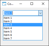
The ComboBox component combines functions of the ListBox and EditBox components.
The component enables the user to select a value in the list or set a custom value.
The difference of the ComboBox from the similar ListBox component is the following:
ComboBox allows the user to enter his own values.
ComboBox can be expanded as well as collapsed (ListBox is always expanded).
ComboBox does not allow multiple selection.
The main property of the component is Items. This list can be filled when a form is being developed (designed). To do this, click a button with ellipsis next to the property in the Objects Inspector window or select the Elements item in the component's context menu.
The main event of the OnChange component occurs when a text in the edit window is changed as a result of direct editing or selecting in the list.
Component style depends on the Style property.
The user choice or the text entered by the user can be determined by the value of the Text property.
The index of the element selected by the user can be determined by the value of the ItemIndex property.
| Property name | Brief description | |
 |
Align | The Align property determines behavior of the component when its parent component is resized. |
|
AllowDrag | The AllowDrag property determines whether an object can be dragged from the component. |
|
AllowDrop | The AllowDrop property determines whether the component can accept a dragged object. |
|
Anchors | The Anchors property returns settings that determine the percentage of the size change for the current component when the parent component is resized. |
|
Brush | The Brush property determines the brush that is used to fill component area. |
|
ClientHeight | The ClientHeight property is used to receive or specify the height of the component’s client area. |
|
ClientWidth | The ClientWidth property is used to receive or specify the width of the component’s client area. |
|
Color | The Color property determines a component background color. |
|
ComponentCount | The ComponentCount property returns the number of child components. |
|
Components | The Components property returns the child component. |
|
Cursor | The Cursor property determines the look of the cursor over the component. |
|
Data | The Data property is used to store any custom data. |
|
DropDownCount | The DropDownCount property determines the maximum number of elements simultaneously displayed in a drop-down list. |
|
DroppedDown | The DroppedDown property returns True if the drop-down list of the component is expanded. |
|
Enabled | The Enabled property determines whether the component is available for the user. |
|
Focused | The Focused property returns True if the focus is set on the component. |
|
Font | The Font property determines the set of characteristics describing the font that is used to display text. |
|
Height | The Height property determines component height. |
|
HelpContext | The HelpContext property determines a unique index for the context help section for this component. |
|
Hint | The Hint property determines a component tooltip text. |
|
ItemCount | The ItemCount property returns the number of rows in a drop-down list. |
|
ItemHeight | The ItemHeight property returns the height of elements (rows) of a drop-down list. |
|
ItemIndex | The ItemIndex property determines the index of the selected list element. |
|
Items | The Items property returns the drop-down list rows collection. |
|
Left | The Left property determines the coordinate of the left border of the component. |
|
MaxLength | The MaxLength property determines the maximum length of the entered text. |
|
Name | The Name property determines a component name. |
|
Parent | The Parent property determines a parent component. |
|
ParentColor | The ParentColor property determines whether the component inherits the color of the parent component. |
|
ParentFont | The ParentFont property determines whether the component uses the font of the parent component. |
|
ParentShowHint | The ParentShowHint property determines whether a tooltip is displayed. |
|
PopupMenu | The PopupMenu property determines the context menu opened by clicking the component with the additional mouse button. |
|
Scrolls | The Scrolls property returns parameters of component's scrollbars. |
|
SelLength | The SelLength property determines the number of characters selected in the component text. |
|
SelStart | The SelStart property determines the cursor position, from which to start text selection in the component. |
|
SelText | The SelText property determines the text selected in the component. |
|
ShowHint | The ShowHint property enables and disables showing a component tooltip. |
|
Sorted | The Sorted property determines whether the rows in the drop-down list must be automatically sorted in alphabetical order. |
|
Style | The Style property determines a style of displaying drop-down list. |
|
TabOrder | The TabOrder property determines the component position in the tab order. |
|
TabStop | The TabStop property determines whether the component is focused when the TAB key is pressed. |
|
Tag | The Tag property is not used by the compiler. The user can change the value of the Tag property and use it as he wishes. |
|
Text | The Text property determines the row identifying a component for the user. |
|
Top | The Top property determines the coordinate of the top border of the component. |
|
Visible | The Visible property determines visibility of the component during execution. |
|
Width | The Width property determines component width. |
| Method name | Brief description | |
 |
BringToFront | The BringToFront method brings a component to front. |
|
ClearEdit | The ClearEdit method clears the component edit box. |
|
ClientToScreen | The ClientToScreen method converts the coordinates of a point specified relative to the component coordinate system into screen coordinates. |
|
DoDragDrop | The DoDragDrop method enables to start dragging operation. |
|
GetImage | The GetImage method returns the image of the component with all the child components. |
|
SelectAll | The SelectAll method selects all component text in the component edit box. |
|
ScreenToClient | The ScreenToClient method converts screen coordinates of a point into coordinates specified relative to the component coordinate system. |
|
SendToBack | The SendToBack method sends a component to back. |
|
SetFocus | The SetFocus method sets focus to this component. |
| Event name | Brief description | |
 |
OnBeginDrag | The OnBeginDrag event occurs for a component when the user starts to drag an object from the component. |
|
OnChange | The OnChange event occurs when the text in the component edit box is changed. |
|
OnClick | The OnClick event occurs if the user clicks the component area. |
|
OnDblClick | The OnDblClick event occurs if the user double-clicks the component area. |
|
OnDragDrop | The OnDragDrop event occurs for the component if the user drops a dragged object over it. |
|
OnDragEnter | The OnDragEnter event occurs when a dragged object crosses the borders of this component. |
|
OnDragLeave | The OnDragLeave event occurs when a dragged object leaves the borders of this component. |
|
OnDragOver | The OnDragOver event occurs for the component when the user drags an object over it. |
|
OnDropDown | The OnDropDown event occurs when a drop-down list is displayed. |
|
OnEnter | The OnEnter event occurs when the component receives focus. |
|
OnExit | The OnExit event occurs when the component loses focus. |
|
OnHScroll | The OnHScroll event occurs when horizontal scrollbar slider changes its position. |
|
OnItemSelect | The OnItemSelect event occurs when an element is selected from the list. |
|
OnKeyDown | The OnKeyDown event occurs if the component is focused and a keyboard key is pressed. |
|
OnKeyPress | The OnKeyPress event occurs if the component is focused when the user presses a character key. |
|
OnKeyPreview | The OnKeyPreview event occurs prior to each event related to key pressing. |
|
OnKeyUp | The OnKeyUp event occurs if the component is focused and the user releases any button previously pressed. |
|
OnMouseDown | The OnMouseDown event occurs if the pointer is in component's area and a mouse key is pressed. |
|
OnMouseEnter | The OnMouseEnter event occurs when mouse cursor enters the component area. |
|
OnMouseHover | The OnMouseHover event occurs when mouse cursor is held in the component area. |
|
OnMouseLeave | The OnMouseLeave event occurs when mouse cursor leaves the component area. |
|
OnMouseMove | The OnMouseMove event occurs on moving the cursor over component. |
|
OnMouseUp | The OnMouseUp event occurs on releasing mouse button when the cursor is in component area. |
|
OnMouseWheel | The OnMouseWheel event occurs if the component is focused when the mouse wheel is rotated. |
|
OnVScroll | The OnVScroll event occurs when vertical scrollbar slider changes its position. |
See also: