The EditBox component is a one-line text editor.
The main application of the EditBox component is to enter any parameters values.
After entering, the text can be used and it is the value of the Text parameter of the component.
The edit box performs many functions that are usual for the majority of editors. The typical hotkeys can be used in the edit box:
CTRL+C. Copying the selected text to the clipboard.
CTRL+X. Cutting the selected text to the clipboard.
CTRL+V. Pasting text from the clipboard.
CTRL+Z. Canceling the last editing command.
| Property name | Brief description | |
 |
Align | The Align property determines behavior of the component when its parent component is resized. |
|
AllowDrag | The AllowDrag property determines whether an object can be dragged from the component. |
|
AllowDrop | The AllowDrop property determines whether the component can accept a dragged object. |
|
Anchors | The Anchors property returns settings that determine the percentage of the size change for the current component when the parent component is resized. |
|
AutoSelect | The AutoSelect property determines whether component text is selected when the component gets focused. |
|
BorderStyle | The BorderStyle property determines a component border style. |
|
Brush | The Brush property determines the brush that is used to fill component area. |
|
CanUndo | The CanUndo property returns True if it is possible to undo text changes in the component. |
|
CharacterCasing | The CharacterCasing property determines the case of the entered characters. |
|
ClientHeight | The ClientHeight property is used to receive or specify the height of the component’s client area. |
|
ClientWidth | The ClientWidth property is used to receive or specify the width of the component’s client area. |
|
Color | The Color property determines a component background color. |
|
ComponentCount | The ComponentCount property returns the number of child components. |
|
Components | The Components property returns the child component. |
|
Cursor | The Cursor property determines the look of the cursor over the component. |
|
Data | The Data property is used to store any custom data. |
|
Enabled | The Enabled property determines whether the component is available for the user. |
|
Focused | The Focused property returns True if the focus is set on the component. |
|
Font | The Font property determines the set of characteristics describing the font that is used to display text. |
|
Height | The Height property determines component height. |
|
HelpContext | The HelpContext property determines a unique index for the context help section for this component. |
|
HideSelection | The HideSelection property determines whether the selected component text remains the same when the focus moves to another component. |
|
Hint | The Hint property determines a component tooltip text. |
|
Left | The Left property determines the coordinate of the left border of the component. |
|
MaxLength | The MaxLength property determines the maximum length of the entered text. |
|
Modified | The Modified property returns True if the component text has been changed. |
|
Name | The Name property determines a component name. |
|
Parent | The Parent property determines a parent component. |
|
ParentColor | The ParentColor property determines whether the component inherits the color of the parent component. |
|
ParentFont | The ParentFont property determines whether the component uses the font of the parent component. |
|
ParentShowHint | The ParentShowHint property determines whether a tooltip is displayed. |
|
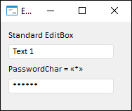
PasswordChar | The PasswordChar property determines the character, which replaces the actual characters entered by the user. |
|
PopupMenu | The PopupMenu property determines the context menu opened by clicking the component with the additional mouse button. |
|
Scrolls | The Scrolls property returns parameters of component's scrollbars. |
|
ReadOnly | The ReadOnly property determines whether the user can change component text. |
|
SelLength | The SelLength property determines the number of characters selected in the component text. |
|
SelStart | The SelStart property determines the cursor position, from which to start text selection in the component. |
|
SelText | The SelText property determines the text selected in the component. |
|
ShowHint | The ShowHint property enables and disables showing a component tooltip. |
|
TabOrder | The TabOrder property determines the component position in the tab order. |
|
TabStop | The TabStop property determines whether the component is focused when the TAB key is pressed. |
|
Tag | The Tag property is not used by the compiler. The user can change the value of the Tag property and use it as he wishes. |
|
Text | The Text property determines the row identifying a component for the user. |
|
Top | The Top property determines the coordinate of the top border of the component. |
|
Visible | The Visible property determines visibility of the component during execution. |
|
Width | The Width property determines component width. |
| Method name | Brief description | |
 |
BringToFront | The BringToFront method brings a component to front. |
|
Clear | The Clear method deletes all text in the component. |
|
ClearSelection | The ClearSelection method deletes all text selected in the component. |
|
ClearUndo | The ClearUndo method is used to fix the changes of the Text property. |
|
CopyToClipboard | The CopyToClipboard method enables the user to copy selected data to the clipboard. |
|
CutToClipboard | The CutToClipboard method enables the user to cut selected data and place it to the clipboard. |
|
ClientToScreen | The ClientToScreen method converts the coordinates of a point specified relative to the component coordinate system into screen coordinates. |
|
DoDragDrop | The DoDragDrop method enables to start dragging operation. |
|
GetImage | The GetImage method returns a graphic presentation of a component together with all child components. |
|
PasteFromClipboard | The PasteFromClipboard method pastes data from the clipboard. |
|
SelectAll | The SelectAll method selects component text. |
|
SetFocus | The SetFocus method sets focus to this component. |
|
ScreenToClient | The ScreenToClient method converts screen coordinates of a point into coordinates specified relative to the component coordinate system. |
|
SendToBack | The SendToBack method sends a component to back. |
|
Undo | The Undo method undoes the last text change in the component. |
| Event name | Brief description | |
 |
OnBeginDrag | The OnBeginDrag event occurs for the component when the user starts to drag an object from the component. |
|
OnChange | The OnChange event occurs after changing the Text property of the editing component. |
|
OnClick | The OnClick event occurs if the user clicks the component area. |
|
OnDblClick | The OnDblClick event occurs if the user double-clicks the component area. |
|
OnDragDrop | The OnDragDrop event occurs for the component if the user drops a dragged object over it. |
|
OnDragEnter | The OnDragEnter event occurs when a dragged object crosses the borders of this component. |
|
OnDragLeave | The OnDragLeave event occurs when a dragged object leaves the borders of this component. |
|
OnDragOver | The OnDragOver event occurs for the component when the user drags an object over it. |
|
OnEnter | The OnEnter event occurs when the component receives focus. |
|
OnExit | The OnExit event occurs when the component loses focus. |
|
OnHScroll | The OnHScroll event occurs when horizontal scrollbar slider changes its position. |
|
OnKeyDown | The OnKeyDown event occurs if the component is focused and a keyboard key is pressed. |
|
OnKeyPress | The OnKeyPress event occurs if the component is focused when the user presses a character key. |
|
OnKeyPreview | The OnKeyPreview event occurs prior to each event related to key pressing. |
|
OnKeyUp | The OnKeyUp event occurs if the component is focused and the user releases any button previously pressed. |
|
OnMouseDown | The OnMouseDown event occurs if the pointer is in component's area and a mouse key is pressed. |
|
OnMouseEnter | The OnMouseEnter event occurs when mouse cursor enters the component area. |
|
OnMouseHover | The OnMouseHover event occurs when mouse cursor is held in the component area. |
|
OnMouseLeave | The OnMouseLeave event occurs when mouse cursor leaves the component area. |
|
OnMouseMove | The OnMouseMove event occurs on moving the cursor over component. |
|
OnMouseUp | The OnMouseUp event occurs on releasing mouse button when the cursor is in component area. |
|
OnMouseWheel | The OnMouseWheel event occurs if the component is focused when the mouse wheel is rotated. |
|
OnVScroll | The OnVScroll event occurs when vertical scrollbar slider changes its position. |
See also: