The MonthCalendar component is a calendar where the user can select date and time.
The component is implemented by the MonthCalendar class.
The component works with the local time, amendments for the time zone must be made manually.
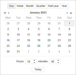
The component looks as follows:
The component provides an option of selecting calendar displaying mode using the Days, Weeks, Months, Quarters and Half-years buttons at the top of the calendar.
Buttons of jumping to the next/previous periods are located under the buttons that select the calendar display mode. Buttons of jumping to the next/previous year are available in all modes except the months mode. Buttons of jumping to the next/previous half year are available in the months mode. Buttons of jumping to the next/previous month are available in the days mode.
Date is selected from the calendar in the mode that suits user.
Time is set together with the buttons of the Hours and Minutes scroll bar. Minutes and hours value can be entered from the keyboard or selected with the help of the scrollbar buttons or the UP and DOWN keys (cursor must be in the edit box).
The current date and time can be set by pressing the Today button.
Example of Creating the MonthCalendar Component.
| Constructor name | Brief description | |
 |
MonthCalendar | The MonthCalendar constructor implements an instance of the MonthCalendar property. |
| Property name | Brief description | |
 |
CurrentDate | The CurrentDate property sets date in the calendar. |
|
MaxDate | The MaxDate property assigns the maximum available date value in the calendar. |
|
MinDate | The MinDate property assigns the minimum available date value in the calendar. |
|
Mode | The Mode property sets the calendar display mode. |
|
ShowDaysButton | The ShowDaysButton property sets visibility for the Days button. |
|
ShowHalfYearsButton | The ShowHalfYearsButton property sets visibility for the HalfYears button. |
|
ShowNowButton | The ShowNowButton property sets visibility for the Today button. |
|
ShowMonthsButton | The ShowMonthsButton property sets visibility for the Months button. |
|
ShowQuartersButton | The ShowQuartersButton property sets visibility for the Quarters button. |
|
ShowTime | The ShowTime property sets visibility of the elements for date input. |
|
ShowWeeksButton | The ShowWeeksButton property sets visibility for the Weeks button. |
| Method name | Brief description | |
|
getCurrentDay | The getCurrentDay method increases the day value. |
|
getCurrentHalfYear | The getCurrentHalfYear method returns the half year value. |
|
getCurrentHour | The getCurrentHour method returns the hour value. |
|
getCurrentMinute | The getCurrentMinute method returns the minute value. |
|
getCurrentMonth | The getCurrentMonth method returns the month value. |
|
getCurrentQuarter | The getCurrentQuarter method returns the current quarter value. |
|
getCurrentWeek | The getCurrentWeek method returns the week value. |
|
getCurrentYear | The getCurrentYear method returns the year value. |
| Event name | Brief description | |
 |
CurrentDateChanged | The CurrentDateChanged event occurs on changing the current date using the CurrentDate property. |
|
ModeChanged | The ModeChanged event occurs on changing the calendar display mode. |
| Method name | Brief description | |
|
getCurrentDay | The getCurrentDay method increases the day value. |
|
getCurrentHalfYear | The getCurrentHalfYear method returns the half-year value. |
|
getCurrentHour | The getCurrentHour method returns the hour value. |
|
getCurrentMinute | The getCurrentMinute method returns the minute value. |
|
getCurrentMonth | The getCurrentMonth method returns the month value. |
|
getCurrentQuarter | The getCurrentYear method returns the year value. |
|
getCurrentWeek | The getCurrentWeek method returns the week value. |
|
getCurrentYear | The getCurrentYear method returns the year value. |
| Property name | Brief description | |
|
Anchors | The Anchors property determines position of the component placed within container. |
|
Animation | The Animation property determines component animation parameters. |
|
Bottom | The Bottom property determines a bottom margin if a component is placed inside LayoutPanel. |
|
Content | The Content property determines component contents. |
|
ContextMenu | The ContextMenu property determines a component's context menu. |
|
Data | The Data property is used to store any custom data. |
|
Enabled | The Enabled property determines whether a component can be used. |
|
Height | The Height property determines component height. |
|
IsRTL | The IsRTL property determines whether component elements are aligned to the right. |
|
IsVisible | The IsVisible property determines whether a component is displayed. |
|
Left | The Left property determines a left margin if a component is placed inside GridPanel. |
|
Opacity | The Opacity property determines component transparency. |
|
Parent | The Parent property determines a parent component of a control. |
|
ParentNode | The ParentNode property determines a parent DOM node. |
|
ResourceKey | The ResourceKey property determines a component resource key. |
|
Right | The Right property determines a right margin if a component is placed inside LayoutPanel. |
|
Rotate | The Rotate property determines a component rotation angle. |
|
ShowToolTip | The ShowToolTip property determines whether a tooltip of the component can be displayed. |
|
Style | The Style property determines a component style. |
|
TabIndex | The TabIndex property determines the order of the control element passing inside the container. |
|
Tag | The Tag property determines a JSON object associated with the component. |
|
ToolTip | The ToolTip property determines text of component tooltip. |
|
Top | The Top property determines a top margin if a component is placed inside GridPanel. |
|
Value | The Value property determines a component value. |
|
Width | The Width property determines component width. |
| Method name | Brief description | |
|
The addClass method adds a CSS class to the component. | |
|
addEventHandler | The addEventHandler method adds an event handler to a DOM node. |
|
The addStateClass method adds a CSS class to the component and removes the previous CSS class. | |
|
The addToNode method adds a component to the specified node. | |
|
bindEvents | The bindEvents method subscribes an element to all available events. |
|
The getAnchorFlags method returns JSON object that contains settings of the current component's position. | |
|
The getClass method returns the current CSS classes of the component. | |
|
The getCssStyle method returns style for the specified node. | |
|
The getDomNode method returns main DOM node of the component. | |
|
The getFocused method determines whether the component is focused. | |
|
getIsBinded | The getIsBinded method returns whether an element is subscribed to all DOM node events. |
|
The hide method hides a control. | |
|
The hideToolTip method clears tooltip timeout and hides the tooltip if it is shown. | |
|
refreshStyle | The refreshStyle method refreshes element CSS styles. |
|
The removeClass method removes CSS class from the component. | |
|
removeEventHandler | The removeEventHandler method removes event handler from DOM node. |
|
removeFromDOM | The removeFromDOM method removes node from the DOM structure. |
|
The removeStateClasses method removes CSS classes of the component. | |
|
The setDraggable method determines whether a component can be dragged on the HTML page. | |
|
The setFocus method sets the component focus. | |
|
The setIsHovered method sets up component displaying only on mouseover. | |
|
The setSize method establishes the sizes of the component. | |
|
The show method displays a control. | |
|
unBindEvents | The unBindEvents method unsubscribes an element from all standard events. |
|
The updatePosition method updates size and position when absolute positioning based on the current parameters is used. | |
|
The updateSize method updates the component size on changing the size of the container that contains the component. |
| Event name | Brief description | |
|
Drag | The Drag event occurs on clicking and holding the mouse button. |
|
DragEnd | The DragEnd event occurs when dragging the component finishes. |
|
DragStart | The DragStart event occurs when dragging the component starts. |
|
OnContextMenu | The OnContextMenu event occurs on calling context menu of the component. |
|
SizeChanged | The SizeChanged event occurs after the component is resized. |
|
SizeChanging | The SizeChanging event occurs during component resize. |
| Property name | Brief description | |
|
The Id property determines a repository object identifier. |
| Method name | Brief description | |
|
clone | The clone method creates an object copy. |
|
dispose | The dispose method deletes the component. |
|
getHashCode | The getHashCode method returns hash code of repository object. |
|
getId | The getId method returns repository object identifier. |
|
getSettings | The getSettings method returns repository object settings. |
|
getTypeName | The getTypeName method returns the name of the object type without the namespace, to which it belongs. |
|
isEqual | The isEqual method determines whether the specified object is equal to the current repository object. |
|
isLive | The isLive method determines validity of repository object. |
|
removeAllEvents | The removeAllEvents method removes all object event handlers by the specified context. |
|
setId | The setId method determines a repository object identifier. |
|
setSettings | The setSettings method determines repository object settings. |
|
defineProps | The defineProps method creates get and set methods from name array for the specified class. |
|
keys | The keys method returns array of methods and properties names for the specified object. |
See also: