The LayoutBox component is a container in the form of table for items layout.
The component is implemented by the LayoutBox class.
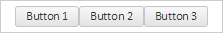
The component looks as follows:
The example of container creation in form of the table is described in the Example of Creating the LayoutBox Component page.
| Constructor name | Brief description | |
 |
LayoutBox | The LayoutBox constructor creates an instance of the LayoutBox property. |
| Property name | Brief description | |
 |
Orientation | The Orientation property determines table orientation. |
| Method name | Brief description | |
|
add | The add method adds an element to the table end. |
|
insert | The insert inserts an element to the table by index. |
|
removeByIndex | The removeByIndex method removes an element from the table by index. |
| Property name | Brief description | |
|
Anchors | The Anchors property determines position of the component placed within container. |
|
Animation | The Animation property determines component animation parameters. |
|
Bottom | The Bottom property determines a bottom margin if a component is placed inside LayoutPanel. |
|
Content | The Content property determines component contents. |
|
ContextMenu | The ContextMenu property determines a component's context menu. |
|
Data | The Data property is used to store any custom data. |
|
Enabled | The Enabled property determines whether a component can be used. |
|
Height | The Height property determines component height. |
|
IsRTL | The IsRTL property determines whether component elements are aligned to the right. |
|
IsVisible | The IsVisible property determines whether a component is displayed. |
|
Left | The Left property determines a left margin if a component is placed inside GridPanel. |
|
Opacity | The Opacity property determines component transparency. |
|
Parent | The Parent property determines a parent component of a control. |
|
ParentNode | The ParentNode property determines a parent DOM node. |
|
ResourceKey | The ResourceKey property determines a component resource key. |
|
Right | The Right property determines a right margin if a component is placed inside LayoutPanel. |
|
Rotate | The Rotate property determines a component rotation angle. |
|
ShowToolTip | The ShowToolTip property determines whether a tooltip of the component can be displayed. |
|
Style | The Style property determines a component style. |
|
TabIndex | The TabIndex property determines the order of the control element passing inside the container. |
|
Tag | The Tag property determines a JSON object associated with the component. |
|
ToolTip | The ToolTip property determines text of component tooltip. |
|
Top | The Top property determines a top margin if a component is placed inside GridPanel. |
|
Value | The Value property determines a component value. |
|
Width | The Width property determines component width. |
| Method name | Brief description | |
|
addItem | The addItem method adds a new element to list. |
|
beginUpdate | The beginUpdate method determines whether the list is updated. |
|
clear | The clear method removes all elements from the list. |
|
clearSelection | The clearSelection method is used to reset selection. |
|
endUpdate | The endUpdate method removes whether the list is updated. |
|
filterByText | The filterByText method filters list elements by string. |
|
getActiveItem | The getActiveItem method returns the selected list element. |
|
getItemByPoint | The getItemByPoint method returns list element by the specified coordinates. |
|
getLastItemClick | The getLastItemClick method returns the last selected list element. |
|
getLayoutItems | The getLayoutItems method returns an array of list elements. |
|
getScrollBox | The getScrollBox method returns scrolling region of elements list. |
|
getSelectedItems | The getSelectedItems method returns array of selected list elements. |
|
insertItem | The insertItem method adds an element to the position of the elements list set by the index parameter. |
|
removeItem | The removeItem method removes the element of the list by the specified index. |
|
scrollToItem | The scrollToItem method scrolls the list up to the item element. |
|
scrollToSelected | The scrollToSelected method scrolls the list up to the selected list element. |
|
selectItemById | The selectItemById method selects the element with the specified Id identifier. |
|
setSelectedFocus | The setSelectedFocus method sets focus on the element index. |
| Event name | Brief description | |
 |
Drag | The Drag event occurs on clicking and holding the mouse button. |
|
DragEnd | The DragEnd event occurs when dragging the component finishes. |
|
DragStart | The DragStart event occurs when dragging the component starts. |
|
OnContextMenu | The OnContextMenu event occurs on calling context menu of the component. |
|
SizeChanged | The SizeChanged event occurs after the component is resized. |
|
SizeChanging | The SizeChanging event occurs during component resize. |
| Property name | Brief description | |
|
The Id property determines a repository object identifier. |
| Method name | Brief description | |
|
clone | The clone method creates an object copy. |
|
dispose | The dispose method deletes the component. |
|
getHashCode | The getHashCode method returns hash code of repository object. |
|
getId | The getId method returns repository object identifier. |
|
getSettings | The getSettings method returns repository object settings. |
|
getTypeName | The getTypeName method returns the name of the object type without the namespace, to which it belongs. |
|
isEqual | The isEqual method determines whether the specified object is equal to the current repository object. |
|
isLive | The isLive method determines validity of repository object. |
|
removeAllEvents | The removeAllEvents method removes all object event handlers by the specified context. |
|
setId | The setId method determines a repository object identifier. |
|
setSettings | The setSettings method determines repository object settings. |
|
defineProps | The defineProps method creates get and set methods from name array for the specified class. |
|
keys | The keys method returns array of methods and properties names for the specified object. |
See also: