To execute the example, in the HEAD tag add links to the PP.js component library, the PP.css visual styles and a resources file (such as resources.en.js). See below the JavaScript code given to create the BorderCombo component. The item with the bc1 identifier must be available in the DIV tag.
var IMAGE_PATH = "../../../../../build/img/"; // Path to the folder with images
// Determine the path to root folder containing resources files
PP.resourceManager.setRootResourcesFolder("../../../../../resources/");
// Determine current regional settings
PP.setCurrentCulture(PP.Cultures.ru);
var borderCombo = new PP.Ui.BorderCombo(        {
    ParentNode: document.getElementById("bc1"),
    // Display panel to line width change
    BorderWidthVisible: true,
    // Set line width value
    LineWidth: 4,
    // Display panel to chose border type
    BorderTypeOnlt: true,
    // Open tab to chose line type
    Mode: 1,
    // Determine that line types which are supported by the SVG technology are available
    TypesMode: "SVG",
    // Display new value of the line width after its change
    LineWidthChanged: function(sender, args) {
        console.log(args.LineWidth)
    },
    // Set a handler of the item value change event
    ValueChanged: function(sender, args) {
        console.log("Property is changed: " + args.PropertyName);
    }
});
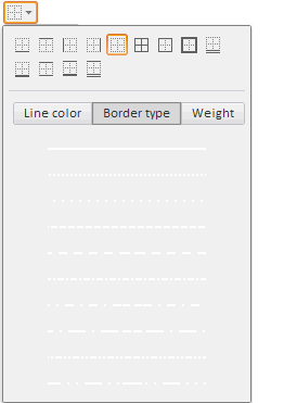
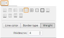
After executing the example, the HTML page contains the BorderCombo component that looks as follows:

The Border Type tab is active. The Width tab is shown (by default it is hidden). The value editor of the Width tab is set to four:

On changing the value in the value editor, the new value is displayed in the console.
On changing any property the console displays information about change:
The property is changed: LineWidth
A panel for border type selection is available (above), by default it is hidden.
See also: