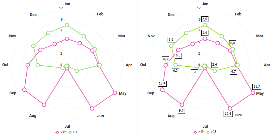
A radar chart enables the user to compare statistical values of several data series.
A radar chart shows all categories with their own coordinate axes that radiate as beams from the coordinate origin. Values that belong to one series are connected with lines.
Example of radar chart (standard and with data labels):
The following chart parameters can also be changed in the edit mode:
To set up category labels in radar charts, use the Category Labels tab on the side panel.
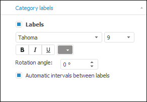
To set up category label parameters, select the Labels checkbox and set:
Font type. In the drop-down list select one of the fonts available in the operating system.
Size. Select the font size in the drop-down list or enter it using the keyboard.
Font style. Click the buttons that determine font style:
B. Bold.
I. Italic.
U. Underline.
When the font style button is pressed, the corresponding font style is used.
Font color. Select the font color in the drop-down palette. To set a new font color, click the Spectrum button in the standard color palette and select a color in the advanced color palette.
Rotation Angle. Set label rotation angle using the keyboard or the value editor.
Automatic Intervals between Labels. When the checkbox is selected, intervals between labels are calculated automatically.
See also:
Chart Types | Setting Up General Chart Parameters | Setting Up Chart Components

 To display the tab