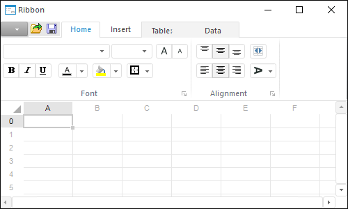
The Ribbon component is used to create an application ribbon.
The application ribbon is a modern interface solution, which combines main menu and application toolbars. The ribbon includes separate tabs, quick access toolbar, application button and general controls.
Tabs contains panels, which house various controls grouped according to their functionality. Tabs can be standard or context. Standard tabs are always displayed in an application. Context tabs are displayed when a certain condition is satisfied, for example, when a certain object is selected.
The quick access toolbar houses most frequently used application commands. The application button serves to open the main menu. General controls are displayed at the right at the level of ribbon tab headers; they can be used to execute minor operations, for example, to open help.
After the component is added to the form, it will be prompted to select theResources object where the ribbon images will be stored. This object can also be specified in the Resources property in the object inspector. An area is selected at the upper part of the form, which will further display the ribbon. To set up the ribbon, select the Edit item in the component's context menu. The ribbon editor opens. Create the required tabs in the editor, then create panels on the tabs and place controls on them. When various parameters are edited in the editor, the ribbon dynamically changes on the form.
If required, form structure can be stored in XML format. To save and load structure, use appropriate context menu items of the Ribbon component.
When a control is used, the OnChange event is generated for this control. The OnChange event is also generated for the Ribbon component. In the component event, use property of the Element argument, the corresponding control can be obtained. All controls have unique identifiers. The user can set correspondence between specific controls and execution of application code by organizing identifier checkup in event handler.
On creating and loading file using the LoadFromXML method, avoid using system element identifiers (for example, ID_APP_EXIT). Such identifiers will be replaced with automatically generated ones.
| Property name | Brief description | |
 |
ActiveCategory | The ActiveCategory property determines the active ribbon tab. |
|
Align | The Align property determines behavior of the component when its parent component is resized. |
|
AllowDrag | The AllowDrag property determines whether an object can be dragged from the component. |
|
AllowDrop | The AllowDrop property determines whether the component can accept a dragged object. |
|
Anchors | The Anchors property returns settings that determine the percentage of the size change for the current component when the parent component is resized. |
|
Brush | The Brush property determines the brush that is used to fill component area. |
|
Categories | The Categories property returns the collection of available ribbon tabs. |
|
ClientHeight | The ClientHeight property is used to receive or specify the height of the component’s client area. |
|
ClientWidth | The ClientWidth property is used to receive or specify the width of the component’s client area. |
|
Color | The Color property determines a component background color. |
|
ComponentCount | The ComponentCount property returns the number of child components. |
|
Components | The Components property returns the child component. |
|
Contexts | The Contexts property returns the context tabs collection. |
|
Cursor | The Cursor property determines the look of the cursor over the component. |
|
Data | The Data property is used to store any custom data. |
|
Elements | The Elements property returns the collection of controls placed on all ribbon tabs. |
|
Enabled | The Enabled property determines whether the component is available for the user. |
|
Focused | The Focused property returns True if the focus is set on the component. |
|
Font | The Font property determines the set of characteristics describing the font that is used to display text. |
|
Height | The Height property determines component height. |
|
HelpContext | The HelpContext property determines a unique index for the context help section for this component. |
|
Hidden | The Hidden property determines whether ribbon is hidden. |
|
Hint | The Hint property determines a component tooltip text. |
|
Images | The Images property determines the component, which contains images to be used on the ribbon. |
|
Left | The Left property determines the coordinate of the left border of the component. |
|
MainButton | The MainButton property returns parameters of application button. |
|
MainCategory | The MainCategory property returns parameters of main ribbon menu. |
|
Name | The Name property determines a component name. |
|
Parent | The Parent property determines a parent component. |
|
ParentColor | The ParentColor property determines whether the component inherits the color of the parent component. |
|
ParentFont | The ParentFont property determines whether the component uses the font of the parent component. |
|
ParentShowHint | The ParentShowHint property determines whether a tooltip is displayed. |
|
PopupMenu | The PopupMenu property determines the context menu opened by clicking the component with the additional mouse button. |
|
QuickAccessToolbar | The QuickAccessToolbar property returns parameters of quick access toolbar. |
|
Resources | The Resources property determines the Resources repository object, which images are used in ribbon controls. |
|
Scrolls | The Scrolls property returns parameters of component's scrollbars. |
|
ShowHint | The ShowHint property enables and disables showing a component tooltip. |
|
TabElements | The TabElements property returns the collection of general ribbon controls. |
|
TabOrder | The TabOrder property determines the component position in the tab order. |
|
TabStop | The TabStop property determines whether the component is focused when the Tab key is pressed. |
|
Tag | The Tag property is not used by the compiler. The user can change the value of the Tag property and use it as he wishes. |
|
Text | The Text property determines the row identifying a component for the user. |
|
Top | The Top property determines the coordinate of the top border of the component. |
|
Visible | The Visible property determines visibility of the component during execution. |
|
Width | The Width property determines component width. |
| Method name | Brief description | |
 |
BringToFront | The BringToFront method brings a component to front. |
|
ClientToScreen | The ClientToScreen method converts the coordinates of a point specified relative to the component coordinate system into screen coordinates. |
|
DoDragDrop | The DoDragDrop method enables to start dragging operation. |
|
FindById | The FindById method finds searches for a control based on its numeric identifier. |
|
GetImage | The GetImage method returns the image of the component with all the child components. |
|
LoadFromXML | The LoadFromXML method loads data from XML file and creates visual ribbon. |
|
SaveToXML | The SaveToXML method saves ribbon structure in XML format and returns obtained XML string. |
|
ScreenToClient | The ScreenToClient method converts screen coordinates of a point into coordinates specified relative to the component coordinate system. |
|
SendToBack | The SendToBack method sends a component to back. |
|
SetFocus | The SetFocus method sets focus to this component. |
| Event name | Brief description | |
 |
OnBeginDrag | The OnBeginDrag event occurs for a component when the user starts to drag an object from the component. |
|
OnChange | The OnChange event occurs when ribbon controls are used. |
|
OnClick | The OnClick event occurs if the user clicks the component area. |
|
OnDblClick | The OnDblClick event occurs if the user double-clicks the component area. |
|
OnDragDrop | The OnDragDrop event occurs for the component if the user drops a dragged object over it. |
|
OnDragEnter | The OnDragEnter event occurs when a dragged object crosses the borders of this component. |
|
OnDragLeave | The OnDragLeave event occurs when a dragged object leaves the borders of this component. |
|
OnDragOver | The OnDragOver event occurs for the component when the user drags an object over it. |
|
OnEnter | The OnEnter event occurs when the component receives focus. |
|
OnExit | The OnExit event occurs when the component loses focus. |
|
OnHScroll | The OnHScroll event occurs when horizontal scrollbar slider changes its position. |
|
OnKeyDown | The OnKeyDown event occurs if the component is focused and a keyboard key is pressed. |
|
OnKeyPress | The OnKeyPress event occurs if the component is focused when the user presses a character key. |
|
OnKeyUp | The OnKeyUp event occurs if the component is focused and the user releases any button previously pressed. |
|
OnMouseDown | The OnMouseDown event occurs if the pointer is in component's area and a mouse key is pressed. |
|
OnMouseEnter | The OnMouseEnter event occurs when mouse cursor enters the component area. |
|
OnMouseHover | The OnMouseHover event occurs when mouse cursor is held in the component area. |
|
OnMouseLeave | The OnMouseLeave event occurs when mouse cursor leaves the component area. |
|
OnMouseMove | The OnMouseMove event occurs on moving the cursor over component. |
|
OnMouseUp | The OnMouseUp event occurs on releasing mouse button when the cursor is in component area. |
|
OnMouseWheel | The OnMouseWheel event occurs if the component is focused when the mouse wheel is rotated. |
|
OnUpdate | The OnUpdate event occurs on ribbon update. |
|
OnVScroll | The OnVScroll event occurs when vertical scrollbar slider changes its position. |
See also: