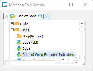
 button can be used to reset tree elements selection.
The MetabaseTreeCombo component is used to display the repository object tree as a drop-down list.
The component display nothing by default. To set the directory, which contents is displayed in the component, use the Root property. The list of displayed objects can be changed by setting up filtering in the Filters property. Each tree element is a link to the corresponding repository object. To get information on corresponding object, cast the tree node to the IMetabaseTreeListNode interface (transform the object using the As keyword) and get the ObjectDescriptor property.
The main list of properties and methods of this component is inherited from TreeCombo, therefore working with this component is identical to working with the tree of the TreeCombo component. The methods that are used to change the element hierarchy are not supported in this component.
The button can be used to reset tree elements selection.
NOTE. The drop-down list of elements can be resized by dragging its right, left or bottom border with the mouse. The minimum width of the drop-down list equals to the component width.
The following types of search are available in the expanded drop-down list:
On typing in first several characters of the element name the cursor moves to the first found element. This type of search is performed in cycles, and only by the elements in the expanded part of element tree hierarchy.
Using the search string, which opens on pressing F3 or CTRL+F. The search is started after the user enters required character line and presses the ENTER key or clicks the  button. The search is executed in cycles by all the element hierarchy.
If the search has been successful, the cursor will focus on the found element. Selection state depends on value of the FindMode property. Depending on the chosen multiple selection mode an element is added to selection either by selecting it using the SPACE key or selecting it with the mouse cursor while holding down the CTRL key.
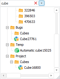
It is also available to search for elements on the collapsed component drop-down list. When the component is focused, entering a set of characters creates a list of elements, which names contain this set of characters:
Elements are selected using the above-given method, depending on the value specified in the SelectionMode property. Closing this dialog box applies the selection to the component.
It is available to search for one or several words based on segments in any mode. To do this, separate the search combinations with whitespace character. The word order in the names of search elements is ignored.
Data sorting is available if the ShowColumnHeaders, Sorted and ColumnClick properties are set to True, and the SortType property has a value other than None.
In the form execution mode, click the header of the appropriate column to sort data by it. The data is sorted in the ascending direction. Double-clicking changes the sorting direction. To sort data by multiple columns, click the headers of the required columns while holding down CTRL key. The sorting order is as follows: the column, which header is clicked last, is sorted last.
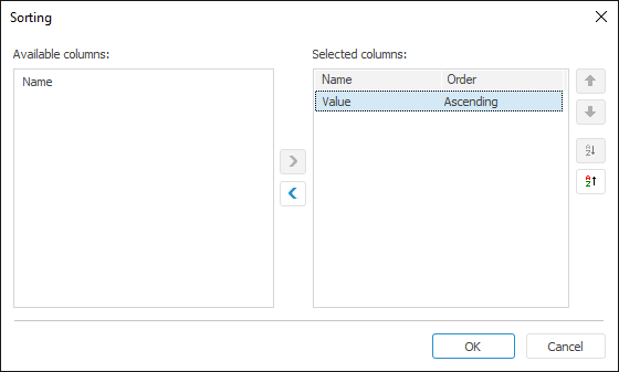
Sorting can also be set up in the Sorting specialized dialog box:
This dialog box opens when selecting the appropriate item if the context menu opened from the column header area.
NOTE. The context menu item is available if the ShowColumnHeaders and Sorted properties are set to True, and the SortType property has a value other than None.
Move the columns that are used to sort by to the selection list. The  and
and  buttons are used to change sorting direction by the selected column. The
  and the
  buttons are used to change the sorting order. Columns at the top of the list are sorted first.
In the Fore language, to apply sorting, set the Sorted property to True, and set the SortType property to the value other than None. The column, which data is sorted, is specified in the SortColumn property. Sorting direction is determined in the SortAscending property of the corresponding column.
Sorting can also be managed by the Sort and SortDefault methods.
To set up filtering for objects displayed in the component tree, execute one of the following operations:
Select the Filter item in the component's context menu.
In the object inspector double-click the Filters property.
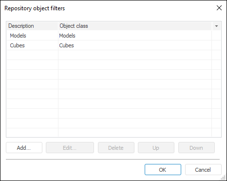
This dialog box contains a list of filters applied to the component.
The list is displayed as a table made up of two columns:
Description. This column presents brief description of a filter.
Object Class. A list of all classes (subclasses) included in this filter.
The dialog box can be used to create new filters, or edit and delete existing filters. Multiple filters can be selected in the table, these selected filters can only be deleted.
Filter description can be edited. To do this, select the required filter and click the description with the mouse. After a few seconds a dialog box for editing a description opens. One can also press F2.
To create a new object filter, execute one of the following operations:
Click the Add button.
Press the INSERT key.
Double-click a white space in the dialog box.
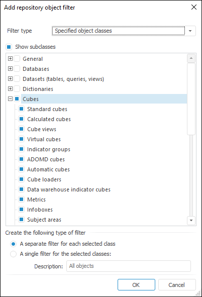
In the dialog box that opens, select the type of the created filter. The available types are:
All Objects. When this filter is used, all repository objects are available.
Specified Object Classes. When this filter is used, only the selected objects are available.
In the class tree, select object classes, which are available when this filter is used. Use the Show Subclasses checkbox to disable displaying of additional object classes in the tree.
In the Create the Following Type of Filter box specify how you want the filter to be saved:
A Separate Filter for Each Selected Class. A separate filter is created for each selected class (subclass). Descriptions of created filters match the names of classes (subclasses).
A Single Filter for the Selected Classes. One composite filter is created for all selected classes. Use the Description box to specify brief description for a created filter.
Clicking the OK button creates a new filter (filters) for the selected object classes.
To edit a filter, execute one of the following operations:
Double-click the required filter.
Select the required filter in the table and click the Edit button.
Select table filter and press F4.
Select the Edit item in the context menu of the selected filter.
Depending on the type of created filter (a separate filter for a class (subclass) or a composite filter), the dialog box for filter editing opens.
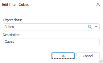
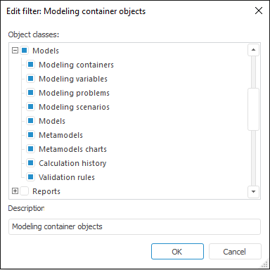
The dialog box can be used to change the object class (subclass or their combination for a composite filter), for which the filter is created, or modify filter description. Clicking the OK button saves the changes.
To delete a filter (filters), select it in the table and execute one of the following operations:
Click the Delete button.
Press the DELETE key.
Select the Delete item in the context menu of required filter (filters).
The filter is deleted.
| Property name | Brief description | |
 |
Align |
The Align property determines behavior of the component when its parent component is resized. |
|
AllowDrag |
The AllowDrag property determines whether an object can be dragged from the component. |
|
AllowDrop |
The AllowDrop property determines whether the component can accept a dragged object. |
|
Anchors |
The Anchors property returns settings that determine the percentage of the size change for the current component when the parent component is resized. |
|
AnimationType |
The AnimationType property determines a type of animation to be used when component's list is expanded. |
|
AutoCheckParent |
The AutoCheckParent property determines whether the parent nodes of the component automatically receive an indefinite state if not all of the child elements are selected. |
|
AutoUpdateInfo |
The AutoUpdateInfo property determines whether information on selection is automatically refreshed in the component editor. |
|
BorderStyle |
The BorderStyle property determines a component border style. |
|
Brush |
The Brush property determines the brush that is used to fill component area. |
|
CancelOnEscape |
The CancelOnEscape property determines whether selection is canceled, and the list is closed when the ESC key is pressed. |
|
Checkboxes |
The Checkboxes property determines whether elements have checkboxes. |
|
CheckedObjects |
The CheckedObjects property returns the collection of descriptions for objects, which checkboxes are selected in the component. |
|
ClientHeight |
The ClientHeight property is used to receive or specify the height of the component’s client area. |
|
ClientWidth |
The ClientWidth property is used to receive or specify the width of the component’s client area. |
|
CloseOnClick |
The CloseOnClick property determines whether the list is automatically closed when one of the elements is selected with a mouse click. |
|
CloseOnEnter |
The CloseOnEnter property determines whether the list is closed, and the selection is saved when the ENTER key is pressed. |
|
Color |
The Color property determines a component background color. |
|
ColumnClick |
The ColumnClick property determines whether column headers can be displayed as buttons. |
|
Columns |
The Columns property returns the component columns collection. |
|
ComponentCount |
The ComponentCount property returns the number of child components. |
|
Components |
The Components property returns the child component. |
|
Cursor |
The Cursor property determines the look of the cursor over the component. |
|
Data |
The Data property is used to store any custom data. |
|
DelayedFill |
The DelayedFill property determines how an object tree is built in the component. |
|
DisplayMode |
The DisplayMode property determines how objects are displayed in the component tree. |
|
Dropped |
The Dropped property returns the status of the drop-down list. |
|
DroppedListHeight |
The DroppedListHeight property determines height of the component's drop-down list. |
|
DroppedListWidth |
The DroppedListWidth property determines width of the component's drop-down list. |
|
DroppedPopupMenu |
The DroppedPopupMenu property determines the context menu, which is opened in the area of the components's drop-down list. |
|
DropTargetNode |
The DropTargetNode property determines the component node, over which the user is currently dragging another node. |
|
Enabled |
The Enabled property determines whether the component is available for the user. |
|
EnableFindDialog |
The EnableFindDialog property determines whether the standard element search dialog box opens on pressing CTRL+F or F3. |
|
FindEditVisible |
The FindEditVisible property determines whether a search field is displayed when the component drop-down list is expanded. |
|
FindMode |
The FindMode property determines a mode of marking found elements. |
|
Filters |
The Filters property returns the collection of filters that are used to filter objects displayed in the component. |
|
FilterStyle |
The FilterStyle property determines a mode of creating a tree of filtered elements. |
|
Focused |
The Focused property returns True if the focus is set on the component. |
|
FocusedNode |
The FocusedNode property determines the node, which is currently focused. |
|
Font |
The Font property determines the set of characteristics describing the font that is used to display text. |
|
GridLines |
The GridLines property determines whether a grid is displayed. |
|
HeaderMenu |
The HeaderMenu property determines the context menu opened by clicking the component column header with the additional mouse button. |
|
Height |
The Height property determines component height. |
|
HelpContext |
The HelpContext property determines a unique index for the context help section for this component. |
|
HideSelection |
The HideSelection property determines whether the selected component element remains selected when the focus moves to another component element. |
|
HighlightTrack |
The HighlightTrack property determines whether to highlight element on mouseover. |
|
Hint |
The Hint property determines a component tooltip text. |
|
HotTrack |
The HotTrack property determines whether the elements are underlined on mouseover. |
|
HotTrackAutoExpand |
The HotTrackAutoExpand property determines whether the state of child elements tree is changed on clicking the selected element. |
|
Images |
The Images property contains a list of images used for nodes rendering. |
|
InnerRoot |
The InnerRoot property returns parameters of inner root node of the tree. |
|
Left |
The Left property determines the coordinate of the left border of the component. |
|
Locked |
The Locked property determines whether it is possible to change selection and edit component elements. |
|
Metabase |
The Metabase property determines a repository associated with a component. |
|
Name |
The Name property determines a component name. |
|
Nodes |
The Nodes property returns the component elements collection. |
|
Parent |
The Parent property determines a parent component. |
|
ParentColor |
The ParentColor property determines whether the component inherits the color of the parent component. |
|
ParentFont |
The ParentFont property determines whether the component uses the font of the parent component. |
|
ParentShowHint |
The ParentShowHint property determines whether a tooltip is displayed. |
|
PopupMenu |
The PopupMenu property determines the context menu opened by clicking the component with the additional mouse button. |
|
ReadOnly |
The ReadOnly property determines whether elements are available for editing. |
|
Root |
The Root property determines the root directory, which contents is displayed in the component. |
|
RowSelect |
The RowSelect property determines whether the whole row is highlighted when an element is selected. |
|
Scrolls |
The Scrolls property returns parameters of component's scrollbars. |
|
Selected |
The Selected property determines the last selected tree element. |
|
SelectedObjects |
The SelectedObjects property returns the collection of descriptions for objects selected in the component. |
|
Selection |
The Selection property returns the tree element selection. |
|
SelectionMode |
The SelectionMode property determines a mode of selecting component elements. |
|
ShowButtons |
The ShowButtons property determines whether expand/collapse child elements buttons are displayed. |
|
ShowColumnHeaders |
The ShowColumnHeaders property determines whether column headers are displayed. |
|
ShowEditImage |
The ShowEditImage property determines whether the icon element is displayed in the component editor. |
|
ShowEmptyFolders |
The ShowEmptyFolders property determines whether empty folders are displayed. |
|
ShowHint |
The ShowHint property enables and disables showing a component tooltip. |
|
ShowHints |
The ShowHints property determines whether tooltips are displayed when the mouse cursor hovers over elements. |
|
ShowInternalObjects |
The ShowInternalObjects property determines whether internal objects are displayed in the repository object tree. |
|
ShowLines |
The ShowLines property determines whether the line connecting a node with its children is displayed. |
|
ShowShortCuts |
The ShowShortCuts property determines whether labels are displayed in the component element tree. |
|
SortColumn |
The SortColumn property determines index of the column, by which sorting is executed. |
|
Sorted |
The Sorted property determines whether it is possible to execute sorting by the column specified in the SortColumn. |
|
SortType |
The SortType property determines a component sorting type. |
|
StateImages |
The StateImages property determines a source of icons for the selected elements. |
|
TabOrder |
The TabOrder property determines the component position in the tab order. |
|
TabStop |
The TabStop property determines whether the component is focused when the TAB key is pressed. |
|
Tag |
The Tag property is not used by the compiler. The user can change the value of the Tag property and use it as he wishes. |
|
Text |
The Text property determines the row identifying a component for the user. |
|
Top |
The Top property determines the coordinate of the top border of the component. |
|
Visible |
The Visible property determines visibility of the component during execution. |
|
Width |
The Width property determines component width. |
| Method name | Brief description | |
 |
AdjustDroppedListWidth |
The AdjustDroppedListWidth property adjusts width of the component's drop-down list. |
|
AdjustWidth |
The AdjustWidth method is used to automatically fit a column based on its contents. |
|
BringToFront |
The BringToFront method brings a component to front. |
|
ClientToScreen |
The ClientToScreen method converts the coordinates of a point specified relative to the component coordinate system into screen coordinates. |
|
DoDragDrop |
The DoDragDrop method enables to start dragging operation. |
|
DropDown |
The DropDown method expands the drop-down list. |
|
FindByDescriptor |
The FindByDescriptor method is used to search for a node of the component tree matching the specified repository object. |
|
FindItemByKey |
The FindItemByKey method is used to find a node in the component tree based on a repository object key. |
|
GetImage |
The GetImage method returns a graphic presentation of a component together with all child components. |
|
GetItemAt |
The GetItemAt method enables the user to get the component element in the specified point. |
|
GetItemObject |
The GetItemObject method returns description of the repository object corresponding to the specified tree node. |
|
HitTest |
The HitTest method is an enhanced version of the GetItemAt method. |
|
RollUp |
The RollUp method collapses the drop-down list. |
|
ScreenToClient |
The ScreenToClient method converts screen coordinates of a point into coordinates specified relative to the component coordinate system. |
|
SelectElem |
The SelectElem method selects the tree node corresponding to the specified repository object. |
|
SelectElemKey |
The SelectElemKey method selects the tree node corresponding to a repository object with the specified key. |
|
SendToBack |
The SendToBack method sends a component to back. |
|
SetFocus |
The SetFocus method sets focus to this component. |
|
Sort |
The Sort method sorts by the values of the specified column. |
|
SortDefault |
The SortDefault method executes sorting by the contents of the column, which index is specified in the SortColumn property. |
|
UpdateInfo |
The UpdateInfo method updates data. |
| Event name | Brief description | |
 |
OnAdded |
The OnAdded event occurs when a new element is added. |
|
OnBeginDrag |
The OnBeginDrag event occurs for a component when the user starts to drag an object from the component. |
|
OnBeginFilter |
The OnBeginFilter event occurs at the start of filtering of component elements list. |
|
OnBeginSearch |
The OnBeginSearch event occurs when elements are started to be searched in the component. |
|
OnCheckToAddElem |
The OnCheckToAddElem event occurs on adding elements to the tree. |
|
OnChecked |
The OnChecked event occurs when the element checkbox is selected. |
|
OnChecking |
The OnChecking event occurs when the element checkbox is selected. |
|
OnClick |
The OnClick event occurs if the user clicks the component area. |
|
OnCollapsed |
The OnCollapsed event occurs after collapsing the hierarchy of the tree node children. |
|
OnCollapsing |
The OnCollapsing event occurs before collapsing the hierarchy of tree node children. |
|
OnColumnClick |
The OnColumnClick event occurs on mouse click on the component column header. |
|
OnCompareItems |
The OnCompareItems event occurs during comparison of two elements during custom element sorting. |
|
OnDblClick |
The OnDblClick event occurs if the user double-clicks the component area. |
|
OnDeleting |
The OnDeleting event occurs when the element is deleted. |
|
OnDragDrop |
The OnDragDrop event occurs for the component if the user drops a dragged object over it. |
|
OnDragEnter |
The OnDragEnter event occurs when a dragged object crosses the borders of this component. |
|
OnDragLeave |
The OnDragLeave event occurs when a dragged object leaves the borders of this component. |
|
OnDragOver |
The OnDragOver event occurs for the component when the user drags an object over it. |
|
OnDropDown |
The OnDropDown event occurs on expanding the component list. |
|
OnEdited |
The OnEdited event occurs on exiting the mode of editing the contents of the component current record field. |
|
OnEditing |
The OnEditing event occurs when switching to the mode of editing the field contents of the current component record. |
|
OnEnter |
The OnEnter event occurs when the component receives focus. |
|
OnExit |
The OnExit event occurs when the component loses focus. |
|
OnExpanded |
The OnExpanded event occurs after expanding the hierarchy of tree node children. |
|
OnExpanding |
The OnExpanding event occurs directly before expanding the tree node children hierarchy. |
|
OnFilter |
The OnFilter event occurs after the components list is filtered. |
|
OnFocusedChanged |
The OnFocusedChanged event occurs when the focus is moved to another component element. |
|
OnFocusedChanging |
The OnFocusedChanged event occurs before the focus is moved to another component node. |
|
OnGetElementPopup |
The OnGetElementPopup event occurs when on calling a context menu for a tree element. |
|
OnGetHint |
The OnGetHint event occurs when a tooltip is displayed over the element, over which the mouse cursor is hovered. |
|
OnGetNodeImage |
The OnGetNodeImage event occurs on determining an image near the tree element. |
|
OnGetNodeStateImage |
The OnGetNodeStateImage event occurs on determining the state images near the tree element. |
|
OnHover |
The OnHover event occurs when the mouse cursor hovers over the element and this component element is underlined. |
|
OnHScroll |
The OnHScroll event occurs when horizontal scrollbar slider changes its position. |
|
OnIsBrowseableElem |
The OnIsBrowseableElem event is used to set whether an element is displayed in a tree. |
|
OnIsDynamicElem |
The OnIsDynamicElem event is used to set whether a tree of folder child elements is dynamically built. |
|
OnIsEmptyFolder |
The OnIsEmptyFolder event is used to set whether a folder is empty. |
|
OnIsFolderElem |
The OnIsFolderElem event is used to set whether elements displayed in the component tree are set as folders. |
|
OnKeyDown |
The OnKeyDown event occurs if the component is focused and a keyboard key is pressed. |
|
OnKeyPress |
The OnKeyPress event occurs if the component is focused when the user presses a character key. |
|
OnKeyPreview |
The OnKeyPreview event occurs prior to each event related to key pressing. |
|
OnKeyUp |
The OnKeyUp event occurs if the component is focused and the user releases any button previously pressed. |
|
OnMouseDown |
The OnMouseDown event occurs if the pointer is in component's area and a mouse key is pressed. |
|
OnMouseEnter |
The OnMouseEnter event occurs when mouse cursor enters the component area. |
|
OnMouseHover |
The OnMouseHover event occurs when mouse cursor is held in the component area. |
|
OnMouseLeave |
The OnMouseLeave event occurs when mouse cursor leaves the component area. |
|
OnMouseMove |
The OnMouseMove event occurs on moving the cursor over component. |
|
OnMouseUp |
The OnMouseUp event occurs on releasing mouse button when the cursor is in component area. |
|
OnMouseWheel |
The OnMouseWheel event occurs if the component is focused when the mouse wheel is rotated. |
|
OnRollUp |
The OnRollUp event occurs when the component list is collapsed. |
|
OnSearch |
The OnSearch event occurs after the element search in the component is finished. |
|
OnSelected |
The OnSelected event occurs after selecting a node. |
|
OnSelecting |
The OnSelecting event occurs before selecting a node. |
|
OnSelectionChanged |
The OnSelectionChanged event occurs when the component element selection is changed. |
|
OnUnselected |
The OnUnselected event occurs after deselecting a node. |
|
OnUnselecting |
The OnUnselecting event occurs before deselecting an element. |
|
OnVScroll |
The OnVScroll event occurs when vertical scrollbar slider changes its position. |
See also: