The CtrlGroupConditions component is used to group elements and work with them.
The component is implemented similarly to the work principle of the ListView component. The component element contains the row and the columns that describe the element. The group of elements may contain grouped elements or one element.
By default, the components contains two columns that cannot be deleted. The first column displays checkboxes for selecting elements and created groups of elements. The second column displays the expressions that determine join statements for elements in group. To get component columns, use the IListView.Columns property.
NOTE. The first element does not contain expression.
To work with the component:
Add the CtrlGroupConditions component to the form.
Add columns to describe component elements using the Columns Editor dialog box.
Add elements with description by specified columns using properties and methods of the component.
Select elements for grouping using checkboxes in the first column.
Group or ungroup groups of elements if required.
After executing the operations the component contains the specified elements or groups of elements with description by columns.
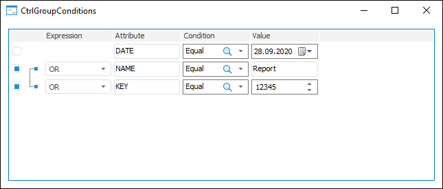
The example of the CtrlGroupConditions component:
| Property name | Brief description | |
 |
Groups | The Groups property determines the collection of groups of elements. |
|
SelectedRows | The SelectedRows property determines an array of selected elements. |
| Property name | Brief description | |
|
Arrangement | The Arrangement property determines the image display type. |
|
AutoArrange | The AutoArrange property determines whether the elements are arranged automatically in regular series when their number is changed. |
|
BorderStyle | The BorderStyle property determines a component border style. |
|
Checkboxes | The Checkboxes property determines whether component elements have checkboxes. |
|
ColumnClick | The ColumnClick property determines whether column headers can be displayed as buttons. |
|
Columns | The Columns property returns the component headers collection. |
|
FocusedItem | The FocusedItem property determines the focused element of the component. |
|
GridLines | The GridLines property determines whether gridlines are displayed. |
|
HeaderMenu | The HeaderMenu property determines the context menu opened by clicking the component column header with the additional mouse button. |
|
HideSelection | The HideSelection property determines whether the selected component element remains selected when the focus moves to another component element. |
|
HighlightTrack | The HighlightTrack property determines whether to highlight element on mouseover. |
|
HotTrackStyles | The HotTrackStyles property determines a style of elements highlighting, over which the mouse cursor hovers. |
|
HoverTime | The HoverTime property determines the time interval, after which the element, over which the mouse cursor hovers, is highlighted. |
|
ItemHeight | The ItemHeight property determines the height of component elements. |
|
Items | The Items property returns the component elements collection. |
|
LargeImages | The LargeImages property determines the source of large icons. |
|
MultiSelect | The MultiSelect property determines whether multiple selection is possible. |
|
ReadOnly | The ReadOnly property determines whether the list can be edited. |
|
RowSelect | The RowSelect property determines whether the whole row is highlighted when an element is selected. |
|
SelectedCount | The SelectedCount property returns the number of elements selected in the component. |
|
SelectedItem | The SelectedItem property determines the selected component element. |
|
ShowColumnHeaders | The ShowColumnHeaders property determines whether column headers are displayed. |
|
ShowHeaderButton | The ShowHeaderButton property determines whether column header menu open button is displayed. |
|
ShowHints | The ShowHints property determines whether a tooltip is displayed when the mouse cursor hovers over elements. |
|
SmallImages | The SmallImages property determines a source of small icons. |
|
SortColumn | The SortColumn property determines the index of the column, by which sorting is executed. |
|
SortType | The SortType property determines a component sorting type. |
|
StateImages | The StateImages property determines the source of icons for the selected elements. |
|
Style | The Style property determines the style of component elements display. |
|
TrackSelect | The TrackSelect property determines whether the element is selected when the mouse cursor hovers over it. |
|
WrapText | The WrapText property determines whether the text can be broken into several lines if it exceeds icon borders. |
| Property name | Brief description | |
|
Align | The Align property determines component alignment within its parent component. |
|
AllowDrag | The AllowDrag property determines whether an object can be dragged from the component. |
|
AllowDrop | The AllowDrop property determines whether the component can accept a dragged object. |
|
Anchors | The Anchors property returns settings that determine the percentage of the size change for the current component when the parent component is resized. |
|
Brush | The Brush property determines the brush that is used to fill component area. |
|
ClientHeight | The ClientHeight property determines the height of the client component area. |
|
ClientWidth | The ClientWidth property determines the width of the client component area. |
|
Color | The Color property determines a component background color. |
|
Cursor | The Cursor property determines how the cursor looks like when it is hovered over the component at the form runtime. |
|
Enabled | The Enabled property determines whether the component is available for the user. |
|
Focused | The Focused property returns True if the focus is set on the component. |
|
Font | The Font property determines the parameters of the font that is used to display text in the component. |
|
Height | The Height property determines the component height in pixels. |
|
HelpContext | The HelpContext property determines a unique index for the context help section for this component. |
|
Hint | The Hint property determines the tooltip text displayed if the cursor is hovered over the component. |
|
HintTimeout | The HintTimeout determines the time, for which a tooltip is displayed. |
|
Left | The Left property determines the coordinate of the component left edge in pixels. |
|
Parent | The Parent property determines a parent component. |
|
ParentColor | The ParentColor property determines whether the component inherits the color of the parent component. |
|
ParentFont | The ParentFont property determines whether the component uses the font of the parent component. |
|
ParentShowHint | The ParentShowHint property determines whether a tooltip is displayed. |
|
PopupMenu | The PopupMenu property determines the context menu displayed when the component is clicked with the right mouse button. |
|
Scrolls | The Scrolls property returns parameters of component's scrollbars. |
|
ShowHint | The ShowHint property determines whether a tooltip is displayed when the cursor is hovered over the component. |
|
TabOrder | The TabOrder property determines the component position in the tab order. |
|
TabStop | The TabStop property determines whether the component is focused when the Tab key is pressed. |
|
Text | The Text property determines the row identifying a component for the user. |
|
Top | The Top property determines the coordinate of the component upper edge in pixels. |
|
Visible | The Visible property determines whether the component is displayed when a form is executed. |
|
Width | The Width property determines the horizontal size of a component in pixels. |
| Property name | Brief description | |
|
ComponentCount | The ComponentCount property returns the number of child components located on the parent component. |
|
Components | The Components property returns the child component, which index is passed via the input parameter. |
|
Data | The Data property is used to store any custom data. |
|
Name | The Name property determines a component name. |
|
Tag | The Tag property is not used by the compiler. The user can change the value of the Tag property and use it as he wishes. |
| Method name | Brief description | |
 |
AddRow | The AddRow method adds an element. |
|
CanGroup | The CanGroup method determines whether elements can be grouped. |
|
CanUngroup | The CanUngroup method determines whether a group of elements can be ungrouped. |
|
GetControl | The GetControl method returns the visual component added to element cell. |
|
Group | The Group method groups selected elements. |
|
GroupByIndexes | The GroupByIndexes method groups elements by indexes. |
|
InsertRow | The InsertRow method adds an element by the specified index. |
|
Ungroup | The Ungroup method ungroups the selected group of elements. |
|
UngroupByIndexes | The UngroupByIndexes method ungroups groups of elements by indexes. |
| Method name | Brief description | |
|
AdjustWidth | The AdjustWidth method is used to automatically fit a column based on its contents. |
|
GetItemAt | The GetItemAt method allows to get the component element in the specified point. |
|
HitTest | The HitTest method is an enhanced version of the GetItemAt method. |
|
InsertControl | The InsertControl method inserts the component into component elements area. |
| Method name | Brief description | |
|
ClientToScreen | The ClientToScreen method converts the coordinates of a point specified relative to the component coordinate system into screen coordinates. |
|
DoDragDrop | The DoDragDrop method enables the user to start dragging operation. |
|
GetImage | The GetImage method returns a graphic view of the component together with all child components. |
|
ScreenToClient | The ScreenToClient method converts screen coordinates of a point into coordinates specified relative to the component coordinate system. |
|
SetFocus | The SetFocus method sets focus to this component. |
| Event name | Brief description | |
 |
OnChecked | The OnChecked event occurs after the list element is selected. |
|
OnChecking | The OnChecking event occurs when the user begins to select the list element. |
|
OnColumnClick | The OnColumnClick event occurs on clicking on one of the component columns. |
|
OnComparelItems | The OnCompareItems event occurs on comparing two elements during user element sorting. |
|
OnDeletion | The OnDeletion event occurs when a component element is deleted. |
|
OnEdited | The OnEdited event occurs on exiting the mode of editing the contents of the component current record field. |
|
OnEditing | The OnEditing event occurs on switching to the mode of editing the current component element. |
|
OnFocusChange | The OnFocusedChange event occurs when the focus is moved to another component element. |
|
OnFocusChanging | The OnFocusedChanging event occurs when the focus is moved to another component element. |
|
OnGetHint | The OnGetHint event occurs when a tooltip is displayed over the element, on which the mouse cursor stops. |
|
OnHover | The OnHover event occurs, when a mouse cursor hovers over the element and the element is underlined. |
|
OnInsert | The OnInsert event occurs when the new element of the component is inserted. |
|
OnSelectingItem | The OnSelectingItem event occurs before the component element selection is changed. |
|
OnSelectItem | The OnSelectItem event occurs on the component element selection changing. |
| Event name | Brief description | |
|
OnBeginDrag | The OnBeginDrag event occurs for a component when the user starts to drag an object from the component. |
|
OnClick | The OnClick event occurs if the user clicks the component area. |
|
OnControlMove | The OnControlMove event occurs when the component is moved. |
|
OnControlResize | The OnControlResize event occurs when the component is resized. |
|
OnDblClick | The OnDblClick event occurs if the user double-clicks the component area. |
|
OnDragDrop | The OnDragDrop event occurs for a component if the user drops a dragged object over it. |
|
OnDragEnter | The OnDragEnter event occurs when a dragged object crosses the borders of this component. |
|
OnDragLeave | The OnDragLeave event occurs when a dragged object leaves component borders. |
|
OnDragOver | The OnDragOver event occurs for the component when the user drags an object over it. |
|
OnEnter | The OnEnter event occurs when the component receives focus. |
|
OnExit | The OnExit event occurs when the component loses focus. |
|
OnHScroll | The OnHScroll event occurs when horizontal scrollbar slider changes its position. |
|
OnKeyDown | The OnKeyDown event occurs if the component is focused and a keyboard key is pressed. |
|
OnKeyPress | The OnKeyPress event occurs if the component is focused when the user presses a character key. |
|
OnKeyPreview | The OnKeyPreview event occurs prior to each event related to key pressing. |
|
OnKeyUp | The OnKeyUp event occurs if the component is focused and the user releases any button previously pressed. |
|
OnMouseDown | The OnMouseDown event occurs if the pointer is in component's area and a mouse key is pressed. |
|
OnMouseEnter | The OnMouseEnter event occurs when mouse cursor enters the component area. |
|
OnMouseHover | The OnMouseHover event occurs when mouse cursor is held in the component area. |
|
OnMouseLeave | The OnMouseLeave event occurs when mouse cursor leaves the component area. |
|
OnMouseMove | The OnMouseMove event occurs on moving the cursor over component. |
|
OnMouseUp | The OnMouseUp event occurs when the mouse button is released and the cursor is in the component area. |
|
OnMouseWheel | The OnMouseWheel event occurs if the component is focused when the mouse wheel is rotated. |
|
OnVScroll | The OnVScroll event occurs when vertical scrollbar slider changes its position. |
See also: